


What happens when two people who create a successful typeface have a falling out and can’t decide who owns the type? That’s the story that Helen Zaltzman brought to listeners of The Allusionist in a musical live show called Souvenirs. Plus, Roman chats with Helen about how the live show was created and what you
The Doves Type® – Typespec
THE DOVES PRESS WAS FOUNDED IN 1900 by T. J. Cobden-Sanderson, in partnership with process engraver & photographer Emery Walker, in Hammersmith, London. During nearly seventeen years of operation, the Doves Press produced some of the finest & most notable examples of twentieth century typography.
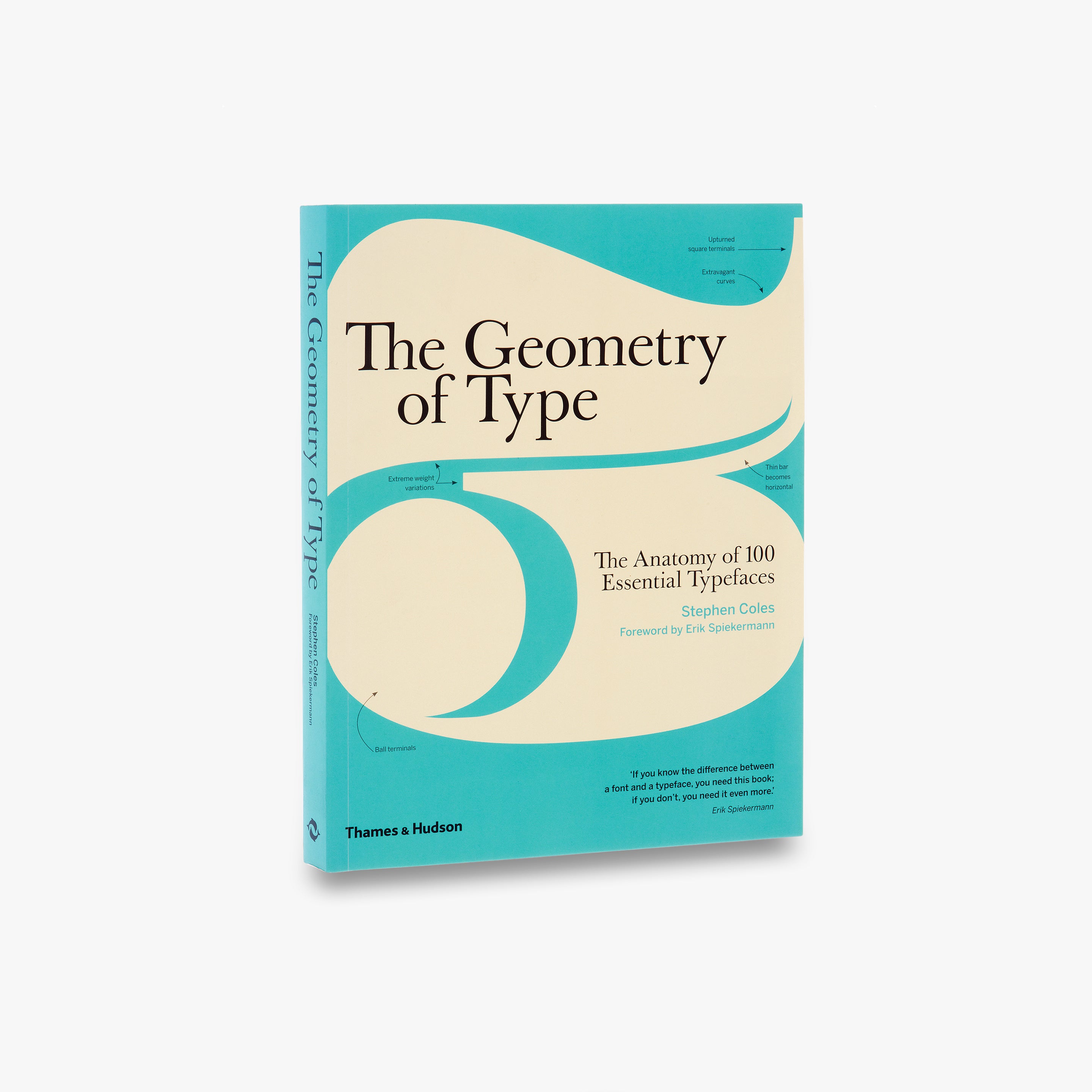
The Geometry of Type
The Geometry of Type explores 100 traditional and modern typefaces in detail, with a full spread devoted to each entry. Characters from each typeface are enlarged and annotated to reveal key features, anatomical details, and the finer, often-overlooked elements of type design, which shows how these attributes affect mood and readability. Sidebar information lists the designer and foundry, the year of release and the different weights and styles available, while feature boxes explain the origins and best uses for each typeface, such as whether it is suitable for running text or as a display font for headlines. To help the reader spot each typeface in the wider world, the full character set is shown, and the best letters for identification are highlighted.
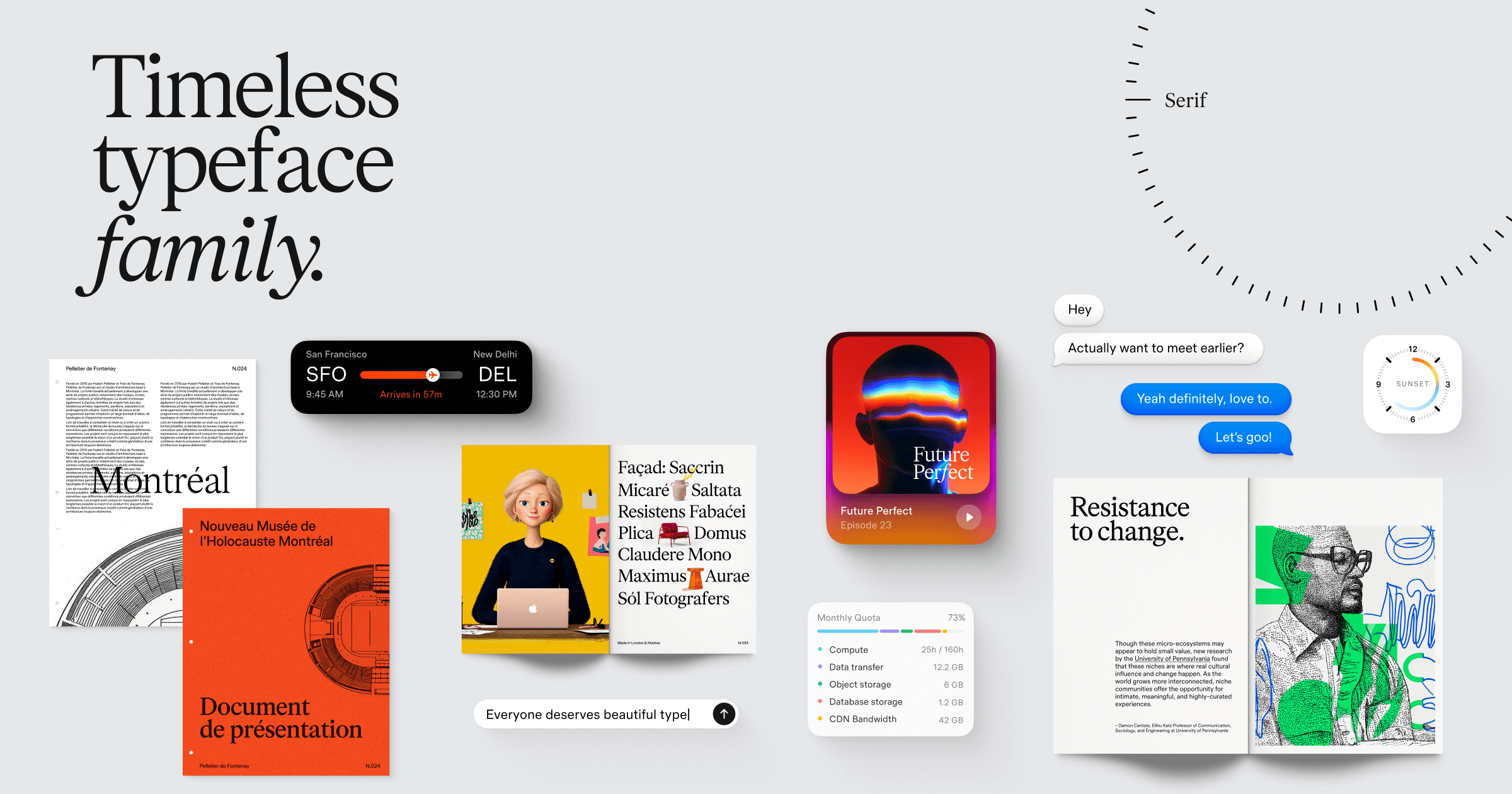
Timeless Type Family
Timeless Grotesk, Sans, Serif and Text — four variable typefaces with matching italics, free for personal and commercial use.
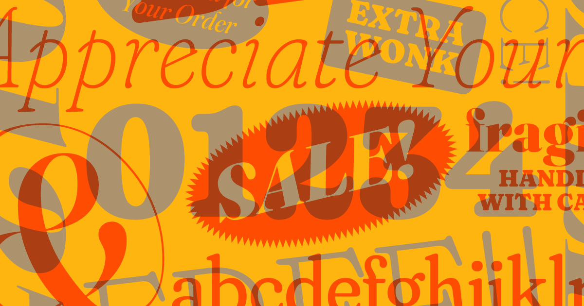
Fraunces by Undercase Type
Fraunces is a display, 'Old Style' soft-serif typeface inspired by the mannerisms of early 20th century typefaces such as Windsor, Souvenir, and the Cooper Series.
Anna E. Cook
Award-winning Product Designer, International Keynote Speaker, and Accessibility + Inclusive Design Specialist
It’s like this: Why perceptions are our realities - Flux
Cecilia Bleasdale just needed a dress to wear to her daughter’s wedding. She had no idea what was about to happen. After considering several frocks, she sent photos of three to her daughter, Grace, informing her she’d purchased one of them. “Oh, the white and gold one?” Grace replied. “No,” Cecilia answered. “It’s blue and […]

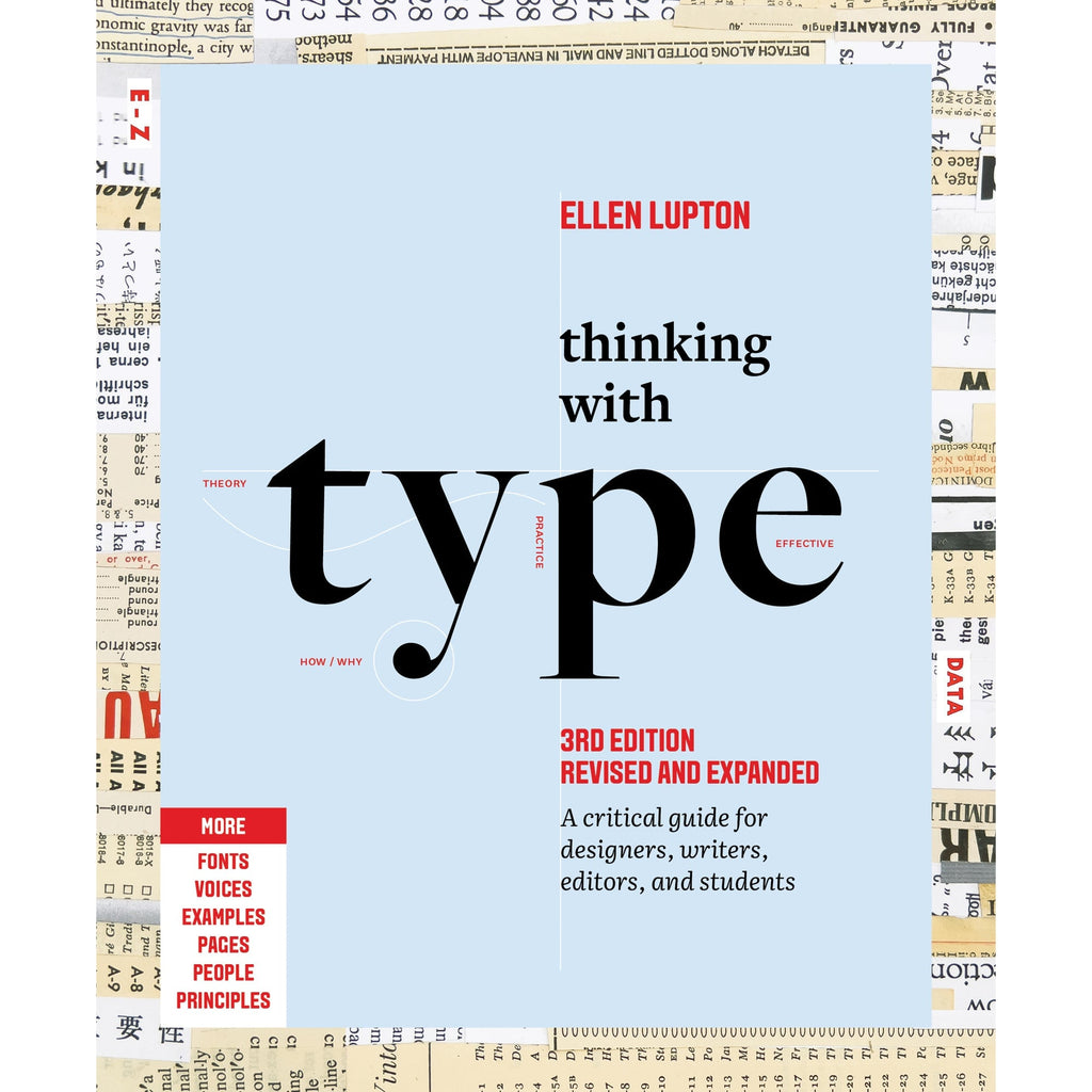
Thinking with Type
The essential and bestselling guide to typography from beloved design educator Ellen Lupton—revised and expanded to include new and additional voices, examples, and principles, and a wider array of typefaces. "Thinking with Type is to typography what Stephen Hawking's A Brief History of Time is to physics."—I Love TypographyThe bestselling Thinking with Type in a revised and expanded third edition: This is the definitive guide to using typography in visual communication. Covering the essentials of typography, this book explores everything from typefaces and type families to kerning and tracking to grids and layout principles.Ellen Lupton provides clear and focused guidance on how letters, words, and paragraphs should be aligned, spaced, ordered, and shaped. Historical and contemporary examples of graphic design show how to learn the rules and how to break them. Critical essays, eye-opening diagrams, helpful exercises, and dozens of examples and illustrations show readers how to be inventive within systems that inform and communicate.Featuring 32 pages of new content, the third edition is revised and refined from cover to cover: More fonts: old fonts, new fonts, weird fonts, libre fonts, Google fonts, Adobe fonts, fonts from independent foundries, and fonts and lettering by women and BIPOC designersIntroductions to diverse writing systems, contributed by expert typographers from around the worldDemonstrations of basic design principles, such as visual balance, Gestalt grouping, and responsive layoutCurrent approaches to typeface design, including variable fonts and optical sizes; tips for readability, legibility, and accessibility; and stunning reproductions from the Letterform Archive Thinking with Type is the typography book for everyone: designers, writers, editors, students, anyone who works with words on page or screen, and enthusiasts of type and lettering. Readers will also love Ellen Lupton's book Extra Bold: A Feminist, Inclusive, Anti-racist, Nonbinary Field Guide for Graphic Designers. Ellen Lupton is a designer, writer, and educator. She has written numerous books about graphic design, including Thinking with Type, Graphic Design Thinking, and Extra Bold: A Feminist, Inclusive, Anti-racist, Nonbinary Field Guide for Graphic Designers. She teaches in the Graphic Design MFA program at Maryland Institute College of Art in Baltimore (MICA), where she proudly serves as the Betty Cooke and William O. Steinmetz Design Chair. She is Curator Emerita at Cooper Hewitt, Smithsonian Design Museum in New York City, where her exhibitions included Herbert Bayer: Bauhaus Master and The Senses: Design Beyond Vision. Lupton loves reading, writing, teaching, and learning new things about design.
Paul Chiusano: The future of software, the end of apps, and why UX designers should care about type theory
[ econ fp tech unison ux ]
MD UI: a Typeface for Interfacing
I kill a lot of typefaces. It’s not that I don’t like them — quite the opposite. I think they deserve better. I love type too much to look at a half-baked idea and call it close enough, and yet sometimes a design’s full potential is simply out of reach. I resurrect typefaces, occasionally, when I find I’ve grown tall enough to try again.


Advancing the Understanding of Phenotypic Mimicry in Men’s Conspicuous Consumption
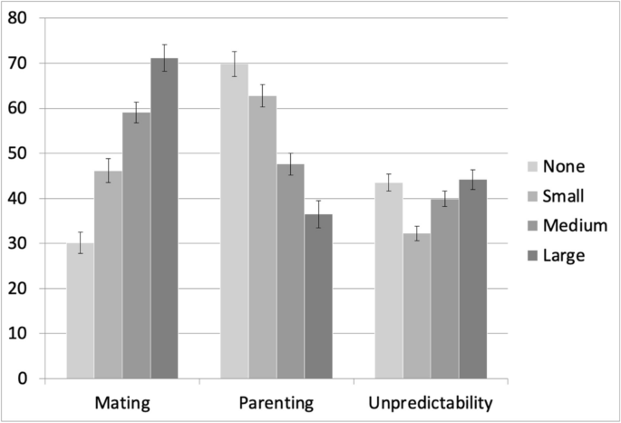
Two studies advance the understanding of phenotypic mimicry in consumer products. Product features mimicking more prominent male secondary sexual characteristics are associated with men’s behavioral strategies which are higher in mating effort and lower in paternal investment in offspring, in parallel with reproductive strategies across species and within the human population. The first study demonstrated a continuous relationship between the sizes of luxury brand logos and perceptions of the owners’ life histories. Two partial replications reproduced Study 1 results. Study 2 demonstrated that a manipulation of coloration, another fundamental dimension of variation in secondary sex characteristics, generates a similar pattern of results. In both studies, men owning shirts with more prominent sensory characteristics were believed to use authority and intimidation as strategies for advancing social status, whereas men owning shirts with less showy characteristics were believed to demonstrate useful abilities and foster cooperative alliances. Participants also recognized the strategic use of luxury display properties across social contexts.
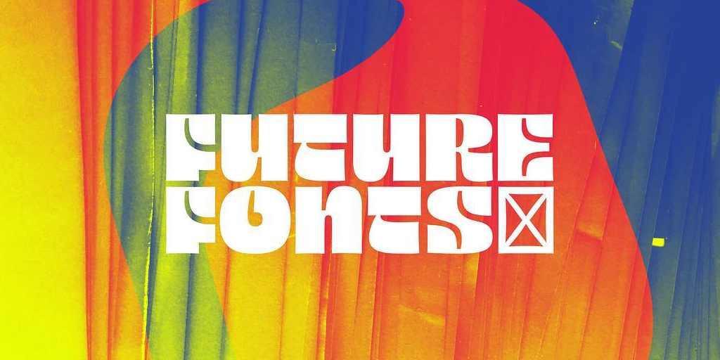
I made a typeface, it's called Flexflex 🔠 I've been working on this project on-and-off for many months. Very happy to finally release it! Flexflex is a typeface that responds to spatial requirements rather than imposing them. Website: ronikaufman.github.io/flexflex
