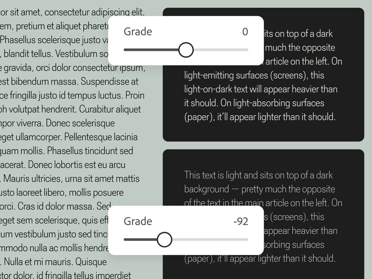
Grade is a subtle typographic adjustment that preserves visual balance across shifting contexts
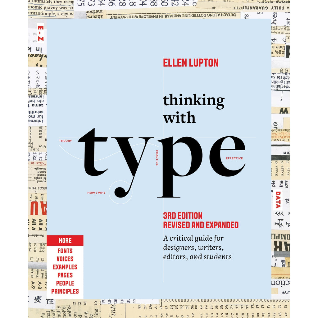
Thinking with Type
The essential and bestselling guide to typography from beloved design educator Ellen Lupton—revised and expanded to include new and additional voices, examples, and principles, and a wider array of typefaces. "Thinking with Type is to typography what Stephen Hawking's A Brief History of Time is to physics."—I Love TypographyThe bestselling Thinking with Type in a revised and expanded third edition: This is the definitive guide to using typography in visual communication. Covering the essentials of typography, this book explores everything from typefaces and type families to kerning and tracking to grids and layout principles.Ellen Lupton provides clear and focused guidance on how letters, words, and paragraphs should be aligned, spaced, ordered, and shaped. Historical and contemporary examples of graphic design show how to learn the rules and how to break them. Critical essays, eye-opening diagrams, helpful exercises, and dozens of examples and illustrations show readers how to be inventive within systems that inform and communicate.Featuring 32 pages of new content, the third edition is revised and refined from cover to cover: More fonts: old fonts, new fonts, weird fonts, libre fonts, Google fonts, Adobe fonts, fonts from independent foundries, and fonts and lettering by women and BIPOC designersIntroductions to diverse writing systems, contributed by expert typographers from around the worldDemonstrations of basic design principles, such as visual balance, Gestalt grouping, and responsive layoutCurrent approaches to typeface design, including variable fonts and optical sizes; tips for readability, legibility, and accessibility; and stunning reproductions from the Letterform Archive Thinking with Type is the typography book for everyone: designers, writers, editors, students, anyone who works with words on page or screen, and enthusiasts of type and lettering. Readers will also love Ellen Lupton's book Extra Bold: A Feminist, Inclusive, Anti-racist, Nonbinary Field Guide for Graphic Designers. Ellen Lupton is a designer, writer, and educator. She has written numerous books about graphic design, including Thinking with Type, Graphic Design Thinking, and Extra Bold: A Feminist, Inclusive, Anti-racist, Nonbinary Field Guide for Graphic Designers. She teaches in the Graphic Design MFA program at Maryland Institute College of Art in Baltimore (MICA), where she proudly serves as the Betty Cooke and William O. Steinmetz Design Chair. She is Curator Emerita at Cooper Hewitt, Smithsonian Design Museum in New York City, where her exhibitions included Herbert Bayer: Bauhaus Master and The Senses: Design Beyond Vision. Lupton loves reading, writing, teaching, and learning new things about design.
Sound & Vision
Explore the future of type with the Re:Vision 2025 typographic playground—an interactive showcase of emerging type trends. Dive in and shape the next wave of visual language.

The typographic scale
The typographic scale has been used for centuries to choose harmonious font sizes. It has been likened to a harmonious musical scale. But there are *flaws* in those historical values.

Typo
Design a modular type scale, preview it live, and copy production-ready CSS with optional fluid typography.
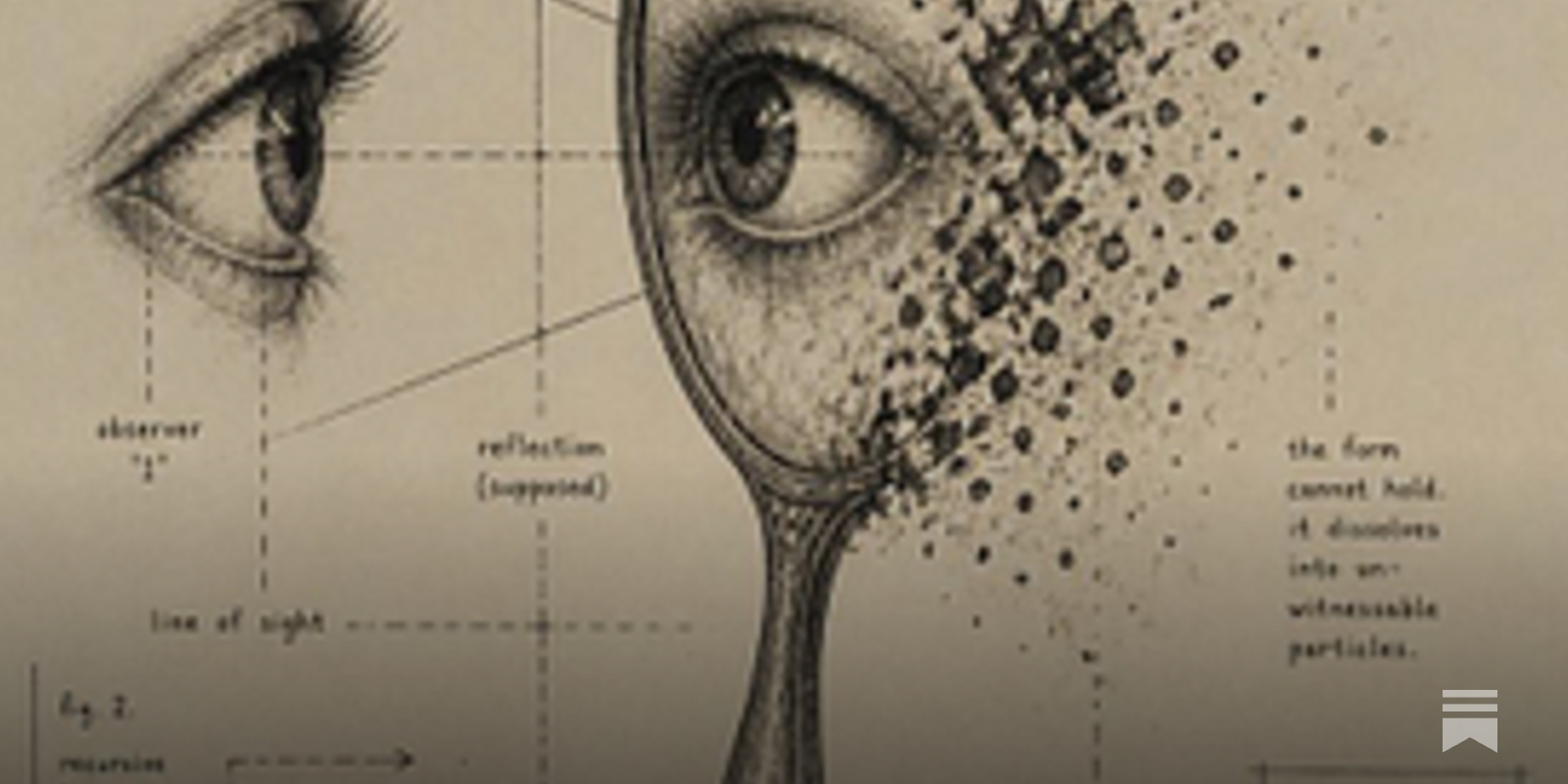
Deficient executive control in transformer attention
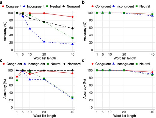
Abstract Although transformers in large language models (LLMs) effectively implement a self-attention mechanism that has revolutionized natural language processing, they lack an explicit architecture for the executive control of attention found in humans, which is essential for resolving conflicts and selecting relevant information in the presence of competing computations and is critical for adaptive behavior. To investigate the impact of this limitation in LLMs, we employed the classic color Stroop task, widely regarded as the gold standard, to test the executive control of attention in these models. Our results revealed a typical conflict effect of underperformance in terms of accuracy in the incongruent condition (e.g. naming the color of the word RED in blue) compared with the congruent condition (e.g. naming the color of the word RED in red), in short word lists, similar to human performance. However, as the length of the word lists increased, performance on the incongruent condition degraded toward near-total performance collapse, even as accuracy in the congruent condition remained excellent, and word reading (e.g. reading the word RED [in red] or RED [in blue], ignoring the color) was near-perfect. These findings demonstrate that transformer attention mechanisms are fundamentally limited in their capacity for conflict resolution across extended contexts, and a failure to up-regulate control adaptively under rising interference. We suggest that incorporating executive control mechanisms akin to those in biological attention is crucial for achieving artificial general intelligence.
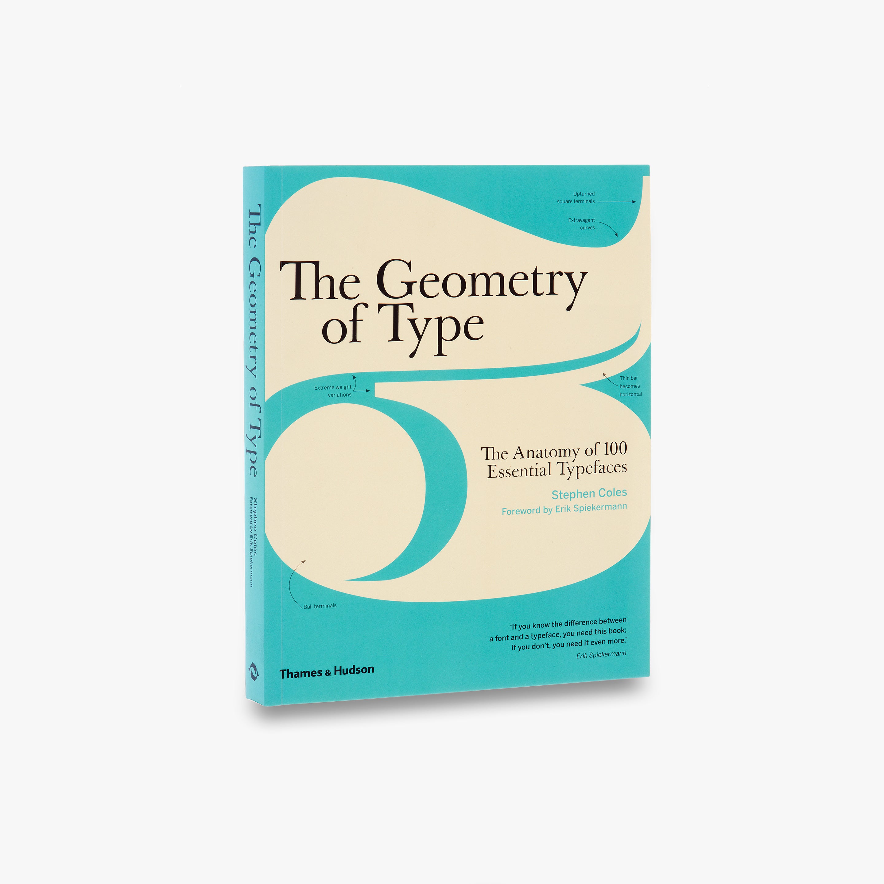
The Geometry of Type
The Geometry of Type explores 100 traditional and modern typefaces in detail, with a full spread devoted to each entry. Characters from each typeface are enlarged and annotated to reveal key features, anatomical details, and the finer, often-overlooked elements of type design, which shows how these attributes affect mood and readability. Sidebar information lists the designer and foundry, the year of release and the different weights and styles available, while feature boxes explain the origins and best uses for each typeface, such as whether it is suitable for running text or as a display font for headlines. To help the reader spot each typeface in the wider world, the full character set is shown, and the best letters for identification are highlighted.
Creative Reading: Scaffolding Reading for Transformation
Reading augmentation systems increasingly help readers process text at scale. While these tools address real constraints of time and cognitive load, they often implicitly frame reading as...

Butterick’s Practical Typography

Typography Is Not About You. Neither Is Your Product.
Yesterday I used Google Flights to compare routes, adjust dates, and pick a flight, all in a couple of minutes. I didn’t stop to appreciate any of it. I just made a decision and moved on. Tha…

Textoshop: Interactions Inspired by Drawing Software to Facilitate Text Editing
A computational account of conflict processing during mental imagery
Previous studies examining conflict processing within the context of a color-word Stroop task have focused on both stimulus and response conflicts. However, it has been unclear whether conflict can emerge independently of stimulus conflict. In this study, a novel arrow-gaze mental-rotation Stroop task was introduced to explore the interplay between conflict processing and mental rotation. A modelling approach was utilized to provide a process-level account of the findings. The results of our Stroop task indicate that conflict can emerge from mental rotation in the absence of stimulus conflict. The strength of this imagery conflict effect decreases and even reverses as mental rotation angles increase. Additionally, it was observed that participants responded more quickly and with greater accuracy to small rather than large face orientations. A comparison of three conflict diffusion models—the diffusion model for conflict tasks (DMC), the dual-stage two-phase model (DSTP), and the shrinking spotlight model (SSP)—yielded consistent support for the DSTP over the DMC and SSP in the majority of instances. The DSTP account of the experimental results revealed an increased nondecision time with increasing mental rotation, a reduction in interference from incompatible stimuli, and an improved drift rate in response selection phase, which suggests enhanced cognitive control. The findings from the model-based analysis provide evidence for a novel interaction between cognitive control and mental rotation.

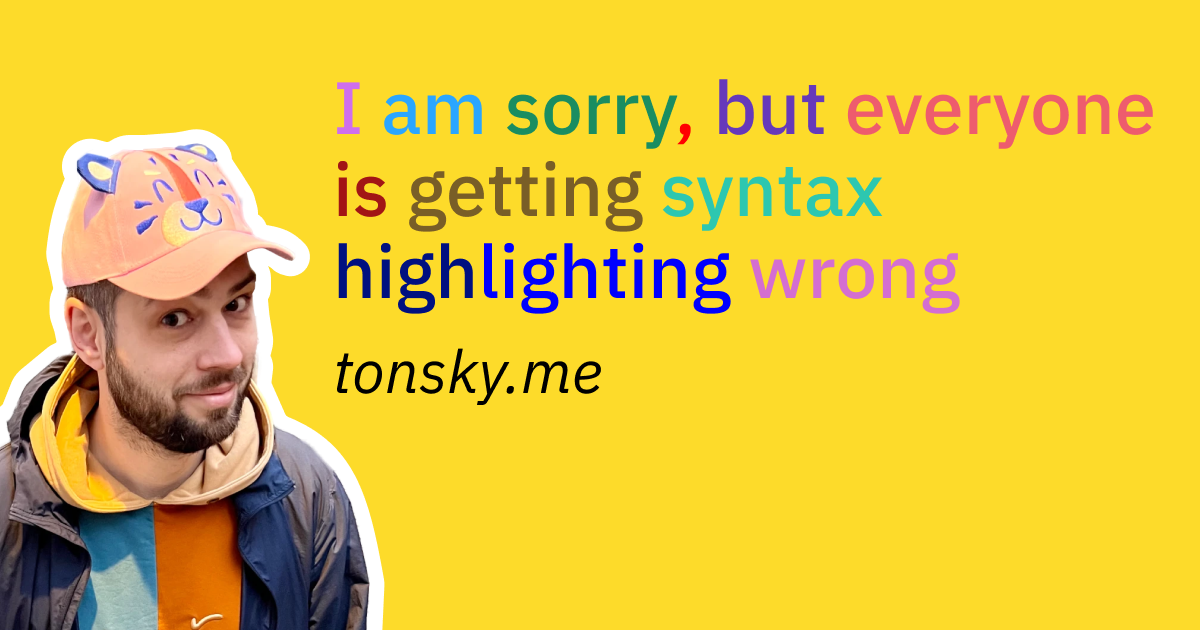
I am sorry, but everyone is getting syntax highlighting wrong
Applying human ergonomics and design principles to syntax highlighting
Tinkered Thinking
Daily, snackable writings to spur changes in thinking.Building a blueprint for a better brain by tinkering with the code.
Announcing: Navigating the AI Shift
Image credit: Joe Groove For a lot of people, AI started out as a net negative. You’re reviewing documents someone couldn’t be bothered to write themselves. You’re having your tim…


When Convenient Illusions Hold Precedence...
Language, Substance, and Money are intermediaries which crumble under weight of inspection