


Normal text wrapping can leave big gaps in your container, which can become even more exaggerated with the new-ish CSS values of text-wrap: balance and text-wrap: pretty. You almost certainly want …
Josh W. Comeau (@joshwcomeau.com)
✨ Neat CSS trick ✨ We can use `width: fit-content` to have a container element shrink to fit its element's width. This is useful for cards! But if that card has any text content, that text will blow out the width of the card, since it won't automatically linewrap. So we wind up with this issue:

Balancing flex items with flex-wrap: balance
A look at how flex items wrap and how to balance them across lines.
Revealing Text With CSS letter-spacing | CSS-Tricks
Until we get something like ::nth-letter, there are still some really cool text effects we can make from existing CSS features, like letter-spacing, ::first-word and ::first-line.
Two CSS Properties for Trimming Text Box Whitespace | CSS-Tricks
The text-box-trim and text-box-edge properties in CSS enable developers to trim specifiable amounts of the whitespace that appear above the
Making features generic in CSS
CSS has two new positional alignment keywords as part of CSS Box Alignment Level 3: flow-start and flow-end. These are defined as aliases for the existing flex-start and flex-end keywords. Therefore, in a supporting browser, the following two lines should align flex items to the end of the flex container (the right assuming you are working in English).
CSS Anchor Positioning Guide | CSS-Tricks
Learn about CSS Anchor Positioning, including its syntax, properties, how it is used to position one element next to another, and even how it's used to resize elements relative to other elements.

2050141 - [text-box-trim] Set layout.css.text-box.enabled for all users
RESOLVED (sajidanwar94) in Core - Layout: Block and Inline. Last updated 2026-07-15.
Multiple-column layout, rows, rules, and floats
Recently implemented in Chrome are two of my top asks for CSS—the concept of rows in multiple-column layout, and gap decorations for rows and columns in grid, flexbox, and multicol. Rows (using column-wrap) provide a way to use multicol on the web without risking scrolling up and down to read if the columns become taller than the viewport. Gap decorations mean that, for multicol, you can now add a rule between these new rows. This post is a collection of the things I think would be interesting to do in future. If you think so too, and particularly if you have a great use case for any of these, let me know in the comments.
CSS Scroll Snap | 12 Days of Web
Tips, tricks and grab-n-go demos for elegant and well-orchestrated scroll experiences.

Victor (@vpon.me)
One CSS property just killed every auto-resize textarea script you've ever written. Seriously, one line. The property is field-sizing: content

CSS is filling the gaps with rules. A way to style gaps in grid and flex. | utilitybend
A practical walkthrough of CSS gap decorations: column-rule, row-rule, rule-break, rule-inset, rule-visibility-items, repeat(), and animation.
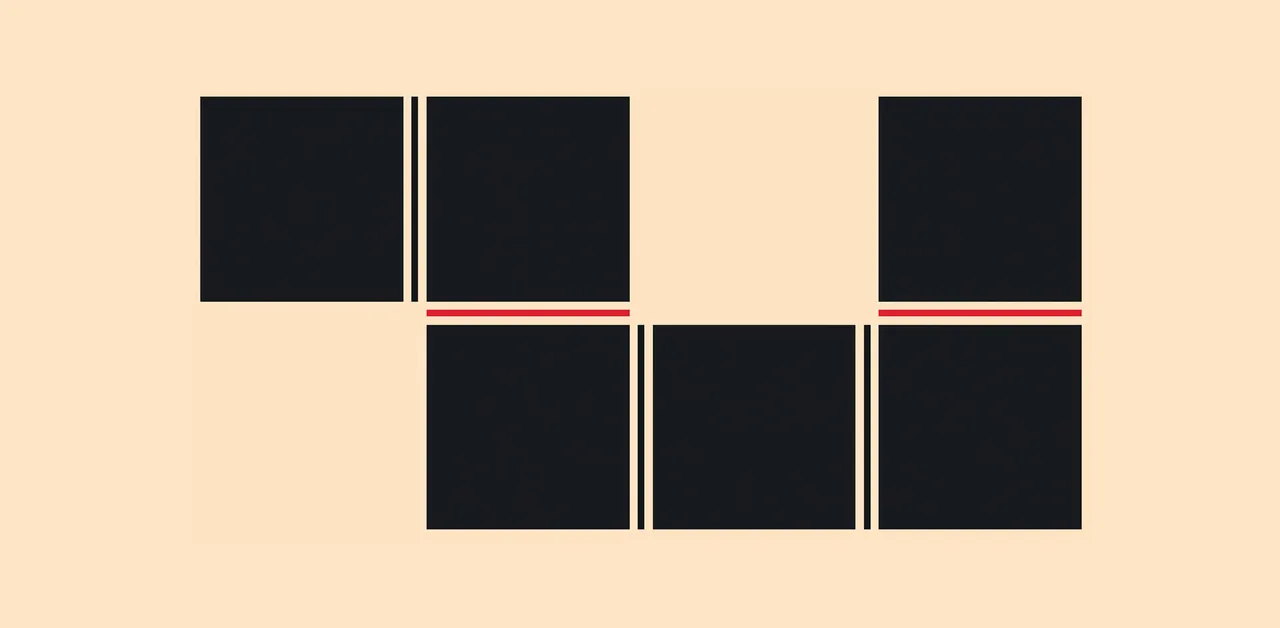
Quirks and Vintage Uses of CSS Table Display
Jokes about aligning divs will not be tolerated.

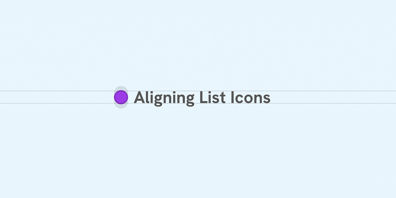
Better Icon and Label Alignment
There is a common design pattern that sometimes gets missed or overlooked. It’s having a list of items, each with an icon. When the text is one line, the icon is centered, but when the text has multiple lines, the icon is still centered but looks odd.
And that's a wrap!!! Thank you so much everyone who turned out today. Built a very simple atproto app in 4 hours that finds your most popular post on this day last year, and then reposts it for you if you want to. Kept it all to a single index.html and did not write a single line of css

pds.dad/remember-when
tangled.org
Bailey Townsend 🦀
🔴 LIVE stream.place/pds.dad Let's build an atproto app!
Anchor positioning makes this type of effect feel almost too easy to make now. If you want the long-form where I break it down in more detail, you can find it here: youtu.be/8_NQ7ARXz8c

