

Some more data from the For You perspective. This graph uses the date of the first and the last visit of the For You feed users. This is a bit different from Patrick's analysis.

Patrick Boueri
So I've been digging into bluesky retention data to see what is preventing growth of the ecosystem. Using likes/posts/follows you can see who is active or dormant on ATProto. The headline is that only 5% of users are retained at 28d and 10% of current users churn. That's not pretty
Jun 1, 2026 at 1:08 AM
Semble Explore Feed and Follow Graph
The Graph That Should Be Front-Page News
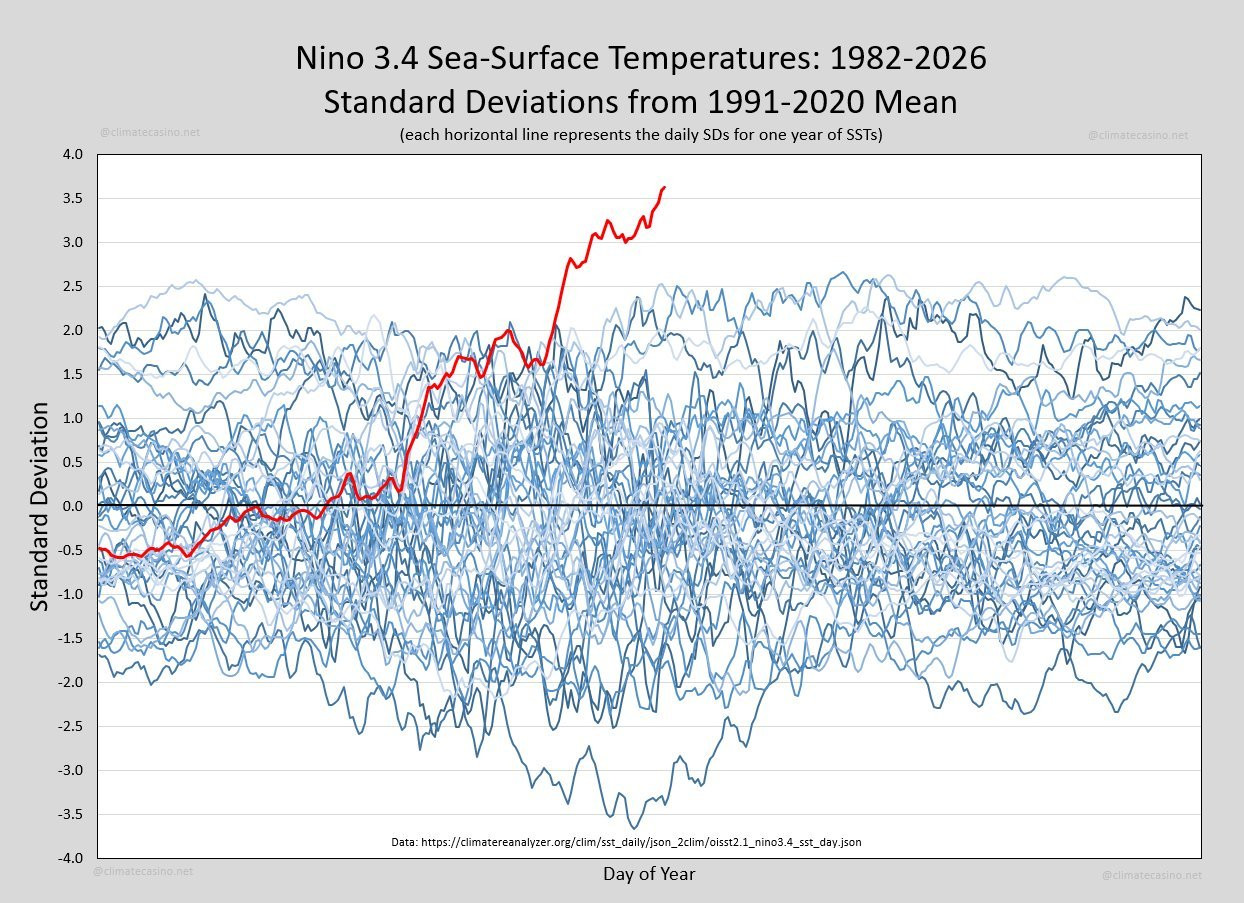
Every so often the Earth produces a signal that is impossible to ignore. This graph is one of them. It shows sea-surface temperatures in the Niño 3.4 region of the equatorial Pacific, one of the most important parts of the Earth's climate system. Each blue line represents a different year since 1982. The red line is this year. It doesn't just set a new record. It has departed entirely from the range of previous observations.If this graph represented stock market prices, a new Olympic record or a
From Feeds to Trails
To design the future of social media, rethink the interface before the algorithm.
How the Substack feed is learning to understand your reading journey
Modeling sequences of user behavior makes discovery feel alive

Permissioned Data Diary 4: The Big Picture - Daniel's Leaflets
A special edition of the data diary that sketches out the rough shape of where we're heading.
Bluesky feed engagement — image-count analysis
The left chart tiers authors by actual follower count (at analysis time). The right chart tiers authors by median likes per post — a proxy for effective reach. Interesting divergence: under the follower definition, medium-size accounts show no 4-img penalty; under median-engagement, the pattern is different.
Here’s a metric that I bet you aren’t using… I want you to check it out, and start using it. It could be a real wake up call about how inactive your users are. I’m talking about the XD28 metric. A… | Moe Ali | 17 comments
Here’s a metric that I bet you aren’t using… I want you to check it out, and start using it. It could be a real wake up call about how inactive your users are. I’m talking about the XD28 metric. A lot of teams have never bothered to collect this data - but you can get started after 28 days. Here’s how the metric works👇 This metric looks at a user and determines how many days they used your product/feature in a 28 day cycle. If your user used your product just once in the last 28 days, they’re identified as 1D28. If they use it 5 days out of 28, they’re categorized as 5D28 and so on… Then you create a bucket with each number of days and how many users used the product for each number of days. For example, 17 users belong in the 5D28 bucket and 500 users belong in the 24D28 bucket. You can use this to create a distribution chart. You should be using these figures to calculate the average AND median number of days that users are using the product in a given 28 day cycle. Ideally you want people to be moving from a lower number of days to a higher number. E.g. If your average number of XD28 is 5 days, you want to aim for 15 days in a year’s time. This is an interesting metric because often you will find users at one extreme of this distribution curve. And it can be a real wake up call for Product Managers. | 17 comments on LinkedIn

it's my following and i want it my way! - matt's not blog
a late response to the social graph talk from last week
bluesky visualizers
See the connections between the last 150 people you followed (if they followed each other as part of their last 150 follows)
bsky charts (@bskycharts.edavis.dev)
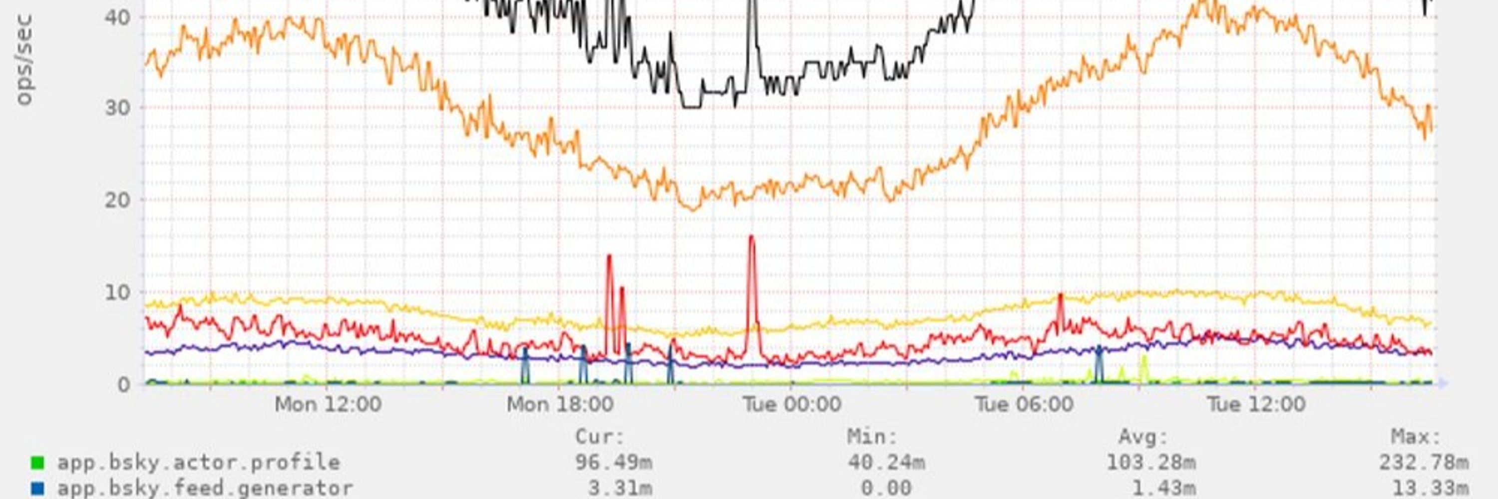
posting unofficial charts of bluesky network activity 🤖📈 more at https://bskycharts.edavis.dev/bluesky-day.html chart guide: https://edavis.dev/notes/bskycharts-guide/
it’s 2026 and you can now keep an exact timestamp of when you meet people in person with youandme.at ! 😌
You & Me
youandme.atpeople love the For You feed, and it shows in the numbers. it generates around 4% of post views inside feeds on Bluesky. that's amazing especially because it's operated by one dev, @spacecowboy17.bsky.social given its popularity, we've decided to give it a bump in visibility on the feeds page.
Same graph, but with the time series expanded to three years. Honestly, it's a minor miracle that a social media company not backed by oligarchs or the state, with no attempt at establishing a revenue stream, and with multiple established competitors, had so much growth in such short time

James Ball
I tend to get dogpiled every time I say this but: as someone *who likes bluesky and benefits from being here* we have a problem. The network is shrinking, not growing. It's shrinking a lot: only about 1.1m people a day even like a post. This time last year it was 1.6m.
Majority of links are behind paywalls which I get; subscriptions in media are everywhere bc platforms killed distribution. How much traffic data actually translates to reading the article? I open links all the time and then close them bc of the paywall. We are reviving discovery but who’s reading?
tfw @aaronstevenwhite.io brings an analysis as sharp as a knife to your half-baked Saturday-morning thoughts: aaronstevenwhite.leaflet.pub/3miwsz2hdv22i 🤯 If we're going to own our data, let's actually own our data. Which is to say: No, really, y'all, we're doing this. 💖🧠

Machine-readable attitudes - Computational Semantics++
aaronstevenwhite.leaflet.pubNew day, new product on the Atmosphere. Launching glean.at a Social RSS Reader on @atproto.com. What does it mean? - Your RSS reader becomes connected to your social graph. - See what people like you read, like or annotate - Discover feeds or articles you wouldn't have known before
Glean
glean.at


