

One line of CSS. Perfectly responsive typography on every screen. font-size: clamp(1rem, 1vw, 1.75rem); 🪄 1rem minimum keeps text readable on phones 🪄 1vw makes it scale fluidly with the viewport 🪄 1.75rem caps it elegantly on large displays No media queries or breakpoints. Try it!
May 10, 2026 at 4:59 AM
Typo
Design a modular type scale, preview it live, and copy production-ready CSS with optional fluid typography.
The Negative Impact of Mobile-First Web Design on Desktop
Mobile-first web designs cause significant usability issues when viewed on desktop. Content becomes overly dispersed across long scrolling pages with expansive white space and enlarged images and fonts, making it difficult for users to consume and understand the information.

Responsive Web Design
Designers have coveted print for its precision layouts, lamenting the varying user contexts on the web that compromise their designs. Ethan Marcotte advocates we shift our design thinking to approp…

The typographic scale
The typographic scale has been used for centuries to choose harmonious font sizes. It has been likened to a harmonious musical scale. But there are *flaws* in those historical values.

Victor (@vpon.me)
One CSS property just killed every auto-resize textarea script you've ever written. Seriously, one line. The property is field-sizing: content

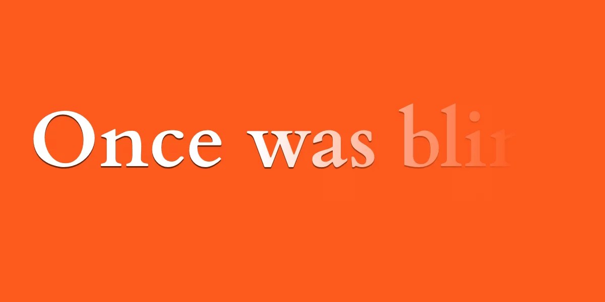
Revealing Text With CSS letter-spacing | CSS-Tricks
Until we get something like ::nth-letter, there are still some really cool text effects we can make from existing CSS features, like letter-spacing, ::first-word and ::first-line.
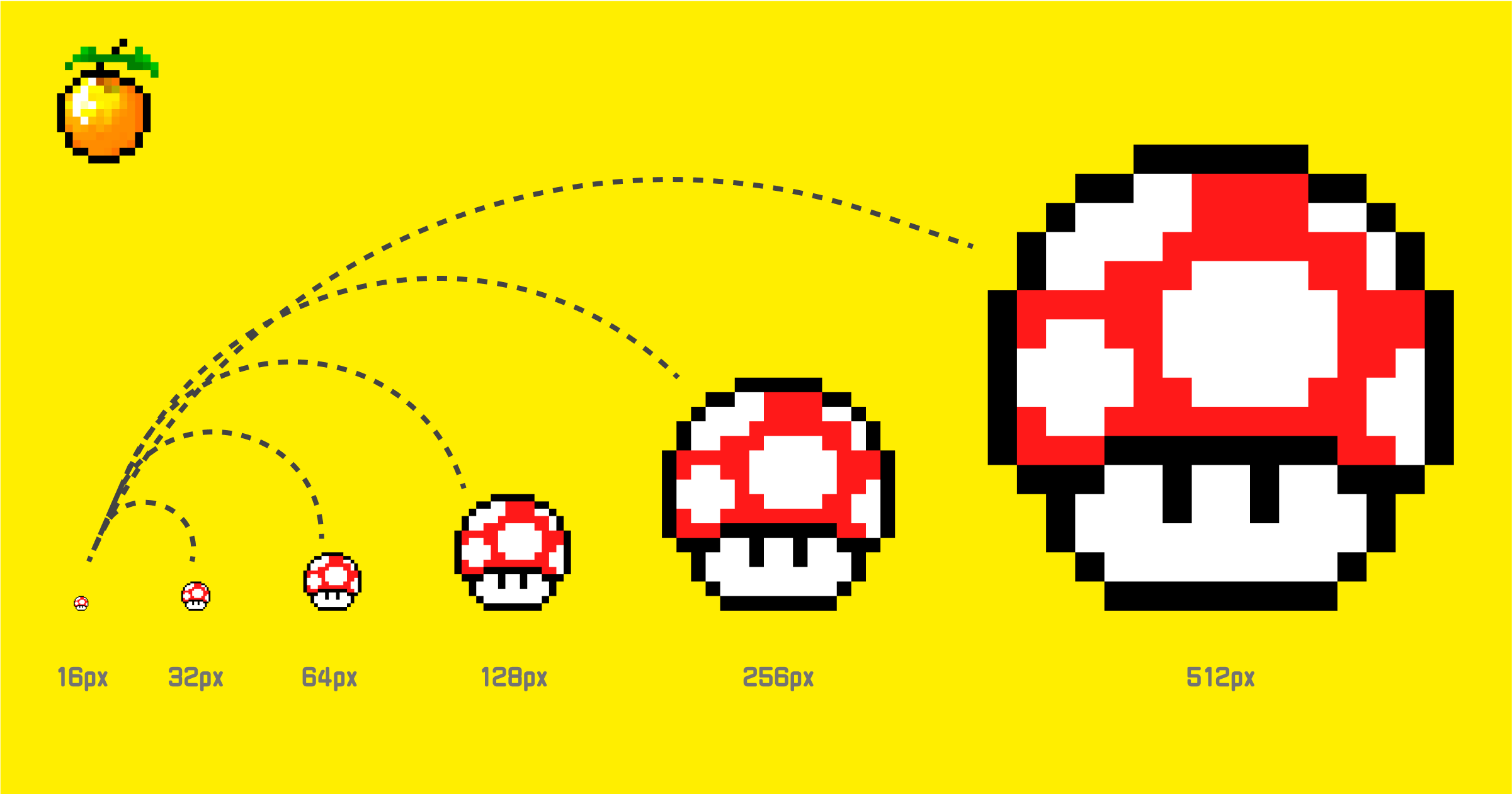
Preserving the Pixel Art Look in Web Content
Learn essential CSS techniques, scaling strategies, and design principles that preserve the crisp, totally-cool aesthetic of pixel graphics across high-resolution displays and responsive web environments.
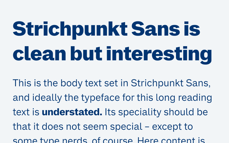
Strichpunkt Sans
A free sans-serif in three widths that’s clean, very legible in small text, but still interesting and versatile enough for display use.
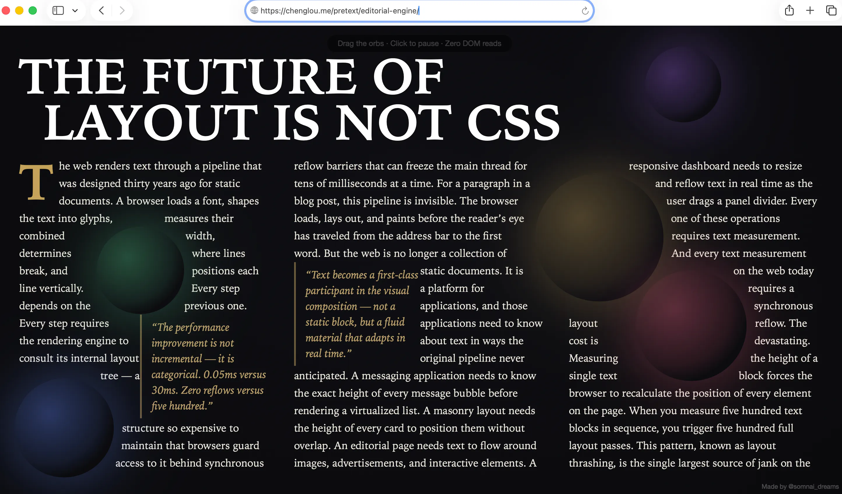
Pretext Does What CSS Can't — Measuring Text Before the DOM Even Exists | HackerNoon
Cheng Lou's Pretext library measures multiline text height without touching the DOM — unlocking layout capabilities CSS has never been able to offer.
Shrink-wrap Text with `position-anchor`
Normal text wrapping can leave big gaps in your container, which can become even more exaggerated with the new-ish CSS values of text-wrap: balance and text-wrap: pretty. You almost certainly want …

New in Chrome 150 | Blog | Chrome for Developers
CSS text-fit property, Focusgroup declarative keyboard navigation, and CSS background-clip border-area.
Schalk Neethling (@schalkneethling.com)
A little tool that came out of my article on @function, type scales, and fluid typography. typo.schalkneethling.com https://typo.schalkneethling.com
Browse Fonts - Google Fonts
Making the web more beautiful, fast, and open through great typography

Aspects of Reality - The Dooyeweerd Pages
(Designed to be readable on phones; for widescreens, reduce window width.)

Stefan Judis


Well... 🫣 Today I learned there's a CSS `zoom` property that scales an element's visual appearance and (!) layout. I can't be the only one hearing about this for the first time, right? stefanjudis.com/today-i-learned/css-zoom-to-s…

