

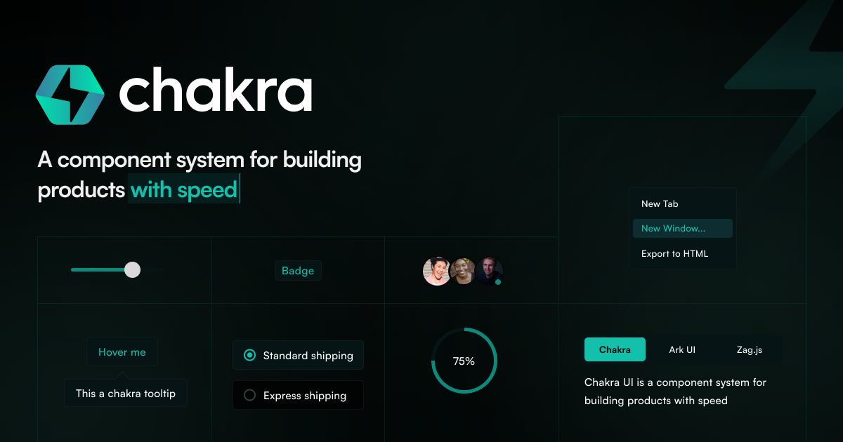
Simple, Modular & Accessible UI Components for your React Applications
Open Props UI | A modern CSS UI library
CSS UI library leveraging the most modern features. Components you can copy and paste into your project.

React
React is the library for web and native user interfaces. Build user interfaces out of individual pieces called components written in JavaScript. React is designed to let you seamlessly combine components written by independent people, teams, and organizations.

Dice UI
Accessible shadcn/ui components built with React, TypeScript, and Tailwind CSS. Copy-paste ready, and customizable.

WaveringAna/atproto-ui
A React component library for rendering common AT Protocol records for applications such as Bluesky and Leaflet.

Components.build
An open standard for building modern, composable and accessible UI components.
A new, modern UI component library built on top of Base UI - coss ui
Built for developers and AI.

Critical Security Vulnerability in React Server Components – React
The library for web and native user interfaces
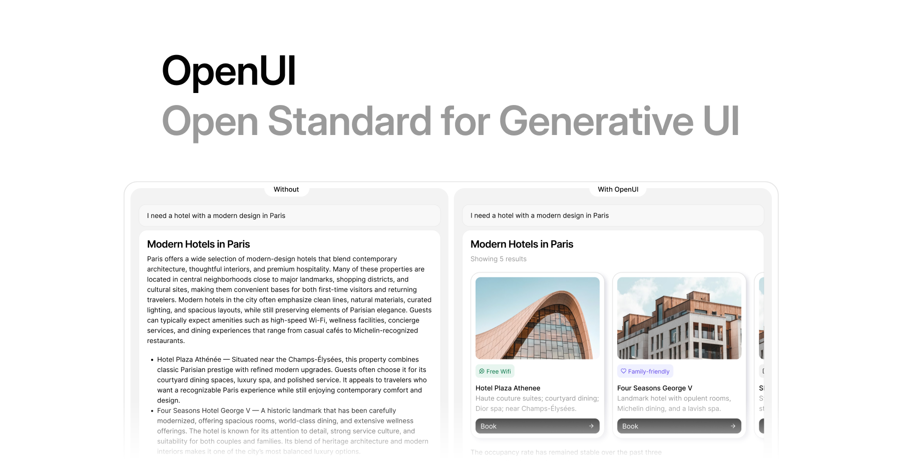
OpenUI - The Open Standard for Generative UI
Full-stack, renderer-agnostic Generative UI with a streaming-first language, official React support, community integrations, and up to 67% fewer tokens than JSON.
Melt UI
An open-source Svelte component library for building high-quality, accessible design systems and web apps.

Svelte Magic UI Components
Svelte Magic UI - A collection of components that will make your application look magical.

Real-World React: Designing Frontend Architectures That Survive Production | Workshops | Faris Aziz
Most React workshops focus on building features. This one focuses on keeping them alive. In production, React applications fail in ways that local environments never show: partial outages, slow dependencies, silent errors, broken rollouts, and performance regressions that only appear under real traffic. This workshop is a practical, architecture-first walkthrough of how experienced teams design React systems that stay resilient, observable, and scalable long after the first release. We will explore how component architecture, reconciliation in practice, and runtime failure patterns shape performance and operability far more than memoization tricks or framework features. Using React and Next.js as shared reference points, we will work through concrete patterns for failure recovery, error containment, safe rollouts, and post-deployment confidence. This is a hands-on, experience-driven workshop based on real production constraints, tradeoffs, and lessons learned from operating large React applications at scale. Attendees will leave with a mental model for building frontend systems that can fail safely, recover quickly, and ship continuously without fear. Most of the workshop is framework and library-agnostic, but we'll use React and Next.js as our common ground for communication and examples. This is not an exhaustive masterclass; it's a conversation starter and experience share to jumpstart your journey toward battle-tested software architecture.
Zag - Rapidly build UI components without sweating over the logic.
State machines for accessible, interactive and performant UI components

React component for screen reader accessibility • Josh W. Comeau
A convenient component for contextualizing visual content for screen readers
GitHub - pmndrs/zustand: 🐻 Bear necessities for state management in React
🐻 Bear necessities for state management in React. Contribute to pmndrs/zustand development by creating an account on GitHub.