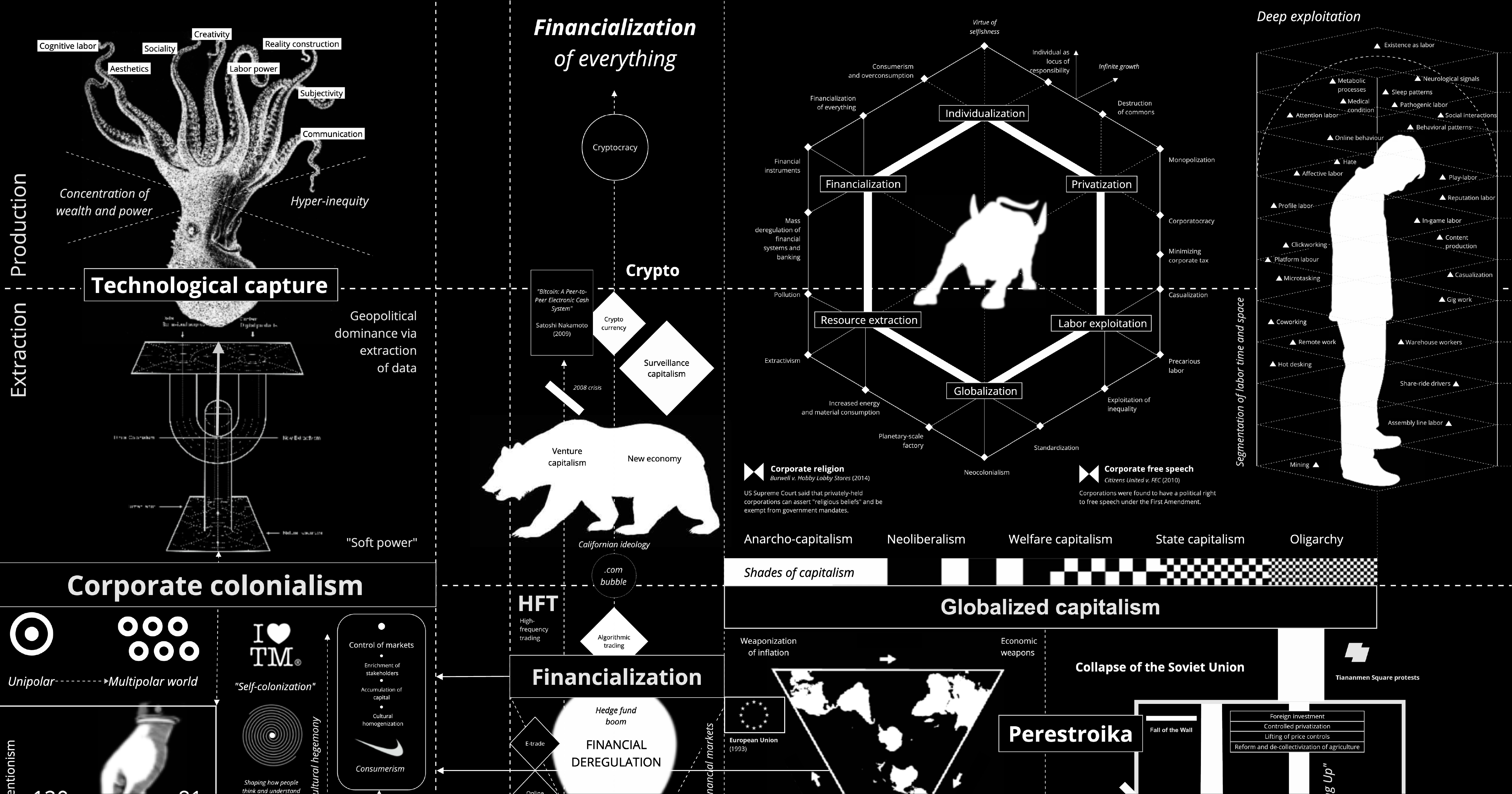
Beautiful Visualization and Analytics
An Award-winning Data Visualization Designer
Visual Cinnamon | Data Visualization Design & Data Art | Data made insightful, effective & beautiful through data visualization and data art
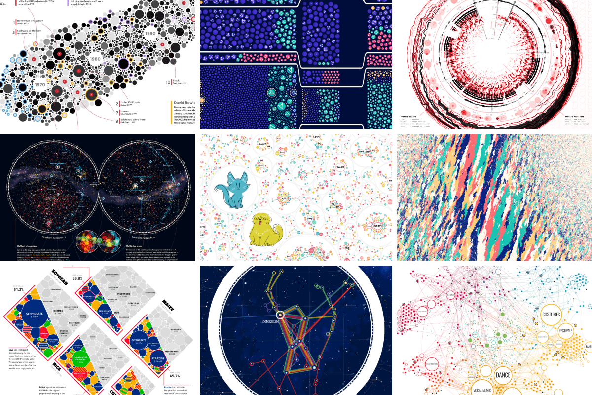
On power, aesthetics, materiality and change in data visualization
Notes from the Information+ Conference at MIT/Northeastern University, Boston.
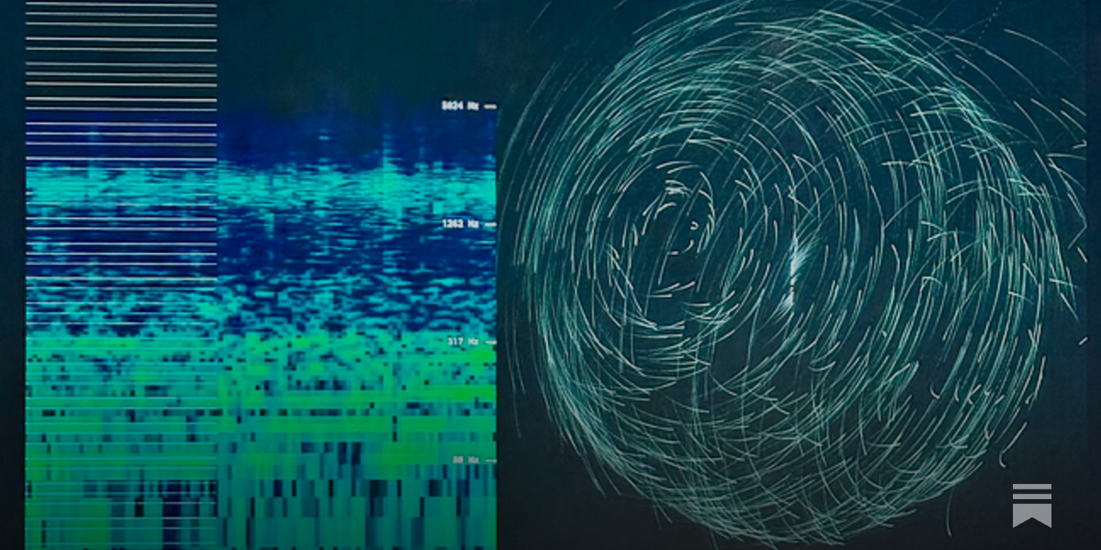
A checklist for designing and improving the visualization of scientific data
Creating clear and engaging scientific figures is crucial to communicate complex data. In this Comment, I condense principles from design, visual perception and data visualization research in a checklist that can help researchers to improve their data visualization, by focusing on clarity, accessibility and design best practices.
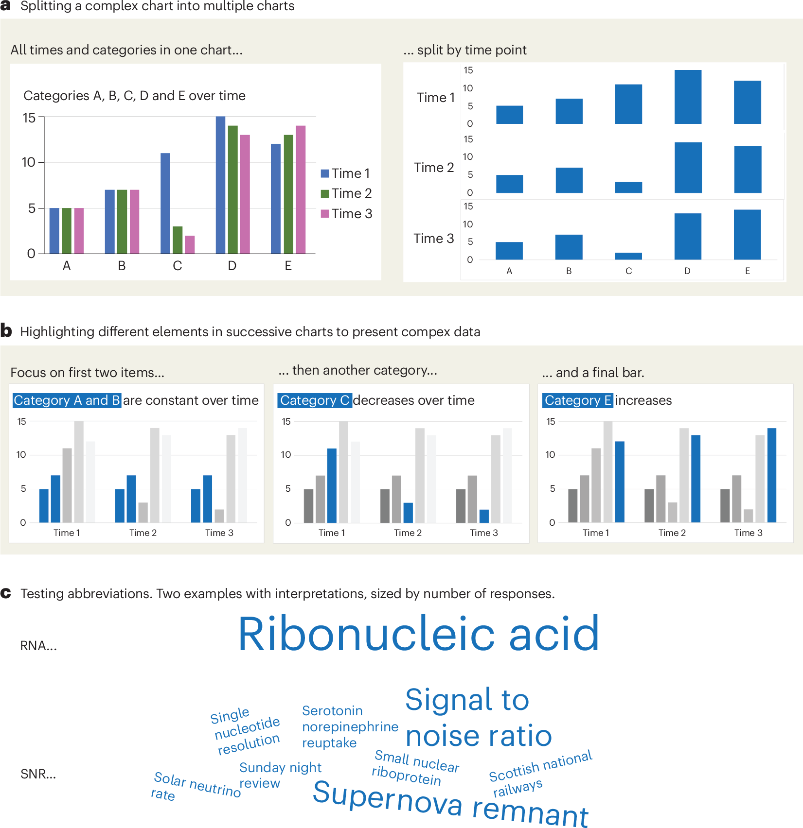

Information is Beautiful
Distilling the world's data, information & knowledge into beautiful infographics & visualizations

Sigma.js
a JavaScript library aimed at visualizing graphs of thousands of nodes and edges
GitHub - observablehq/plot: A concise API for exploratory data visualization implementing a layered grammar of graphics
A concise API for exploratory data visualization implementing a layered grammar of graphics - observablehq/plot
GitHub - HEmile/juggl: An interactive, stylable and expandable graph view for Obsidian. Juggl is designed as an advanced 'local' graph view, where you can juggle all your thoughts with ease.
An interactive, stylable and expandable graph view for Obsidian. Juggl is designed as an advanced 'local' graph view, where you can juggle all your thoughts with ease. - GitHub - H...
Hive Plots - Linear Layout for Network Visualization - Visually Interpreting Network Structure and Content Made Possible
the hive plot is a perceptually uniform and scalable linear layout visualization for network visual analytics
Code Galaxies Visualization
Code galaxies visualization allows you to explore huge graphs of software package managers (npm, go, ruby gems, composer, etc.)
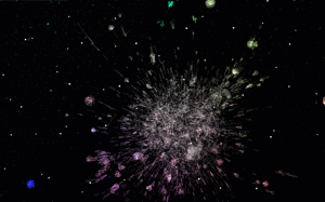
Semble Explore Feed and Follow Graph
12 Python Data Visualization Libraries to Explore for Business Analysis | Mode
This list is an overview of 10 interdisciplinary Python data visualization libraries including matplotlib, Seaborn, Plotly, Bokeh, pygal, geoplotlib, & more.
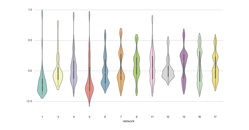
The new way we’ll do science
Papers should become human-readable views over a graph of data, tools, results, and certificates.

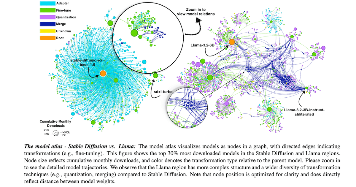
Charting and Navigating Hugging Face's Model Atlas
Charting and Navigating Hugging Face's Model Atlas: an interactive visualization and analysis tool for exploring large-scale AI model repositories. The atlas maps model relationships, and helps identify trends and fill in undocumented regions using structural patterns in the data.
Calculating Empires: A Genealogy of Technology and Power since 1500
Explore how technical and social structures co-evolved over five centuries in this large-scale research visualization.