

With a few lines of code, you can get the number of columns, number of rows, and item coordinates
Extracting Grid Information Using CSS
It's an interesting and potentially useful trick to have an element know where it is on a grid. That's tricky enough when the items are in one row/column, but what about when they span?

GRID: A simple visual cheatsheet for CSS Grid Layout
Learn all about the properties available in CSS Grid Layout through simple visual examples.


Multiple-column layout, rows, rules, and floats
Recently implemented in Chrome are two of my top asks for CSS—the concept of rows in multiple-column layout, and gap decorations for rows and columns in grid, flexbox, and multicol. Rows (using column-wrap) provide a way to use multicol on the web without risking scrolling up and down to read if the columns become taller than the viewport. Gap decorations mean that, for multicol, you can now add a rule between these new rows. This post is a collection of the things I think would be interesting to do in future. If you think so too, and particularly if you have a great use case for any of these, let me know in the comments.
AG Grid: High-Performance React Grid, Angular Grid, JavaScript Grid
AG Grid is a feature-rich Data Grid for all major JavaScript frameworks, offering filtering, grouping, pivoting, and more. Free and open-source. Upgrade to Enterprise for advanced features.
Animating CSS Grid Layouts with CSS Anchor Positioning
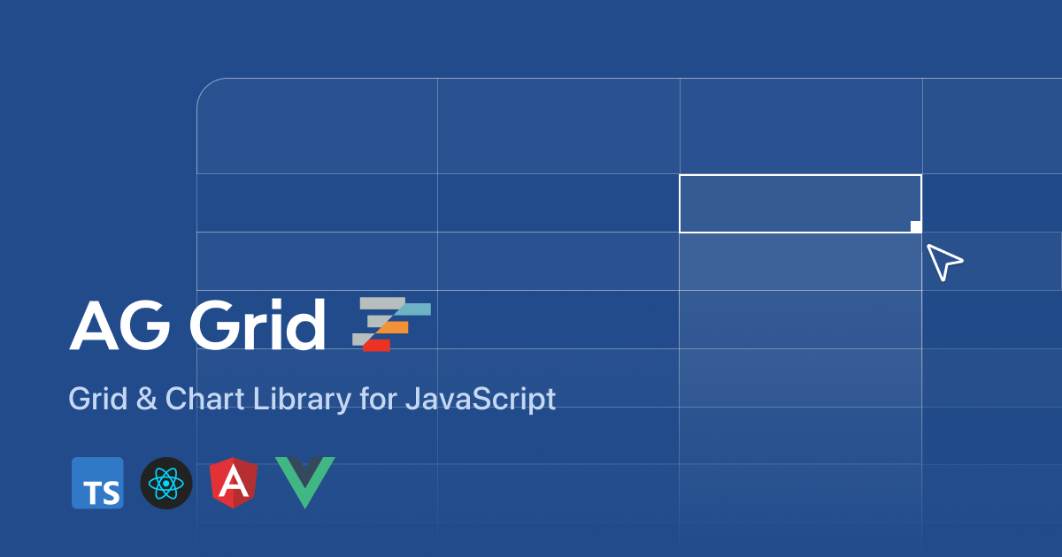
At CSS Day (back in June), someone asked me how Brave (the browser) might have built their New Tab Page which features some tiles laid out in a grid. While the grid is nothing spectacular, something special happens with it when you resize the viewport: as the available space changes, the grid nicely reorganizes itself in an animated way. The animations are also interruptible, so no View Transitions seem to be at play.So, how did they do it? I’m not sure. But if I were to recreate it, I’d use CSS Anchor Positioning with regular CSS Transitions on top.
CSS dot pattern/grid background

CSS is filling the gaps with rules. A way to style gaps in grid and flex. | utilitybend
A practical walkthrough of CSS gap decorations: column-rule, row-rule, rule-break, rule-inset, rule-visibility-items, repeat(), and animation.
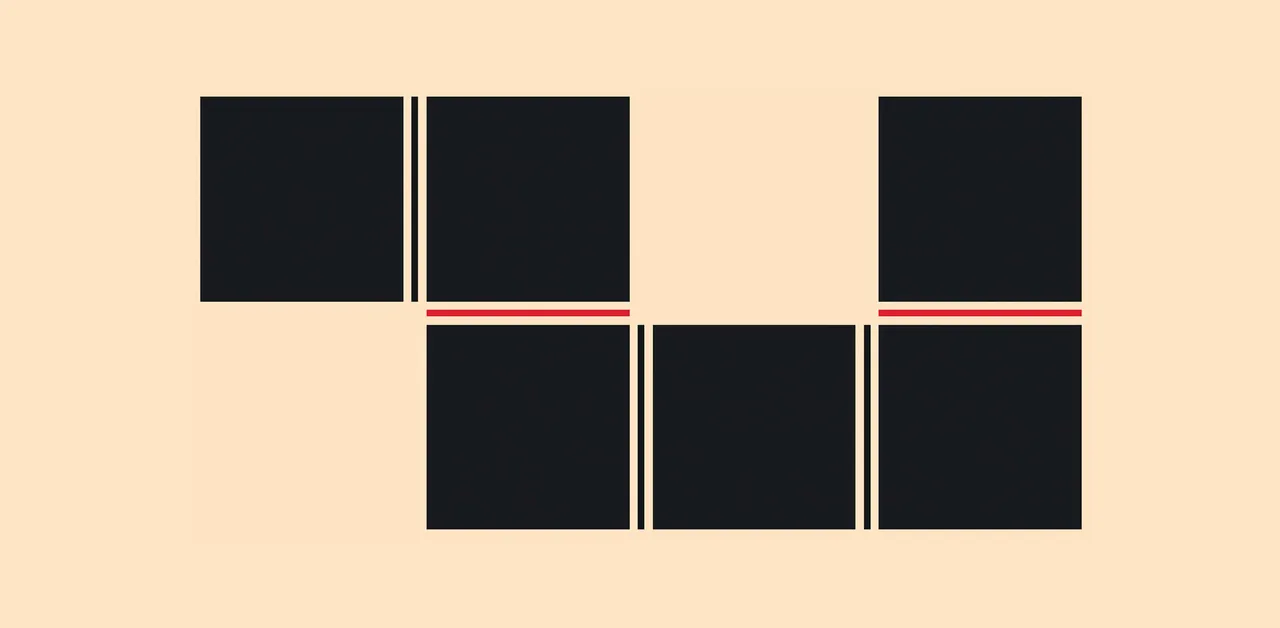
box-sizing CSS property - CSS | MDN
The box-sizing CSS property sets how the total width and height of an element is calculated.

Let’s Play With Gap Decorations!
The `rule` (and friends) CSS property allows us to draw markers (like borders) in the gaps between columns and rows (and flex items!)

Modern CSS snippets. Every old hack, replaced.
Side-by-side comparisons of outdated CSS techniques and their modern native replacements. Grid, custom properties, nesting, container queries, and more.
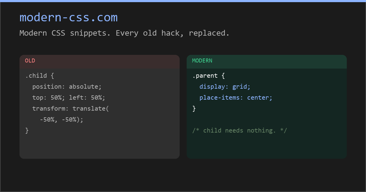
Modern CSS snippets. Every old hack, replaced.
Side-by-side comparisons of outdated CSS techniques and their modern native replacements. Grid, custom properties, nesting, container queries, and more.
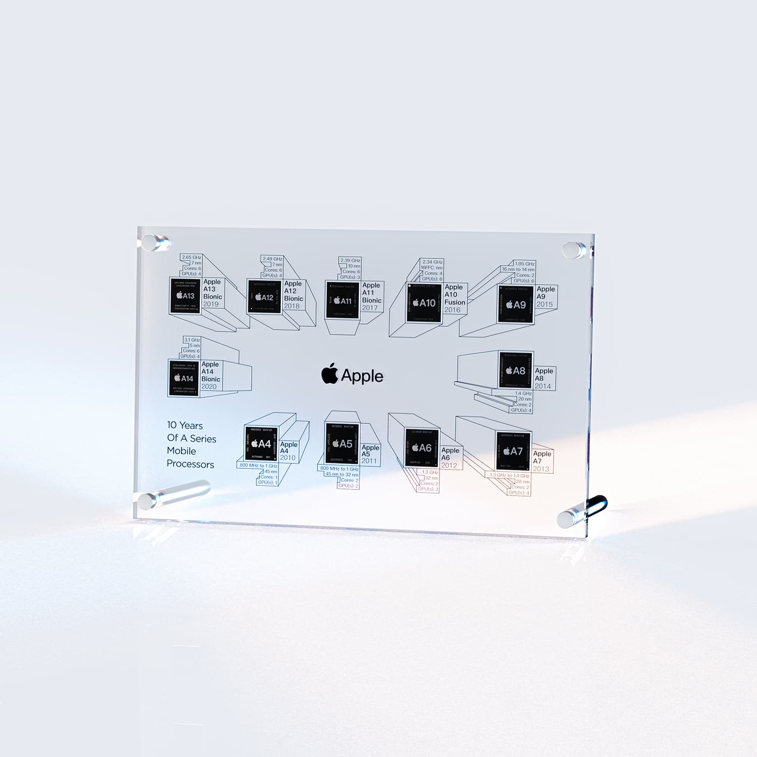
GRID® APPLE A SERIES MOBILE PROCESSORS (V2)
Discover the beauty of Apple's custom-designed chips with our stunning display featuring the A-series chips used in iPhones from 2010 to 2020. Each chip is meticulously arranged and mounted on a sleek acrylic panel, creating a unique and eye-catching piece of tech art. From the groundbreaking A4 chip of the iPhone 4 to the powerful A13 Bionic of the iPhone 11, this display showcases the evolution of Apple's custom silicon over the years. Whether you're a tech enthusiast or a design aficionado, this display is sure to impress. Hang it on your wall, place it on your desk, or gift it to a fellow Apple fan. With its clean design and high-quality materials, this display is a perfect addition to any home, office, or tech collection. Experience the beauty of technology with Grid Studio's A-series chip display. Size: 7.68*4.9*0.4 in (19.5*12.5*1 cm) -Grid Studio
CSS selectors - CSS | MDN
The CSS selectors module defines the patterns to select elements to which a set of CSS rules are then applied along with their specificity. The CSS selectors module provides us with more than 60 selectors and five combinators. Other modules provide additional pseudo-class selectors and pseudo-elements.

Patrick Brosset
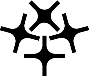

CSS masonry (aka grid-lanes) has two orientations: rows and columns. I'm trying to think of good metaphors... Row is easy: a brick wall, that's where the masonry term comes from. Column: many call it waterfall, but trying to put it into an image doesn't work. Motorway works a lot better.