


Learn about CSS Anchor Positioning, including its syntax, properties, how it is used to position one element next to another, and even how it's used to resize elements relative to other elements.
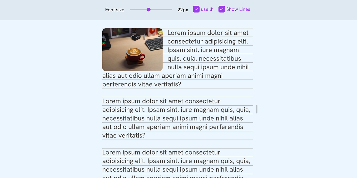
A few HTML tips – Mozilla Hacks - the Web developer blog
A while ago I wrote an article with some CSS tips, now it’s time to give some polish to our HTML! In this article I’ll share some tips and advice ...

Modern CSS snippets. Every old hack, replaced.
Side-by-side comparisons of outdated CSS techniques and their modern native replacements. Grid, custom properties, nesting, container queries, and more.
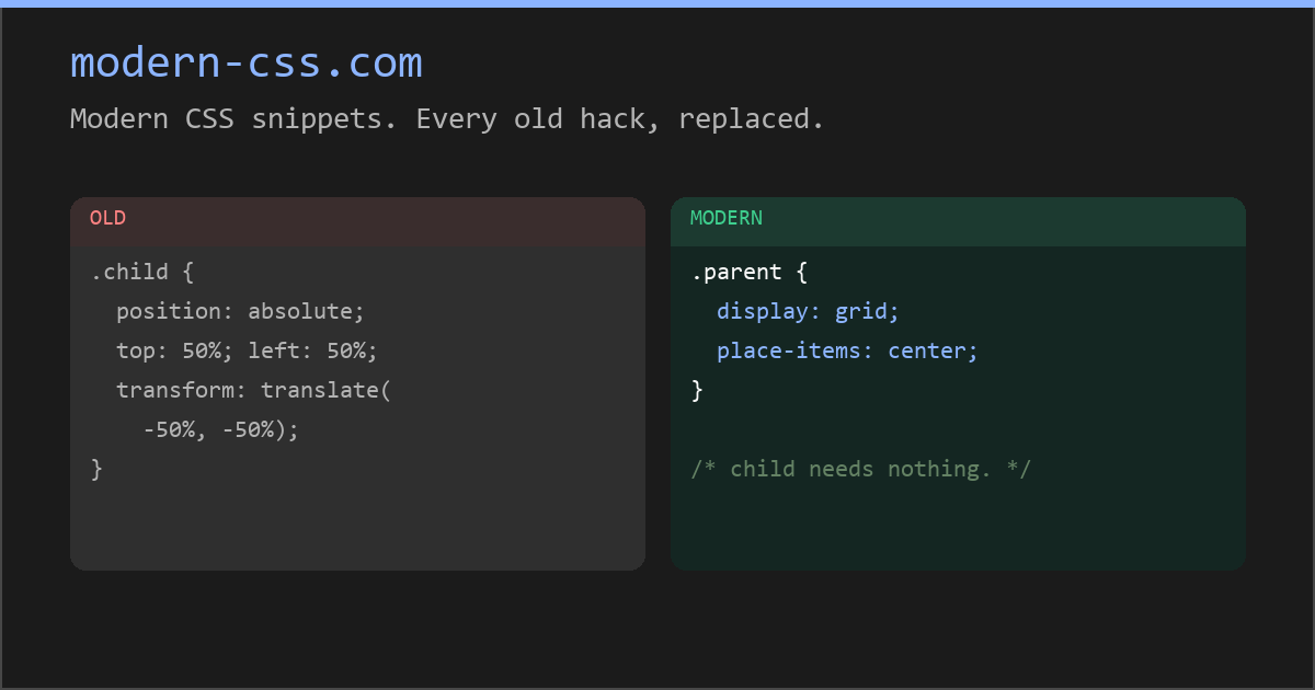
Modern CSS snippets. Every old hack, replaced.
Side-by-side comparisons of outdated CSS techniques and their modern native replacements. Grid, custom properties, nesting, container queries, and more.
CSS does your tooltip positioning now - Matt Smith
CSS can now handle tooltip and dropdown positioning without JavaScript. Learn how anchor positioning, popovers, and anchor-size() simplify UI.

GRID: A simple visual cheatsheet for CSS Grid Layout
Learn all about the properties available in CSS Grid Layout through simple visual examples.

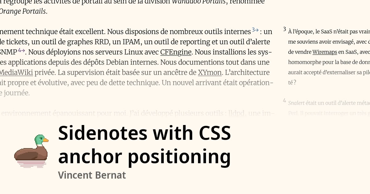
Sidenotes with CSS anchor positioning
Sidenotes positioned in the margin with CSS anchor positioning, without JavaScript. On narrow viewports and older browsers, they fall back below...
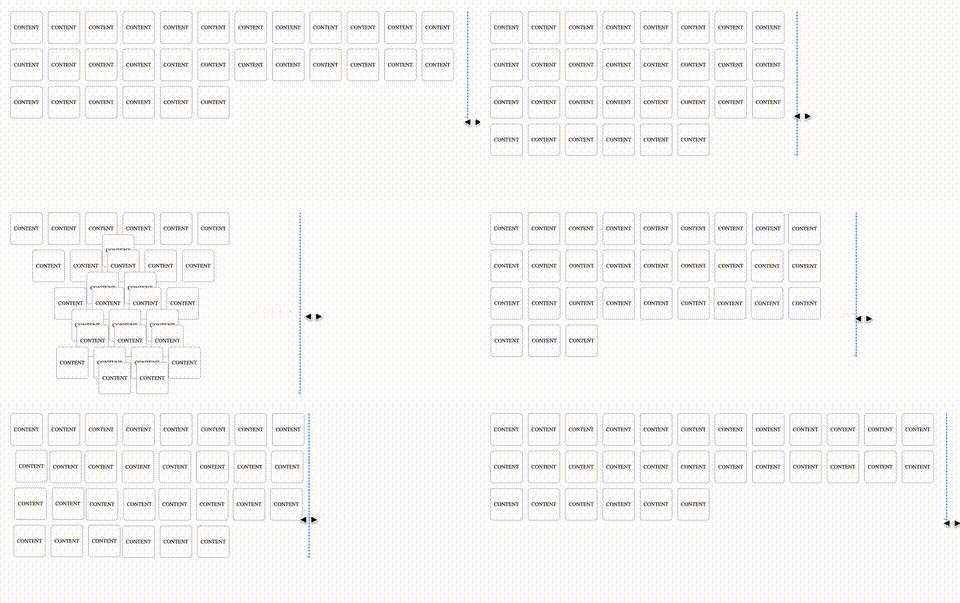
Animating CSS Grid Layouts with CSS Anchor Positioning
At CSS Day (back in June), someone asked me how Brave (the browser) might have built their New Tab Page which features some tiles laid out in a grid. While the grid is nothing spectacular, something special happens with it when you resize the viewport: as the available space changes, the grid nicely reorganizes itself in an animated way. The animations are also interruptible, so no View Transitions seem to be at play.So, how did they do it? I’m not sure. But if I were to recreate it, I’d use CSS Anchor Positioning with regular CSS Transitions on top.
element() CSS function - CSS | MDN
The element() CSS function defines an <image> value generated from an arbitrary HTML element. This image is live, meaning that if the HTML element is changed, the CSS properties using the resulting value are automatically updated.

CSS is filling the gaps with rules. A way to style gaps in grid and flex. | utilitybend
A practical walkthrough of CSS gap decorations: column-rule, row-rule, rule-break, rule-inset, rule-visibility-items, repeat(), and animation.
good-css
Strong opinions about modern CSS technique, borrowed from experts, for agents to know and reach for.

box-sizing CSS property - CSS | MDN
The box-sizing CSS property sets how the total width and height of an element is calculated.
Edit fiddle - JSFiddle - Code Playground
JSFiddle - Test your JavaScript, CSS, HTML or CoffeeScript online with JSFiddle.
Stop Treating CSS Container Queries Like Traditional Media Queries — Smashing Magazine
Despite broad browser support, container queries remain surprisingly underused and frequently misunderstood. Let’s look at how they differ from media queries, when to reach for each, and how container queries help reusable components respond naturally to the contexts in which they appear. - CSS - Tools - Techniques

uhh… TIL: <marquee direction="down" behavior="alternate"> <marquee behavior="alternate">This text will bounce</marquee> </marquee> developer.mozilla.org/en-US/docs/Web/HTML/Reference…

Kevin Powell

No more magic numbers with this modern CSS feature (I'll save the clickbait for YT, it's anchor positioning... though it does look like it's in the thumbnail too 😁) youtube.com/shorts/k330_RUaSIE

No more magic numbers with this modern CSS feature
youtube.com