

I’m currently in the process of rolling out yet another Card UI. Since Pinterest, the end-state of every list view with decent imagery is to become a Card UI. But thar be dragons! I’m here to share some of the pitfalls Paravel have encountered building Card UIs over the years.
Invention Cards 3.0: Stories
Last month, after a long hiatus, I showed invention.cards to a friend in SF and came away unsatisfied. Indeed, the work was not yet done . Three things drove this revision: It felt incomplete. The experience was built around T-shaped navigation, focusing on a specific card and showing only their ancestors and descendants. It was hard to see where you were in time, hard to feel the shape of history, and ultimately was far removed from the way a tech tree should feel . The connections matter more than the nodes. What's most interesting to me was not
UI design is fun! (inspirational ways of looking at UI, and discussing how to better understand UI’s place in game design…) – The Candybox Blog
This post is an extended writeup of what would have been my GDC2020 talk. Since the conference has been postponed I’m sharing parts of this talk as a blogpost (I elaborated on what would have been my talk. This post is much longer).
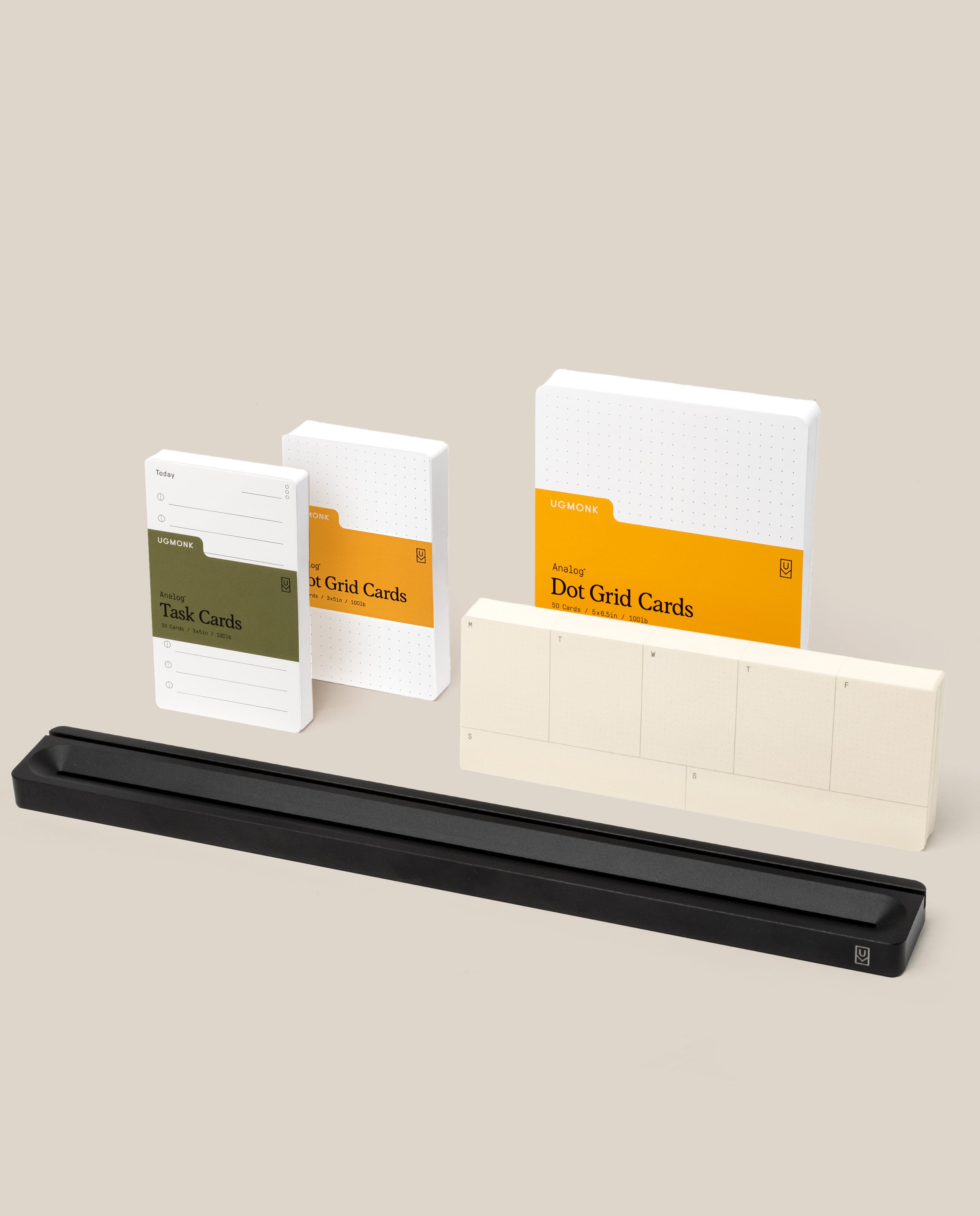
Analog Card Bar - Pro Kit (Black)
Save $17 with this best-selling Analog Kit. Everything you need to get started with Analog. Plan your days, capture ideas, and manage your week, right out of the box. 16" Analog Card Bar (Black) 1 pack Small Task Cards (3" x 5") 1 pack Small Dot Grid Cards (3" x 5") 1 pack Large Dot Grid Cards (5" x 6.5") 1 pack of Weekly Cards (3" x 8.5") The Analog Card Bar is precision milled from solid aluminum with a black beadblasted finish and displays your cards at the perfect viewing angle. Two slots give you versatility to arrange cards in various configurations, and the front conveniently doubles as a pen tray. At almost 1.5lbs with a rubber pad on the bottom, it stays firmly in place on your desk. Features: 16" Analog Card Bar (Black) 1 pack Small Task Cards (3" x 5") 1 pack Small Dot Grid Cards (3" x 5") 1 pack Large Dot Grid Cards (5" x 6.5") 1 pack of Weekly Cards (3" x 8.5") Solid aluminum construction with matte black bead blasted finish Holds multiple cards at optimal viewing angle Front tray for pens or additional card storage Laser-etched Ugmonk logo Dimensions: 16" x 1.8" x .63"
Physicality: the new age of UI
There’s a lot of rumors of a big impending UI redesign from Apple. Let’s imagine what’s (or what could be) next for the design of iPhones, Macs and iPads.


Visa Digital Issuer Solutions
Build cardholder primacy with standout digital experiences.

The Weird Death Of User Interfaces
Introducing OG Image Generation: Fast, dynamic social card images at the Edge
Announcing Vercel OG Image Generation, a new library for generating dynamic social card images.
Claude Fable 5 and Mythos 5: The System Card
First things first: Claude Fable 5 is the new best publicly available model.

Ignacio Soffia on Twitter / X
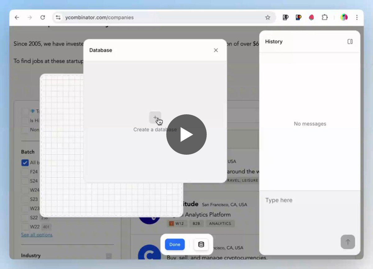
Creating a card is simple. All you need is to select what part of the site you want to use as a "live database" and then use natural language to describe what you want the card do or look like. pic.twitter.com/PsJXWFAQwu— Ignacio Soffia (@ignaciosoffia) November 21, 2024
Pinterest is Dead. I Built an Alternative
Issue Cards | Service Design Tools
Support the conversation around complex matters by breaking down the subject into physical cards.

i couldn’t be more excited Inlay is finally out and open source! i’ve been working on this nonstop for the past few months. it’s a bit in the “mad science” territory but i hope it inspires you too to think about malleable and remixable social user interfaces

Inlay
today was the Inlay release day! discover, remix, create, and compose different ways to view the Atmosphere data on inlay.at

