

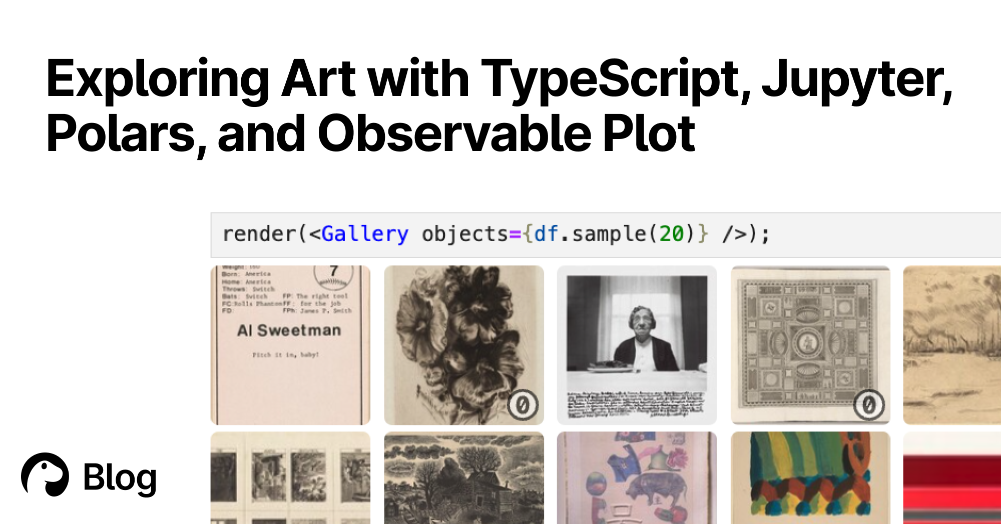
With Deno's Jupyter support, you can explore, interact, and create interactive charts with TypeScript and HTML. Here's a tutorial featuring data of over 130,000 famous artworks.
GitHub - observablehq/plot: A concise API for exploratory data visualization implementing a layered grammar of graphics
A concise API for exploratory data visualization implementing a layered grammar of graphics - observablehq/plot
Introducing Observable Canvases
A new way to explore, visualize, and collaborate with data — all in one shared canvas.
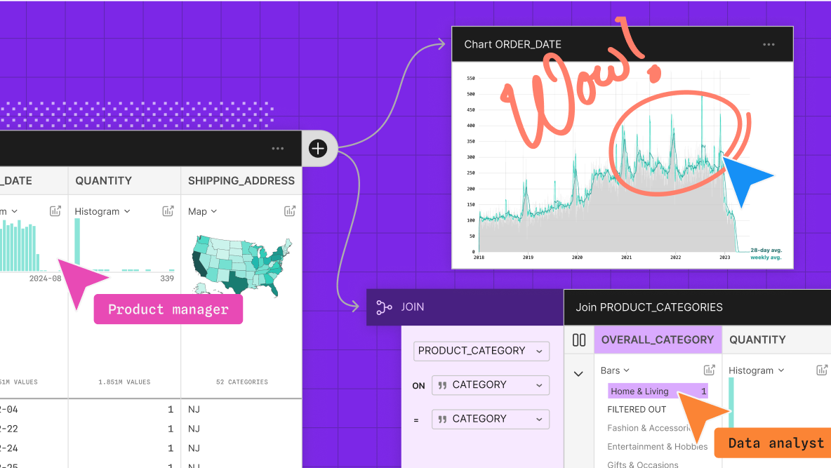
Observable Canvases | Explore and visualize data together
Observable’s collaborative data canvas helps you explore data, perform analysis, and build expressive charts and dashboards.
TypeScript AST Viewer
Interactive viewer to help visualize the TypeScript Compiler API's AST.
An AI Agent Published a Hit Piece on Me
Scott Shambaugh helps maintain the excellent and venerable matplotlib Python charting library, including taking on the thankless task of triaging and reviewing incoming pull requests. A GitHub account called @crabby-rathbun …

TanStack Charts
A typed, tree-shakable chart grammar for SVG and Canvas. Compose marks, views, scales, transforms, interactions, and motion with compact primitives or D3-compatible inputs.
Sigma.js
a JavaScript library aimed at visualizing graphs of thousands of nodes and edges

Living documents and interactive schematics — Selin Jessa
Using LLMs to turn static figures from data analysis, schematics, and publications into interactive widgets as tools for thought
12 Python Data Visualization Libraries to Explore for Business Analysis | Mode
This list is an overview of 10 interdisciplinary Python data visualization libraries including matplotlib, Seaborn, Plotly, Bokeh, pygal, geoplotlib, & more.
ai-hero-dev/poland-ai-ts-workshop
52 exercises on AI + TypeScript, for Matt's workshop in Poland
kepano (@stephango.com)
This is Pele, my new rendering library for diagrams and charts, compatible with the latest Mermaid syntax. - 100-500× faster than mermaid.js - 6× smaller bundle - No dependencies - Easy to theme - Responsive to device width - Open source (MIT) Try it at pele.run

Flow vs TypeScript
A framework for easily creating beautiful presentations using HTML