
:zap: Toolkit for component-oriented styling
Styling with utility classes - Core concepts
Building complex components from a constrained set of primitive utilities.
Open Props UI | A modern CSS UI library
CSS UI library leveraging the most modern features. Components you can copy and paste into your project.

Melt UI
An open-source Svelte component library for building high-quality, accessible design systems and web apps.

Zag - Rapidly build UI components without sweating over the logic.
State machines for accessible, interactive and performant UI components
Radix UI
Components, icons, and colors for building high‑quality, accessible UI. Free and open-source.
Svelte Magic UI Components
Svelte Magic UI - A collection of components that will make your application look magical.

Shoelace: A forward-thinking library of web components.
Hand-crafted custom elements for any occasion.

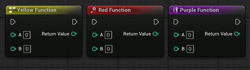
Styled Nodes in Unreal Engine
I showcase how you can style a collection of Unreal Engine nodes
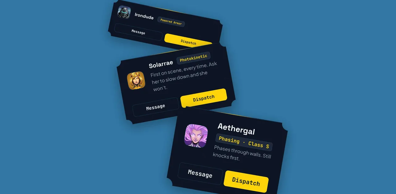
Container style queries and advanced attr(): rethinking how to wire up my components in CSS | utilitybend
Wiring HTML attributes into CSS with advanced typed attr(), and letting container style queries pass that state down to child components.

tailwindcss - npmx
A utility-first CSS framework for rapidly building custom user interfaces.

Svelte component library
daisyUI is the best Tailwind CSS component library for Svelte projects
Components.build
An open standard for building modern, composable and accessible UI components.