Research and production tool for type revival projects
Introducing Glyph Protocol for Terminals - Raphael Amorim
There’s one thing about terminals that has always bothered me: to get your favorite editor, prompt, or TUI to render nicely, you are almost always forced to install a patched font. You know the drill. You open a fresh terminal, pull up your editor, and half of the UI is replaced by little rectangles — the infamous tofu. The fix is to go download a Nerd Font, or Powerline, or some other patched set, and switch your terminal font to it. A font that is often well above 10MB in size1. All of that — just so you can render...

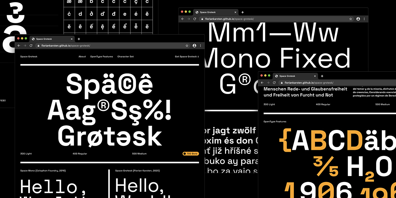
Space Grotesk
Space Grotesk is a proportional sans-serif typeface variant based on Colophon Foundry's fixed-width Space Mono family (2016). Designed by Florian Karsten.
Yep! Type Foundry — Screen-first typefaces with honest pricing and friendly licensing: Innovator Grotesk
Innovator Grotesk — a neo-grotesque variable font for UI, 9 weights with 12° oblique, calibrated vertical metrics for buttons and labels, 250+ Latin-script languages.
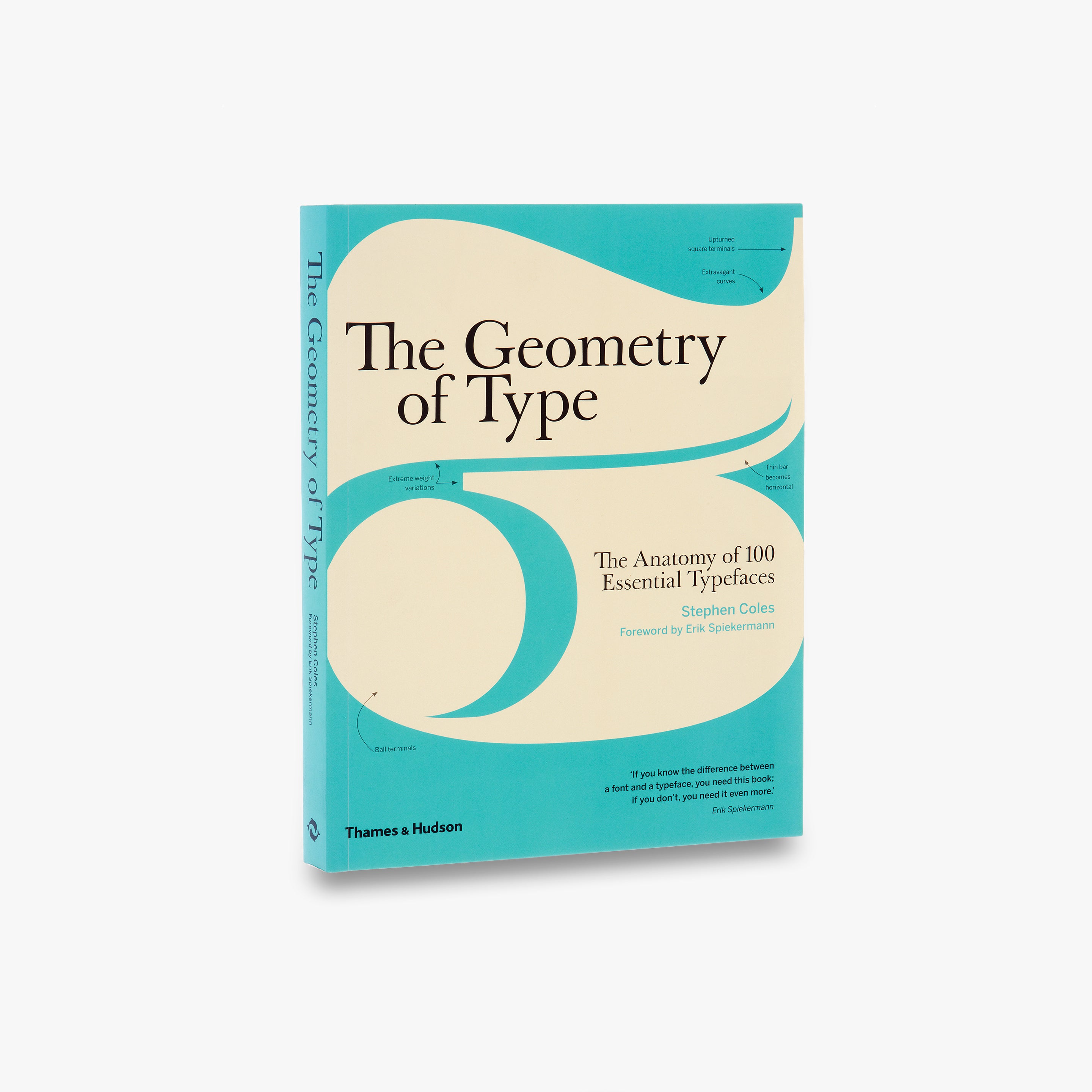
The Geometry of Type
The Geometry of Type explores 100 traditional and modern typefaces in detail, with a full spread devoted to each entry. Characters from each typeface are enlarged and annotated to reveal key features, anatomical details, and the finer, often-overlooked elements of type design, which shows how these attributes affect mood and readability. Sidebar information lists the designer and foundry, the year of release and the different weights and styles available, while feature boxes explain the origins and best uses for each typeface, such as whether it is suitable for running text or as a display font for headlines. To help the reader spot each typeface in the wider world, the full character set is shown, and the best letters for identification are highlighted.
propublica/weepeople
A typeface of people sillhouettes, to make it easy to build web graphics featuring little people instead of dots.
Glyphs
Glyphs 4 is a Mac font editor that puts you in control: quickly draw high-precision vectors, efficiently reuse shapes, and easily manage any number of letters, figures and symbols.

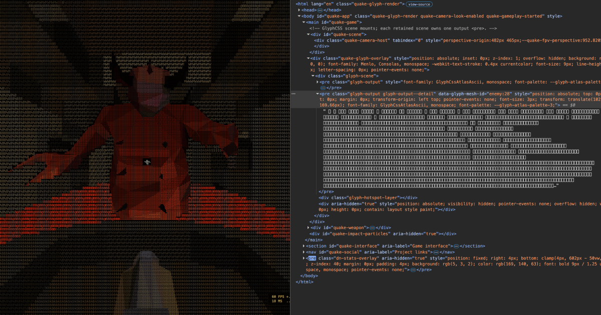
asciiQuake - Powered by GlyphCSS
Play Quake rendered as a live ASCII character grid through GlyphCSS, with no WebGL or canvas renderer.
Home - Use & Modify
This is a personal selection of beautiful, classy, punk, professional, incomplete, weird typefaces. Open source licenses make them free to use and modify. This selection is the result of deep search and crushes. This selection is yours — Raphaël
swiza | atipo foundry
an independent digital typeface foundry and graphic design studio

Thireus/GGUF-Tool-Suite
Produce your own Dynamic 3.0 Quants and achieve optimum accuracy & SOTA quantization performance! Input a target size and the toolchain will create a GGUF recipe tuned to your hardware within seconds — flexible model sizing and lowest achievable perplexity/kld for GGUF enthusiasts seeking precise and automated dynamic quant production.
wotfard | atipo foundry
an independent digital typeface foundry and graphic design studio

mg¹² | atipo foundry
an independent digital typeface foundry and graphic design studio

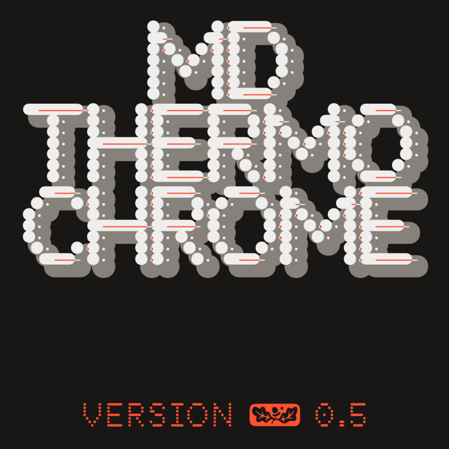
MD Thermochrome by Mass-Driver - Future Fonts
Our written world is made from little dots: little dots of ink from a printer; phosphors or pixels on a screen; blackened thermal paper on a sales receipt. MD Thermochrome is a typeface designed around little dots. It’s not a faithful mimicry of any single printing technique, but an allusion to several — the coarse grid of dot-matrix printers, the visible scanlines of CRT terminal fonts, the varying dot size of over- and under-inked documents from any number of technologies. Built on a consistent (but not quite square) grid, Thermochrome features five discrete italic angles (Upright, Italic, Inclined, Retalic, Reclined), eight weights, and over 100 icons and symbols.