

I just read this post from Marcin Wichary's Unsung, where he points out a peculiar macOS dialog box that shows boolean toggles in four different shades of grey:
Dark mode toggles: two states are enough • Lea Verou
Yes, the underlying model must have three states, but one is always irrelevant to the actual user goal. Users do not seek out solutions to problems they don’t currently have. A lot of the hate towards two-state toggles is based on poor implementations.
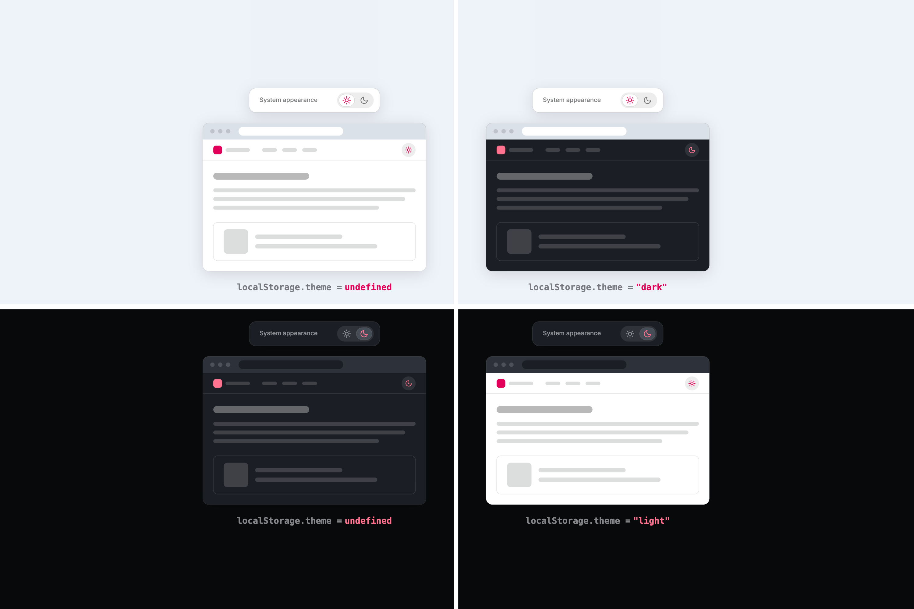
Solar Eclipse Toggle (a dark/light mode toggle Web Component)—zachleat.com
A post by Zach Leatherman (zachleat)
Designing for Colour-Blindness
As always, I’ve been tinkering with the site over the last few weeks. One of the adjustments I made was to remove the underlines from links, which I felt mad...

The Dark Mode Toggle Discourse
How the dark mode toggle discourse unfolded One designer's argument against the classic light/dark/system three-way switch turned into weeks of blog rebuttals, parody posts, and "do you even need a toggle at all?" takes. The timeline Aug 1…
prefers-color-scheme: Hello darkness, my old friend | Articles | web.dev
Many devices now support an operating system wide dark mode or dark theme experience. This post explains how dark mode can be supported on web pages, lists best practices, and introduces a custom element named dark-mode-toggle that allows web developers to offer users a way to override their operating system level preference on specific web pages.
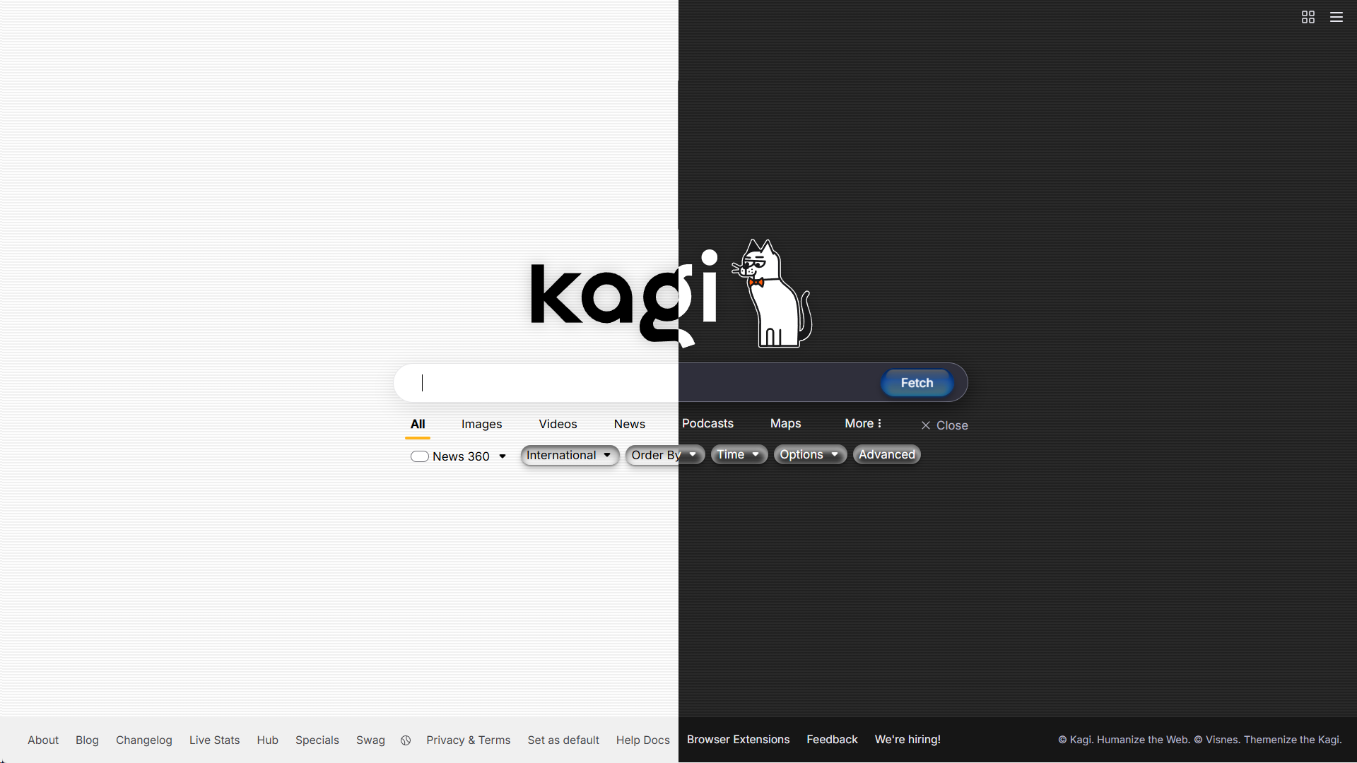
OS X Aqua - Kagi Search Theme
A custom theme that's inspired by old school Apple's OS X Aqua theme. Has both Dark and Light mode that changes based on your system settings. ** [Github repo](https://github.com/Visnes/kagi-aqua/) ** Do the following: Go to Appearance → Change theme to "Default", not "Light" or "Dark" → Enable Custom CSS & Paste custom.css → Save changes
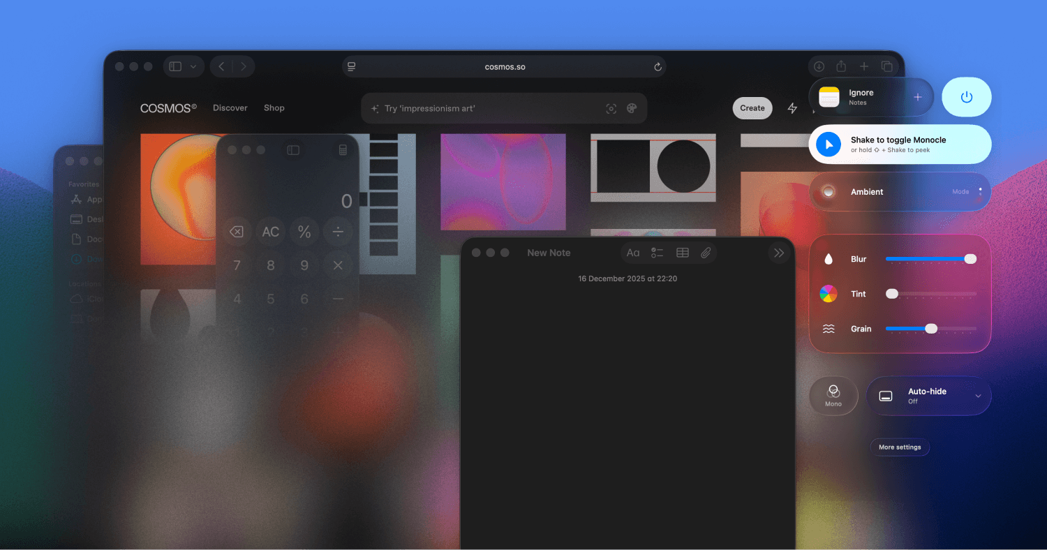
Monocle for macOS • Noise-cancelling for your screen
Blur everything but your active window — just wiggle your cursor.
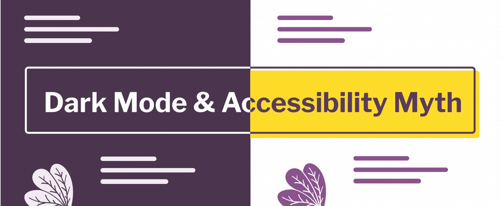
Dark mode & accessibility myth by Stéphanie Walter - UX Researcher & Designer.
Dark mode isn't always better for accessibility, you need to let users chose. And if you build a dark theme, make it accessible!
Moody — Your discreet notch prompter
Moody is a smart prompter for your macOS notch. Your script appears right at your camera — so you maintain eye contact with your audience while staying perfectly on track.
Something’s Rotten in the State of macOS Icon Design
Writing about the big beautiful mess that is making things for the world wide web.
GitHub repository landing pages now show an accessibility tab, if provided
I’m excited to see how people use this new addition to the platform.

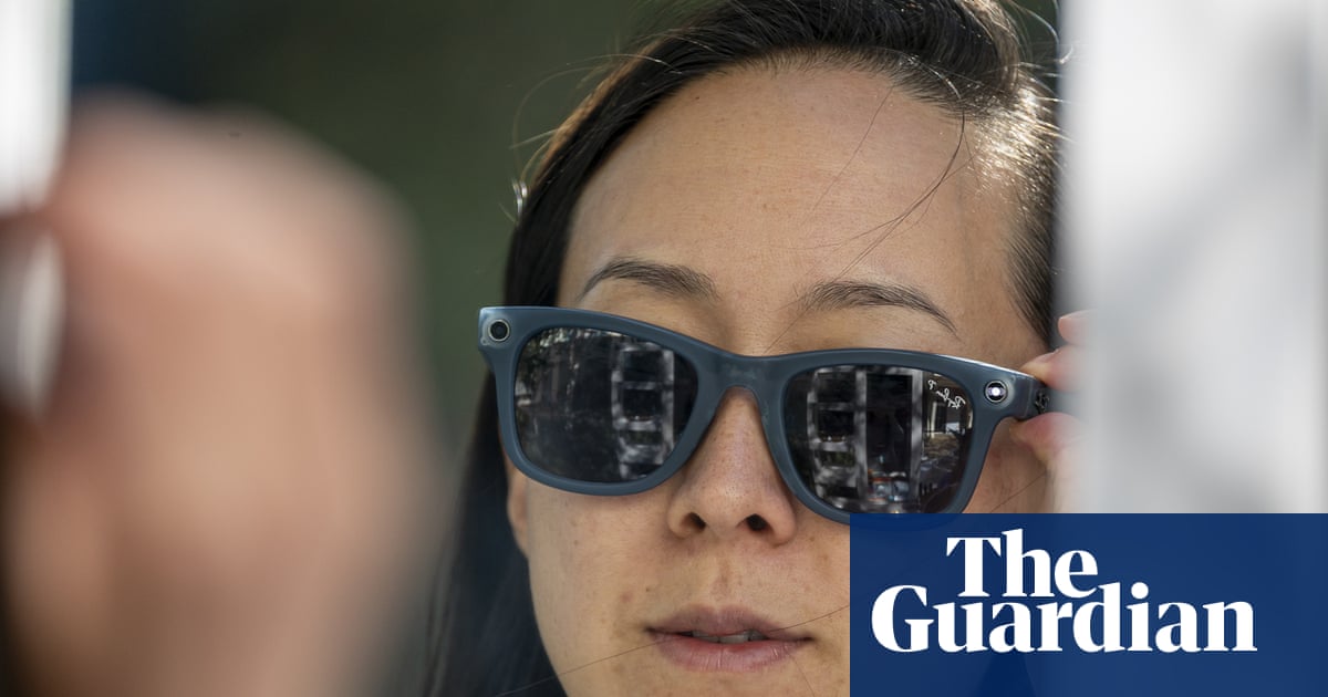
Smart glasses controversy sidelines the benefits for disabled people | Letter
Letters: Guardian readers reflect on the ableism rife in the debate about Ray-Ban Meta eyewear, despite the life-changing difference they can make
This was based on the second screenshot in the post I linked to, but I think it might be a misunderstanding on my end (I thought the checkbox is grayed out and unselectable, leading me to misinterpret the message underneath, which I’ve now realized is the same as Bsky’s; maybe it’s not unselectable)
