

A look at how flex items wrap and how to balance them across lines.
Shrink-wrap Text with `position-anchor`
Normal text wrapping can leave big gaps in your container, which can become even more exaggerated with the new-ish CSS values of text-wrap: balance and text-wrap: pretty. You almost certainly want …

Multiple-column layout, rows, rules, and floats
Recently implemented in Chrome are two of my top asks for CSS—the concept of rows in multiple-column layout, and gap decorations for rows and columns in grid, flexbox, and multicol. Rows (using column-wrap) provide a way to use multicol on the web without risking scrolling up and down to read if the columns become taller than the viewport. Gap decorations mean that, for multicol, you can now add a rule between these new rows. This post is a collection of the things I think would be interesting to do in future. If you think so too, and particularly if you have a great use case for any of these, let me know in the comments.
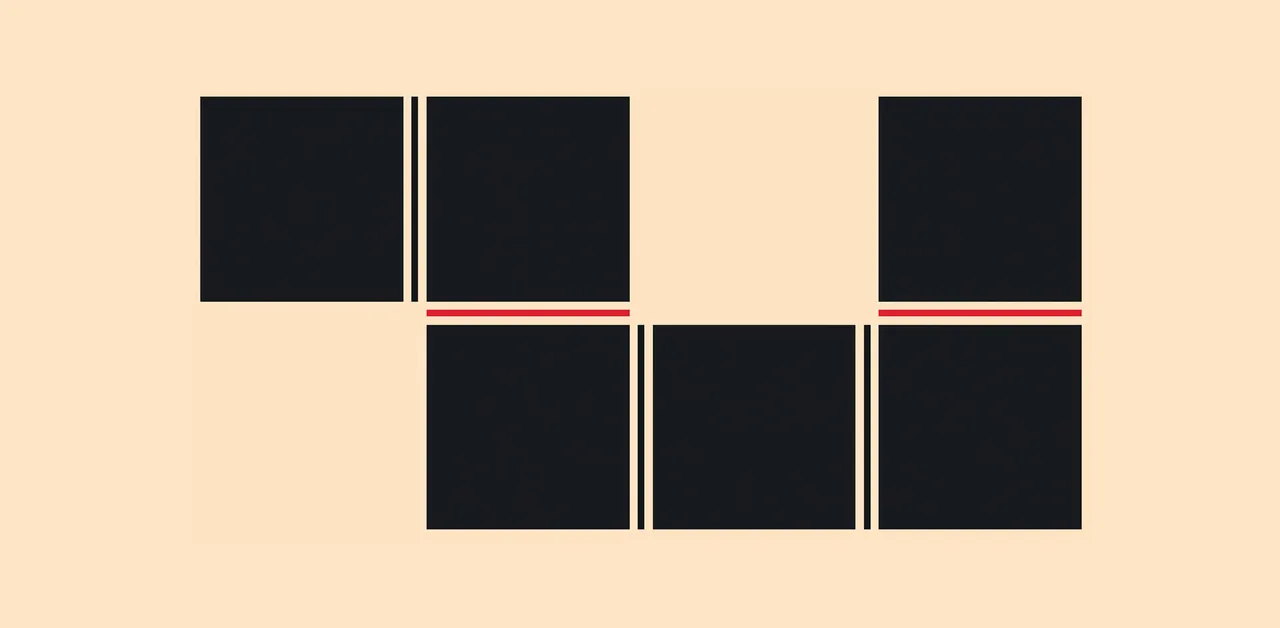
CSS is filling the gaps with rules. A way to style gaps in grid and flex. | utilitybend
A practical walkthrough of CSS gap decorations: column-rule, row-rule, rule-break, rule-inset, rule-visibility-items, repeat(), and animation.
Let’s Play With Gap Decorations!
The `rule` (and friends) CSS property allows us to draw markers (like borders) in the gaps between columns and rows (and flex items!)

Josh W. Comeau (@joshwcomeau.com)
✨ Neat CSS trick ✨ We can use `width: fit-content` to have a container element shrink to fit its element's width. This is useful for cards! But if that card has any text content, that text will blow out the width of the card, since it won't automatically linewrap. So we wind up with this issue:

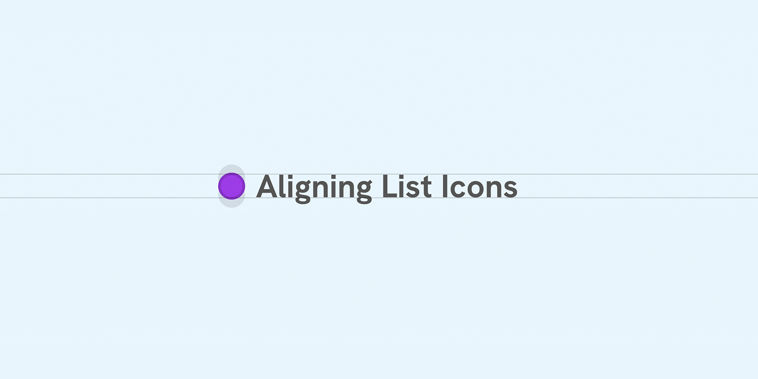
Better Icon and Label Alignment
There is a common design pattern that sometimes gets missed or overlooked. It’s having a list of items, each with an icon. When the text is one line, the icon is centered, but when the text has multiple lines, the icon is still centered but looks odd.
Shoelace: A forward-thinking library of web components.
Hand-crafted custom elements for any occasion.
Re-balancing For You - For You notes
How to Write a Flexbox Layout Engine
You won't guess how little code it takes to write a Flexbox-like layout engine that could render any website.

Evolving the infinite canvas
In the digital world, especially on the web, we’re used to things being stacked vertically. Scrolling, scrolling, through boxes of content,
CSS Anchor Positioning Guide | CSS-Tricks
Learn about CSS Anchor Positioning, including its syntax, properties, how it is used to position one element next to another, and even how it's used to resize elements relative to other elements.

Curved Text Along a Path | CSS-Tricks
We can flow text along a curved line with three tools built right into SVG: , and .

Extracting Grid Information Using CSS
It's an interesting and potentially useful trick to have an element know where it is on a grid. That's tricky enough when the items are in one row/column, but what about when they span?

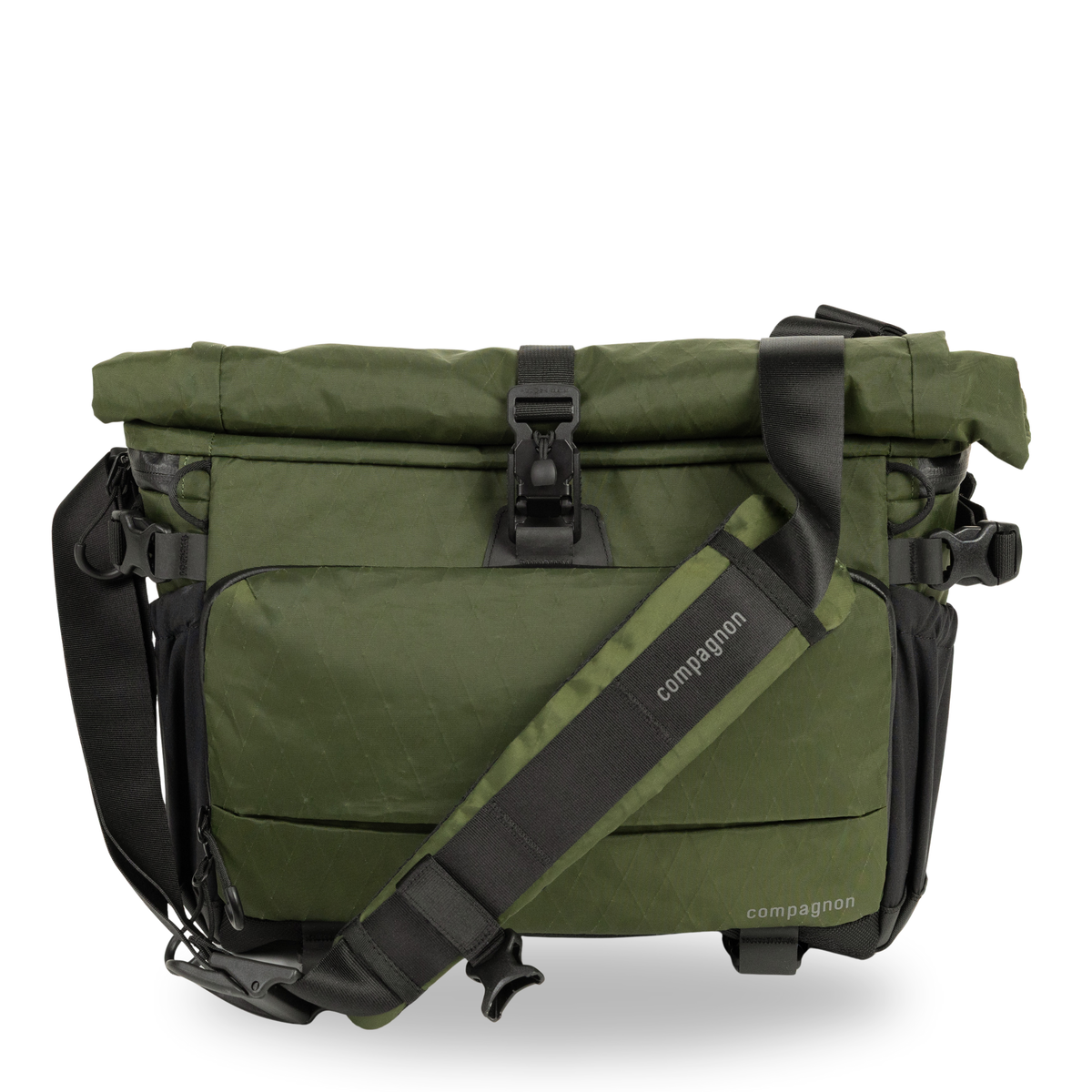
Element sling 12L
Agile Camera Sling & comfortable shoulder bag with 13"/14" laptop compartment in one. Roll-top for 6L of extra storage space. Extremely durable, recycled AX Carbon outer shell & many ingenious pro features.
Oh, and you can follow @margin.at collections, too 🤯
We are currently working on a semble.so integration for Margin, where you will be able to see Semble collections and cards on Margin! @cosmik.network is working on something similar for Margin on Semble 👀

Semble — A social knowledge network for research
semble.so
