


The `rule` (and friends) CSS property allows us to draw markers (like borders) in the gaps between columns and rows (and flex items!)
CSS is filling the gaps with rules. A way to style gaps in grid and flex. | utilitybend
A practical walkthrough of CSS gap decorations: column-rule, row-rule, rule-break, rule-inset, rule-visibility-items, repeat(), and animation.
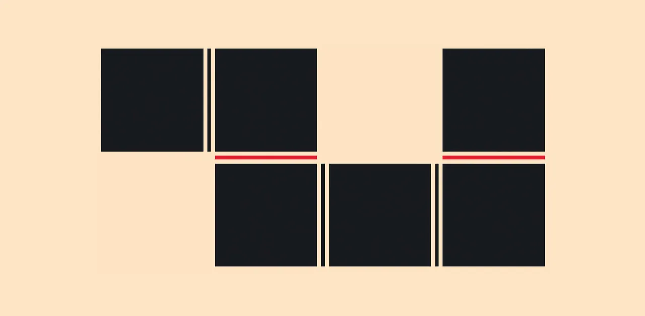
Multiple-column layout, rows, rules, and floats
Recently implemented in Chrome are two of my top asks for CSS—the concept of rows in multiple-column layout, and gap decorations for rows and columns in grid, flexbox, and multicol. Rows (using column-wrap) provide a way to use multicol on the web without risking scrolling up and down to read if the columns become taller than the viewport. Gap decorations mean that, for multicol, you can now add a rule between these new rows. This post is a collection of the things I think would be interesting to do in future. If you think so too, and particularly if you have a great use case for any of these, let me know in the comments.
GRID: A simple visual cheatsheet for CSS Grid Layout
Learn all about the properties available in CSS Grid Layout through simple visual examples.

Extracting Grid Information Using CSS
It's an interesting and potentially useful trick to have an element know where it is on a grid. That's tricky enough when the items are in one row/column, but what about when they span?

Pure CSS halftone patterns: dots, lines, circles
A project overdue. As an 80's/90's kid, I was obsessed with printing technology - and especially halftone patterns. I've long theorized that these pat

Balancing flex items with flex-wrap: balance
A look at how flex items wrap and how to balance them across lines.
CSS dot pattern/grid background

Davis Mega Maze - Davis Mega Farm Festival
[vc_row full_width=”stretch_row_content” css=”.vc_custom_1695133852660{margin-top: 0px !important;margin-right: 0px !important;margin-bottom: 0px !important;margin-left: 0px !important;padding-top: 0px !important;padding-right: 0px !important;padding-bottom: 0px !important;padding-left: 0px !important;background-color: #000000 !important;}”][vc_column css=”.vc_custom_1695133816273{margin-top: 0px !important;margin-bottom: 0px !important;padding-top: 0px !important;padding-bottom: 0px !important;background-color: #000000 !important;}”][vc_column_text css=”.vc_custom_1756320183567{margin-top: 0px !important;margin-bottom: 0px !important;padding-top: 0px !important;padding-bottom: 0px !important;}”][/vc_column_text][/vc_column][/vc_row][vc_row full_width=”stretch_row” css=”.vc_custom_1600113663479{padding-top: 0px !important;background-image: url(https://davismegamaze.com/wp-content/uploads/2018/07/Background.jpg?id=1374) !important;background-position: center !important;background-repeat: no-repeat !important;background-size: cover !important;}”][vc_column css=”.vc_custom_1529348978248{margin-top: 0px […]
Revealing Text With CSS letter-spacing | CSS-Tricks
Until we get something like ::nth-letter, there are still some really cool text effects we can make from existing CSS features, like letter-spacing, ::first-word and ::first-line.

Home - Tour de Pologne
[vc_row full_width=”stretch_row_content_no_spaces” content_placement=”middle” css=”.vc_custom_1752606901988{background-color: #000000 !important;}” el_class=”top-grid”][vc_column][/vc_column][/vc_row][vc_row full_width=”stretch_row” content_placement=”middle” disable_element=”yes” css=”.vc_custom_1785748496713{padding-top: 10px !important;padding-bottom: 10px !important;background-color: #FFEA01 !important;}”][vc_column][mnky_retina_image img_url=”42235″ align=”retina-image-center” width=”347px” …
CSS3 Patterns Gallery
The patterns themselves should work on Firefox 3.6+, Chrome, Safari 5.1, Opera 11.10+ and IE10+. However, implementation limitations might cause some of them to not be displayed correctly even on those browsers (for example at the time of writing, Gecko is quite buggy with radial gradients).
Rijk's Website
When building out the CSS for this website, I took some extra time to perfect the vertical rhythm. This is very often overlooked, and is one of those things you can't really tell, but definitely feel.
Home - Bioregioning Tayside
[vc_row full_width=”stretch_row” css=”.vc_custom_1690377681496{border-bottom-width: 2px !important;background-image: url(https://bioregioningtayside.scot/wp-content/uploads/2020/06/topography.svg?id=173) !important;border-bottom-color: #36322e !important;border-bottom-style: solid !important;}”][vc_column][vc_empty_space][vc_row_inner css=”.vc_custom_1592579907572{padding-top: 30px !important;padding-bottom: 30px !important;}”][vc_column_inner width=”5/6″ offset=”vc_col-lg-offset-2 vc_col-lg-8 vc_col-md-offset-4 vc_col-md-8 vc_col-sm-offset-1 vc_col-xs-12″][vc_column_text css=””] Bioregioning Tayside “Bioregioning reframes the way we see the places where we live and work, helping us reconnect to and restore the ecological systems of which we are a part and...
The Cascading Workarounds of Feature Gaps
When creating plugins, such as my old Shader Forge, or now, Shapes, you generally want it to look and feel native, as well as being…


Patrick Brosset

CSS masonry (aka grid-lanes) has two orientations: rows and columns. I'm trying to think of good metaphors... Row is easy: a brick wall, that's where the masonry term comes from. Column: many call it waterfall, but trying to put it into an image doesn't work. Motorway works a lot better.
A self-styling `style` element - makes itself visible & styles itself to look like code printed on an alternating line background with lateral perforations (real transparency allows to see through holes to the backdrop) codepen.io/thebabydino/pen/wBBLJrz?edito… If you're looking for original code boxes...🐱 #CSS
