

It’s been a long process but now, masonry layouts have an actual CSS approach, so Saleh Mubashar has put together a really useful guide on how it works, how we got here and what’s next.
GRID: A simple visual cheatsheet for CSS Grid Layout
Learn all about the properties available in CSS Grid Layout through simple visual examples.


Modernist tiles with CSS Grid
A Modernist hydraulic tile floor, one motif rotated across the whole room, is something you'll find everywhere in Barcelona. Let's build our own in CSS Grid. Six real motifs, a whole floor of palettes.

The Layout Maestro by Ahmad Shadeed
Build any web layout with confidence. Learn practical CSS layout through visual lessons, interactive demos, and a proven layout mindset.

Multiple-column layout, rows, rules, and floats
Recently implemented in Chrome are two of my top asks for CSS—the concept of rows in multiple-column layout, and gap decorations for rows and columns in grid, flexbox, and multicol. Rows (using column-wrap) provide a way to use multicol on the web without risking scrolling up and down to read if the columns become taller than the viewport. Gap decorations mean that, for multicol, you can now add a rule between these new rows. This post is a collection of the things I think would be interesting to do in future. If you think so too, and particularly if you have a great use case for any of these, let me know in the comments.
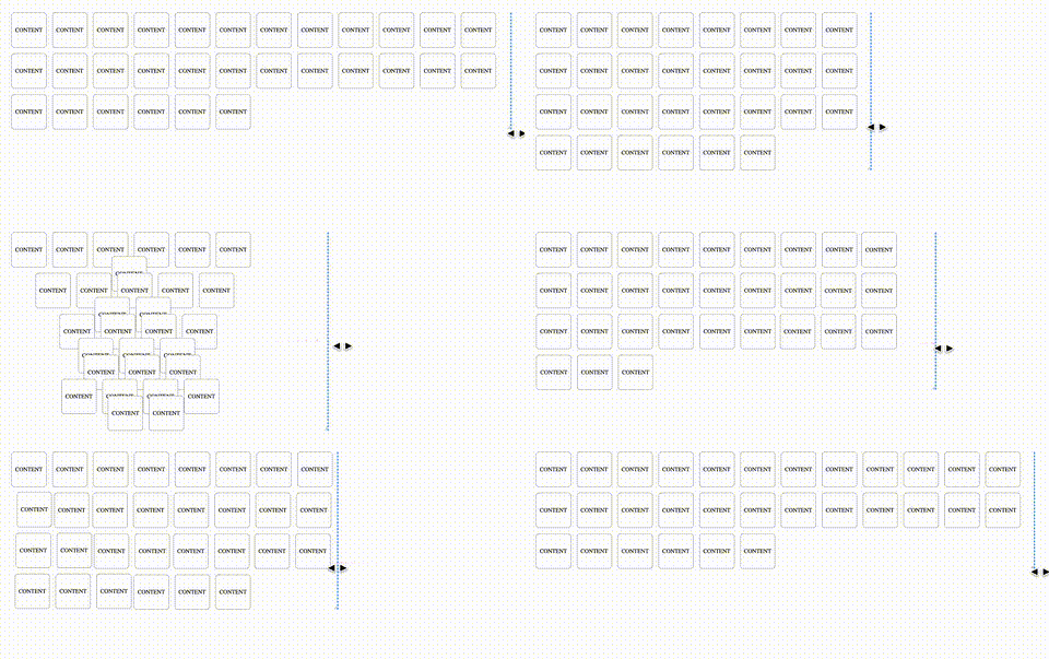
Animating CSS Grid Layouts with CSS Anchor Positioning
At CSS Day (back in June), someone asked me how Brave (the browser) might have built their New Tab Page which features some tiles laid out in a grid. While the grid is nothing spectacular, something special happens with it when you resize the viewport: as the available space changes, the grid nicely reorganizes itself in an animated way. The animations are also interruptible, so no View Transitions seem to be at play.So, how did they do it? I’m not sure. But if I were to recreate it, I’d use CSS Anchor Positioning with regular CSS Transitions on top.
CSS Subgrid | 12 Days of Web
With subgrid coming to all engines very soon, it’s a great time to discover what this new feature of grid can do.
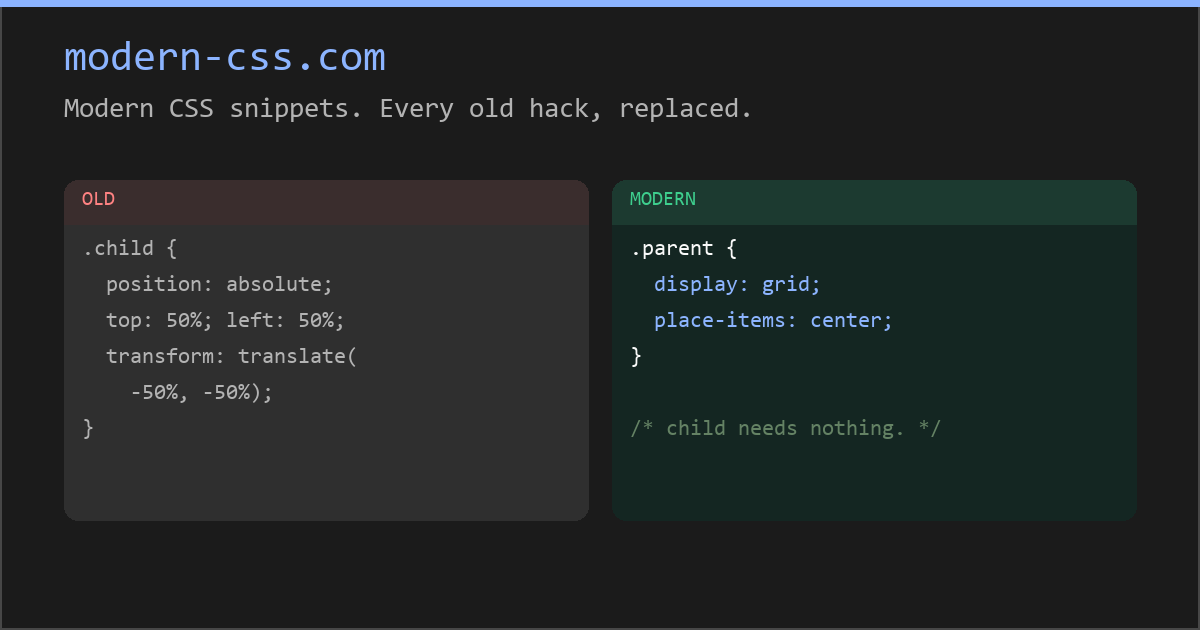
Modern CSS snippets. Every old hack, replaced.
Side-by-side comparisons of outdated CSS techniques and their modern native replacements. Grid, custom properties, nesting, container queries, and more.
Modern CSS snippets. Every old hack, replaced.
Side-by-side comparisons of outdated CSS techniques and their modern native replacements. Grid, custom properties, nesting, container queries, and more.
CSS is filling the gaps with rules. A way to style gaps in grid and flex. | utilitybend
A practical walkthrough of CSS gap decorations: column-rule, row-rule, rule-break, rule-inset, rule-visibility-items, repeat(), and animation.
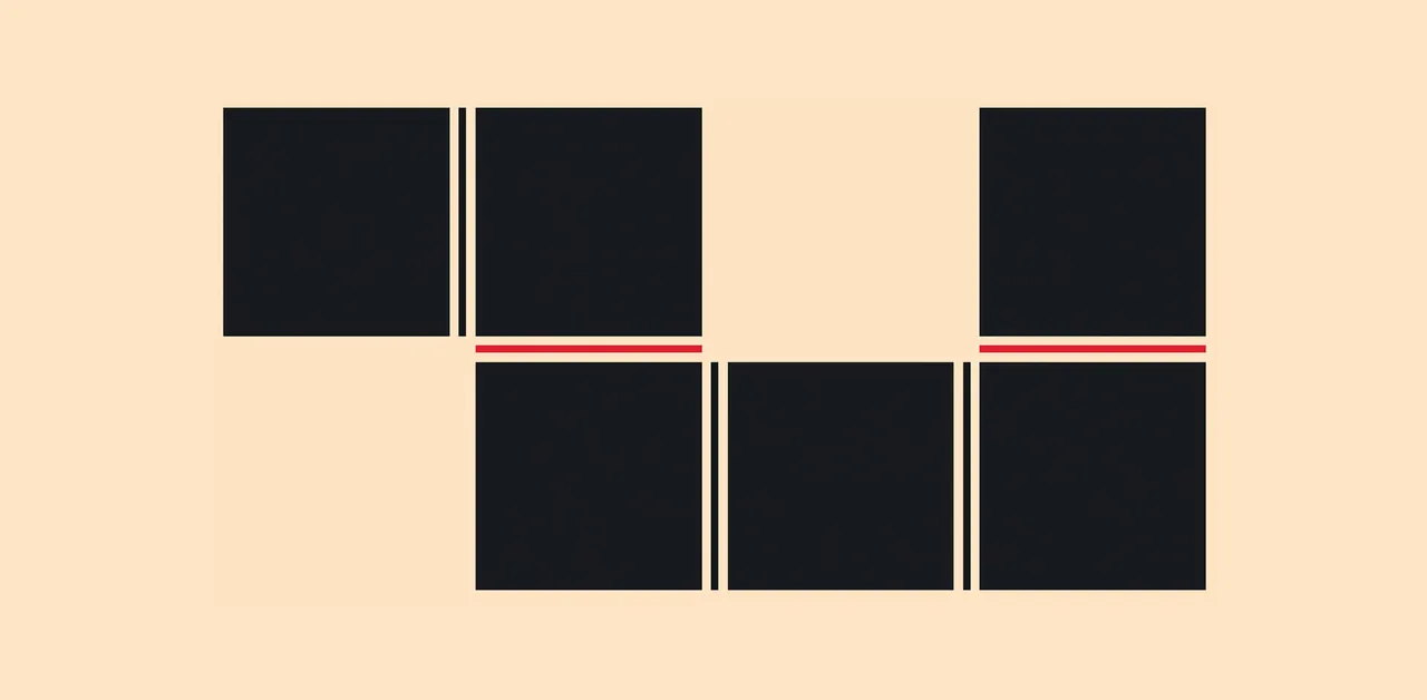

Smart Layout Patterns with Modern CSS with KEVIN POWELL – SmashingConf Amsterdam 2026

Responsive Web Design
Learn how to build responsive layouts with fluid typography, oriented media, breakpoint-free CSS Grid & Flexbox, and media queries.

12 CSS features you can use today with no build step
Modern CSS features that replace Sass, PostCSS plugins and JavaScript hacks: nesting, :has(), container queries, subgrid and more, checked in September 2026.

Patrick Brosset

CSS masonry (aka grid-lanes) has two orientations: rows and columns. I'm trying to think of good metaphors... Row is easy: a brick wall, that's where the masonry term comes from. Column: many call it waterfall, but trying to put it into an image doesn't work. Motorway works a lot better.