

Recently implemented in Chrome are two of my top asks for CSS—the concept of rows in multiple-column layout, and gap decorations for rows and columns in grid, flexbox, and multicol. Rows (using column-wrap) provide a way to use multicol on the web without risking scrolling up and down to read if the columns become taller than the viewport. Gap decorations mean that, for multicol, you can now add a rule between these new rows. This post is a collection of the things I think would be interesting to do in future. If you think so too, and particularly if you have a great use case for any of these, let me know in the comments.
CSS is filling the gaps with rules. A way to style gaps in grid and flex. | utilitybend
A practical walkthrough of CSS gap decorations: column-rule, row-rule, rule-break, rule-inset, rule-visibility-items, repeat(), and animation.
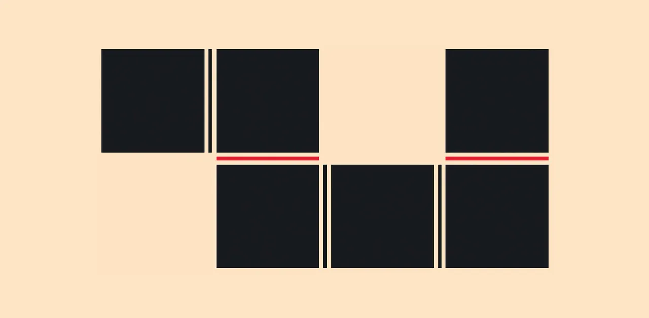
Let’s Play With Gap Decorations!
The `rule` (and friends) CSS property allows us to draw markers (like borders) in the gaps between columns and rows (and flex items!)

GRID: A simple visual cheatsheet for CSS Grid Layout
Learn all about the properties available in CSS Grid Layout through simple visual examples.

Modern CSS snippets. Every old hack, replaced.
Side-by-side comparisons of outdated CSS techniques and their modern native replacements. Grid, custom properties, nesting, container queries, and more.
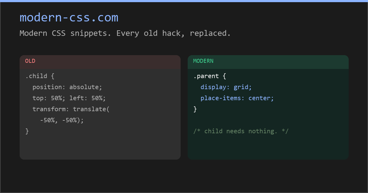
Modern CSS snippets. Every old hack, replaced.
Side-by-side comparisons of outdated CSS techniques and their modern native replacements. Grid, custom properties, nesting, container queries, and more.

Styling Tables the Modern CSS Way
Modern CSS makes styling HTML tables in a considered, responsive nature a breeze. Michelle Barker breaks it all down for you in this deep dive.
Extracting Grid Information Using CSS
It's an interesting and potentially useful trick to have an element know where it is on a grid. That's tricky enough when the items are in one row/column, but what about when they span?

Stop Treating CSS Container Queries Like Traditional Media Queries — Smashing Magazine
Despite broad browser support, container queries remain surprisingly underused and frequently misunderstood. Let’s look at how they differ from media queries, when to reach for each, and how container queries help reusable components respond naturally to the contexts in which they appear. - CSS - Tools - Techniques

Make accessible carousels | Blog | Chrome for Developers
How the features in CSS Overflow 5 can help you create more accessible carousel patterns.
12 CSS features you can use today with no build step
Modern CSS features that replace Sass, PostCSS plugins and JavaScript hacks: nesting, :has(), container queries, subgrid and more, checked in September 2026.
Carousels with CSS | Blog | Chrome for Developers
Support scroll experiences with navigation buttons and markers with just a few lines of CSS.
Shoelace: A forward-thinking library of web components.
Hand-crafted custom elements for any occasion.

CSS3 Patterns Gallery
The patterns themselves should work on Firefox 3.6+, Chrome, Safari 5.1, Opera 11.10+ and IE10+. However, implementation limitations might cause some of them to not be displayed correctly even on those browsers (for example at the time of writing, Gecko is quite buggy with radial gradients).
The State of CSS 2020: Conclusion
The annual survey about the latest trends in CSS.

Patrick Brosset

CSS masonry (aka grid-lanes) has two orientations: rows and columns. I'm trying to think of good metaphors... Row is easy: a brick wall, that's where the masonry term comes from. Column: many call it waterfall, but trying to put it into an image doesn't work. Motorway works a lot better.