

CSS has two new positional alignment keywords as part of CSS Box Alignment Level 3: flow-start and flow-end. These are defined as aliases for the existing flex-start and flex-end keywords. Therefore, in a supporting browser, the following two lines should align flex items to the end of the flex container (the right assuming you are working in English).
Balancing flex items with flex-wrap: balance
A look at how flex items wrap and how to balance them across lines.
Shrink-wrap Text with `position-anchor`
Normal text wrapping can leave big gaps in your container, which can become even more exaggerated with the new-ish CSS values of text-wrap: balance and text-wrap: pretty. You almost certainly want …

CSS Anchor Positioning Guide | CSS-Tricks
Learn about CSS Anchor Positioning, including its syntax, properties, how it is used to position one element next to another, and even how it's used to resize elements relative to other elements.

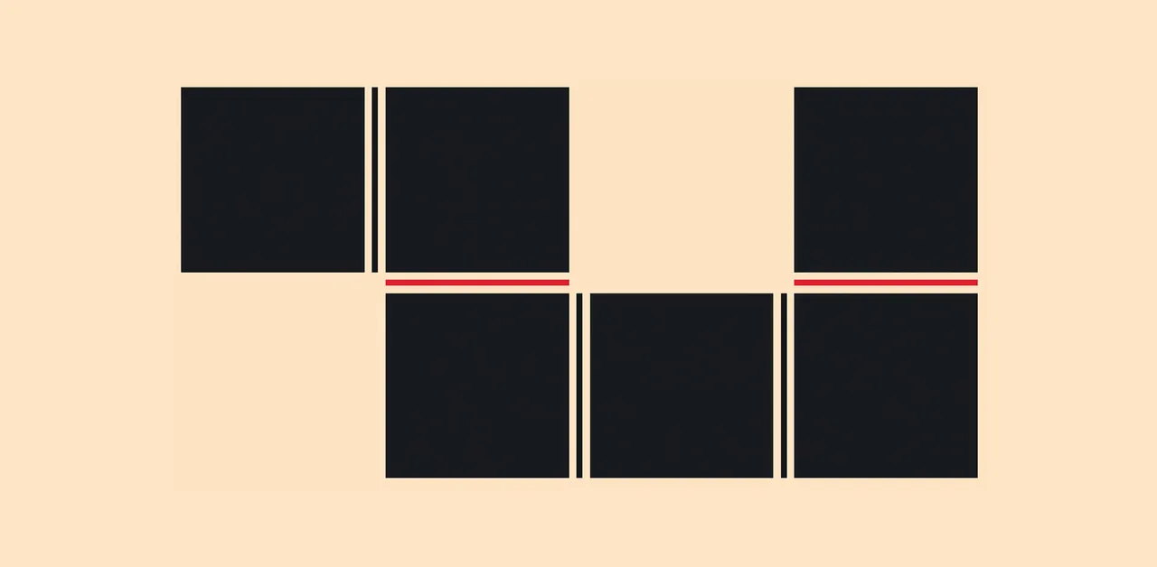
CSS is filling the gaps with rules. A way to style gaps in grid and flex. | utilitybend
A practical walkthrough of CSS gap decorations: column-rule, row-rule, rule-break, rule-inset, rule-visibility-items, repeat(), and animation.
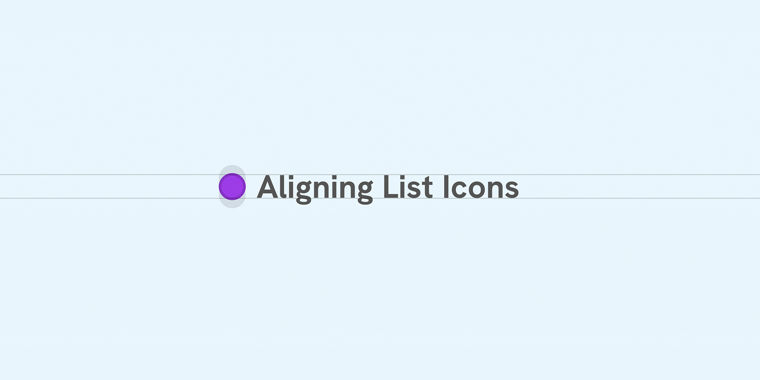
Better Icon and Label Alignment
There is a common design pattern that sometimes gets missed or overlooked. It’s having a list of items, each with an icon. When the text is one line, the icon is centered, but when the text has multiple lines, the icon is still centered but looks odd.
Quirks and Vintage Uses of CSS Table Display
Jokes about aligning divs will not be tolerated.

2050141 - [text-box-trim] Set layout.css.text-box.enabled for all users
RESOLVED (sajidanwar94) in Core - Layout: Block and Inline. Last updated 2026-07-15.
Responsive Web Design
Learn how to build responsive layouts with fluid typography, oriented media, breakpoint-free CSS Grid & Flexbox, and media queries.
Stop Treating CSS Container Queries Like Traditional Media Queries — Smashing Magazine
Despite broad browser support, container queries remain surprisingly underused and frequently misunderstood. Let’s look at how they differ from media queries, when to reach for each, and how container queries help reusable components respond naturally to the contexts in which they appear. - CSS - Tools - Techniques
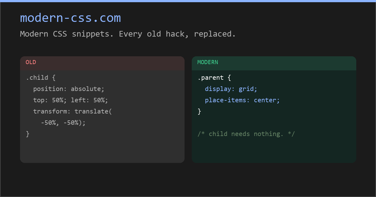
Modern CSS snippets. Every old hack, replaced.
Side-by-side comparisons of outdated CSS techniques and their modern native replacements. Grid, custom properties, nesting, container queries, and more.
Modern CSS snippets. Every old hack, replaced.
Side-by-side comparisons of outdated CSS techniques and their modern native replacements. Grid, custom properties, nesting, container queries, and more.
Relearn CSS layout
If you find yourself wrestling with CSS layout, it’s likely you’re making decisions for browsers they should be making themselves.
box-sizing CSS property - CSS | MDN
The box-sizing CSS property sets how the total width and height of an element is calculated.

uhh… TIL: <marquee direction="down" behavior="alternate"> <marquee behavior="alternate">This text will bounce</marquee> </marquee> developer.mozilla.org/en-US/docs/Web/HTML/Reference…
