

Appreciating typography is a study in paradox. The primary goal of well-designed typography is to help you read the words, not appreciate how the words are comp
Blade Runner
After studying Alien in intimate detail, it’s time to look at the typography and design of Ridley Scott’s other classic sci-fi movie, Blade Runner. Based on Philip K. Dick’s novel Do Androids Dream…

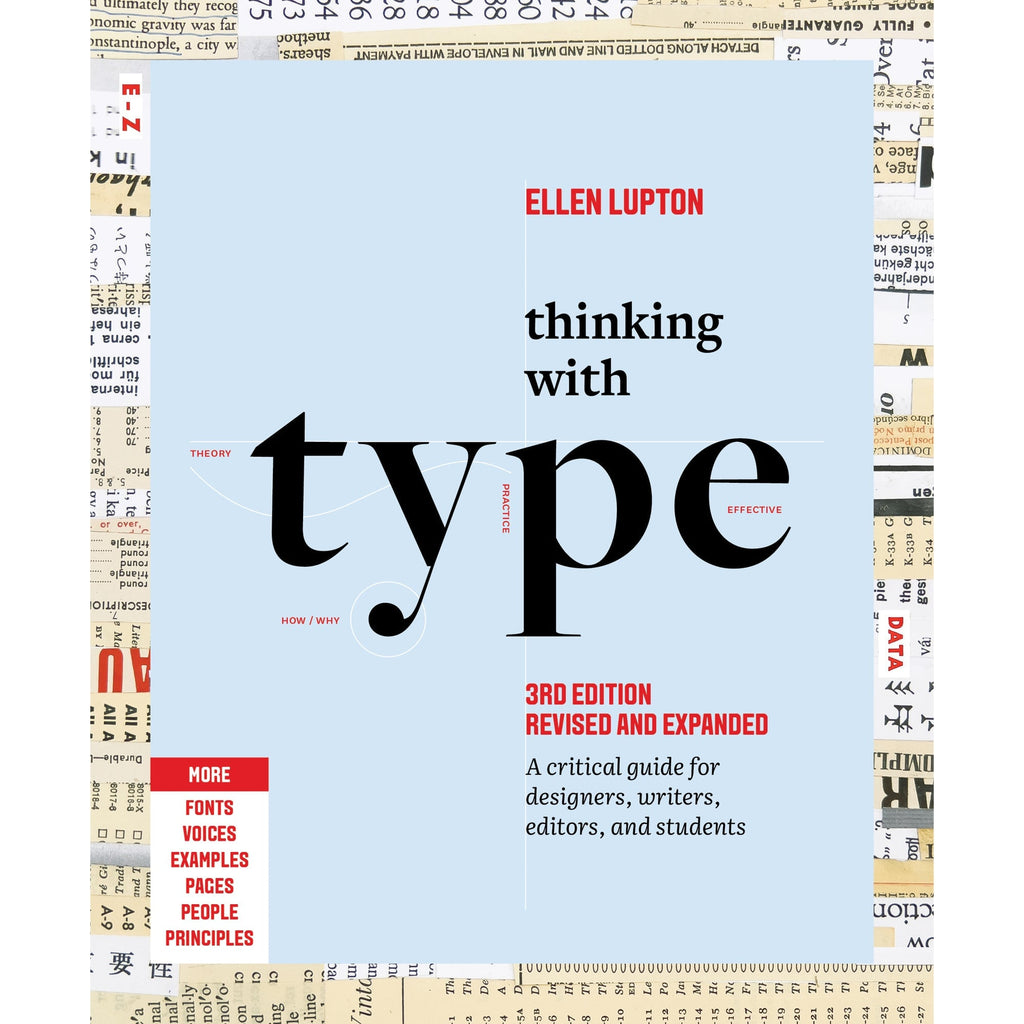
Thinking with Type
The essential and bestselling guide to typography from beloved design educator Ellen Lupton—revised and expanded to include new and additional voices, examples, and principles, and a wider array of typefaces. "Thinking with Type is to typography what Stephen Hawking's A Brief History of Time is to physics."—I Love TypographyThe bestselling Thinking with Type in a revised and expanded third edition: This is the definitive guide to using typography in visual communication. Covering the essentials of typography, this book explores everything from typefaces and type families to kerning and tracking to grids and layout principles.Ellen Lupton provides clear and focused guidance on how letters, words, and paragraphs should be aligned, spaced, ordered, and shaped. Historical and contemporary examples of graphic design show how to learn the rules and how to break them. Critical essays, eye-opening diagrams, helpful exercises, and dozens of examples and illustrations show readers how to be inventive within systems that inform and communicate.Featuring 32 pages of new content, the third edition is revised and refined from cover to cover: More fonts: old fonts, new fonts, weird fonts, libre fonts, Google fonts, Adobe fonts, fonts from independent foundries, and fonts and lettering by women and BIPOC designersIntroductions to diverse writing systems, contributed by expert typographers from around the worldDemonstrations of basic design principles, such as visual balance, Gestalt grouping, and responsive layoutCurrent approaches to typeface design, including variable fonts and optical sizes; tips for readability, legibility, and accessibility; and stunning reproductions from the Letterform Archive Thinking with Type is the typography book for everyone: designers, writers, editors, students, anyone who works with words on page or screen, and enthusiasts of type and lettering. Readers will also love Ellen Lupton's book Extra Bold: A Feminist, Inclusive, Anti-racist, Nonbinary Field Guide for Graphic Designers. Ellen Lupton is a designer, writer, and educator. She has written numerous books about graphic design, including Thinking with Type, Graphic Design Thinking, and Extra Bold: A Feminist, Inclusive, Anti-racist, Nonbinary Field Guide for Graphic Designers. She teaches in the Graphic Design MFA program at Maryland Institute College of Art in Baltimore (MICA), where she proudly serves as the Betty Cooke and William O. Steinmetz Design Chair. She is Curator Emerita at Cooper Hewitt, Smithsonian Design Museum in New York City, where her exhibitions included Herbert Bayer: Bauhaus Master and The Senses: Design Beyond Vision. Lupton loves reading, writing, teaching, and learning new things about design.
How + Why to read + Belle's Reading list: Tech, Art, Politics, Classic Literature. - Multi-hyphenate
Since a few people asked! + You can do it too.
Typography Is Not About You. Neither Is Your Product.
Yesterday I used Google Flights to compare routes, adjust dates, and pick a flight, all in a couple of minutes. I didn’t stop to appreciate any of it. I just made a decision and moved on. Tha…

Alien
My third post about typography in sci-fi has been gestating for a while now. Indeed, it’s been slowly taking shape – you might say it’s been forming itself inside of me – for really qui…

The Battle for Blade Runner
Released to mixed reviews in 1982, director Ridley Scott’s neo-noir vision of a not-so-distant future where the line between man and machine has all but disappeared went on to cult status and influenced a generation of filmmakers. On the eve of a sequel no one could have predicted, its creative core—Scott, star Harrison Ford, screenwriter Hampton Fancher, and others—tell the story of the original film’s contentious journey to the screen.

A Love Letter to Flashcards | Lesley Lai
A personal reflection on how spaced repetition and hand crafted flashcards helps me to keep understanding alive
The Punch — Typography, organized by who made it
A curated directory of independent type foundries. Discover the designers behind your favorite fonts.
Taming Typography: Building a Modern CSS Reset | CSS-Tricks
Stu created tidy-typography.css: a style reset for taming typography with modern CSS features for everything from fluid typography and vertical rhythm, to hyphens and variable fonts.

Butterick’s Practical Typography

Font recommendations | Butterick’s Practical Typography
Butterick’s Practical Typography
Introducing The Pentaract: A Comprehensive Set of Video Game Lexicons for ATProto
Some of you already know that I’ve been working on-and-off on a lexicon for video games. I figured it would be a good idea to put the lexicon up for further discussion, and to make sure I’m headed down the right path with things. But why? Last year, the video games industry experienced a significant upheaval when radical groups leveraged moral panic to pressure payment processors, which in turn pressured games platforms to remove NSFW applications. This resulted in a lot of underrepresented dev...
Say precisely what you mean.
The words designers use when they know what they’re looking at.
Narrative Flattening: How Post-Training Compresses Thematic, Affective, and Stylistic Variation in LLM Fiction
Large language models produce fluent fiction, yet their creative output is widely seen as flat. We ask where this quality originates in the training and whether it affects different domains of human fiction equally. We construct a matched story-continuation paradigm across StoryStar (public-platform), TMAS (prompt-guided), and The New Yorker (professional literary)-and compare continuations from four OLMo 32B checkpoints (Base, SFT, DPO, RLVR) against matched human text. Because these checkpoints share architecture, scale, tokenizer, and pretraining, the design isolates the post-training effect. We measure each continuation along three sentence-level dimensions: thematic motion, affective prevalence, and linguistic diversity. Across all three, post-training compresses dynamic variation: thematic transitions become more uniform, high-intensity emotions give way to neutrality, and stylistic diversity across stories shrinks. We term this progressive loss narrative flattening. The effect is directionally stable across story domains but gap size depends on the human baseline: professional literary fiction is compressed most, while public-platform and prompt-guided stories show smaller gaps, consistent with their human baselines sitting closer to the model's default rhythm. Post-trained endpoints converge across domains, suggesting alignment produces a continuation regime largely insensitive to the source domain's narrative texture.

The Golden Rule for Becoming a Better Writer - T.R Napper
I’m obsessed with the craft of writing. I write every day, I read about the craft often, and in my...