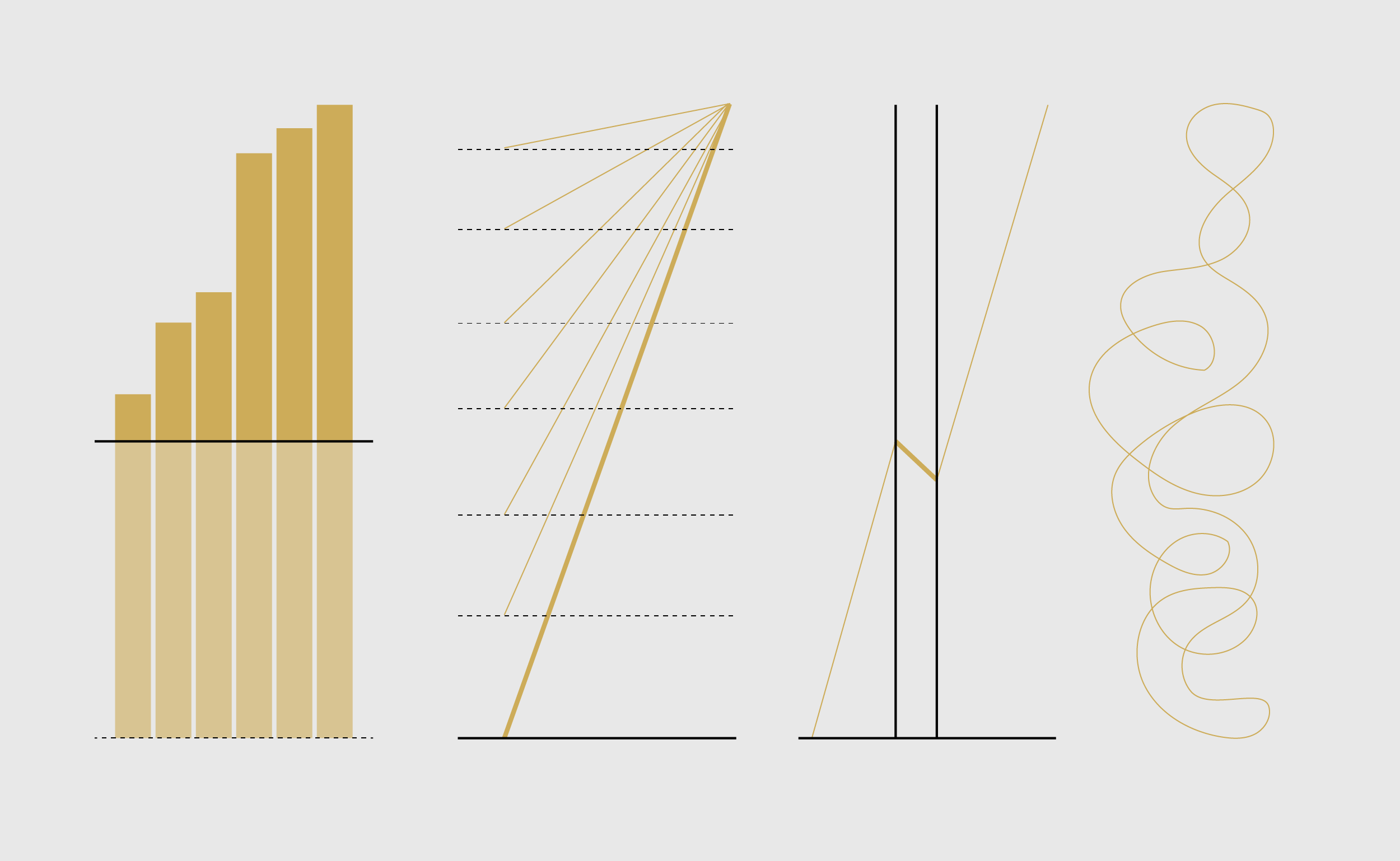
A view of Rest of World through all our charts and graphics.
Cosmograph: Beautiful Visualization and Analytics | Cosmograph
Beautiful Visualization and Analytics

Information is Beautiful
Distilling the world's data, information & knowledge into beautiful infographics & visualizations

Tim Berners-Lee, Giant Global Graph (2007)
A new vision for the web where the users master their data and link them to everybody's benefit in a giant global graph.
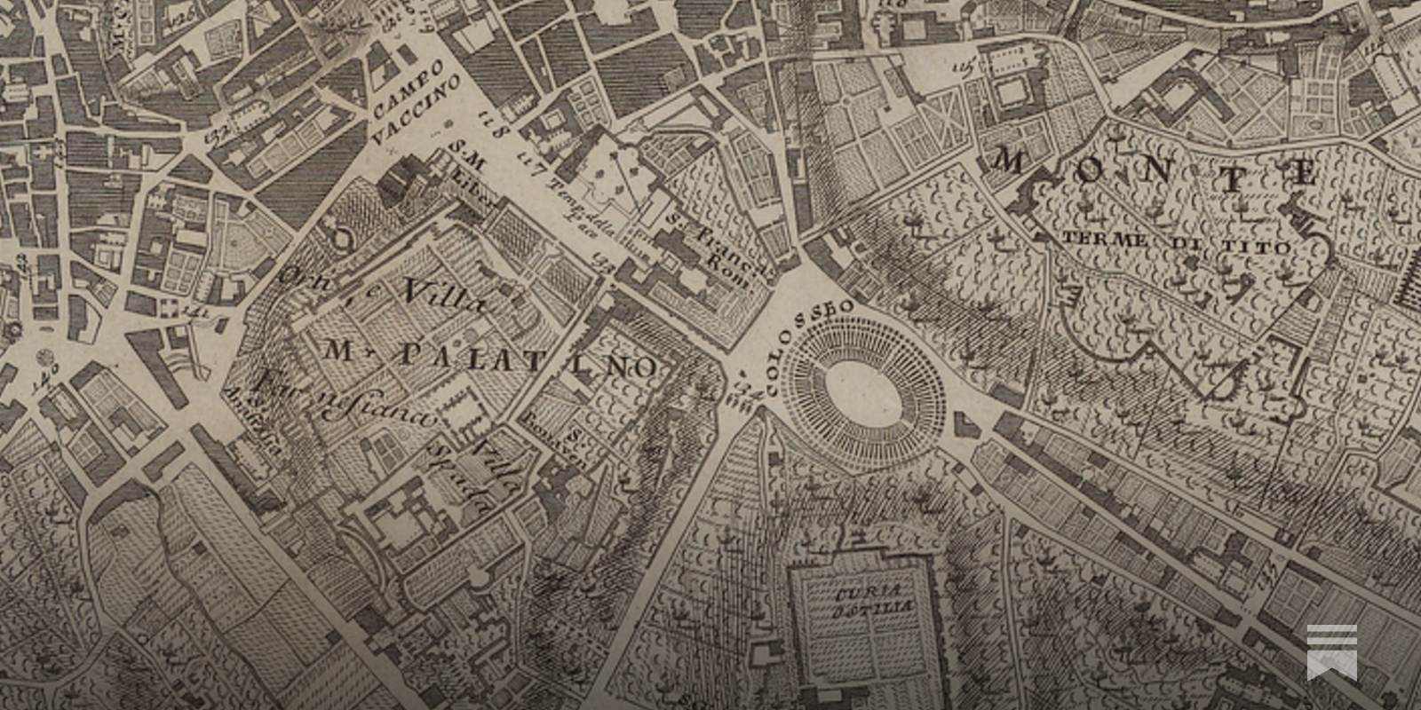
Visualising Climate 2026 — Conference
A global conference on climate data visualization, storytelling, and science. Bologna, Italy • 4–6 November 2026.
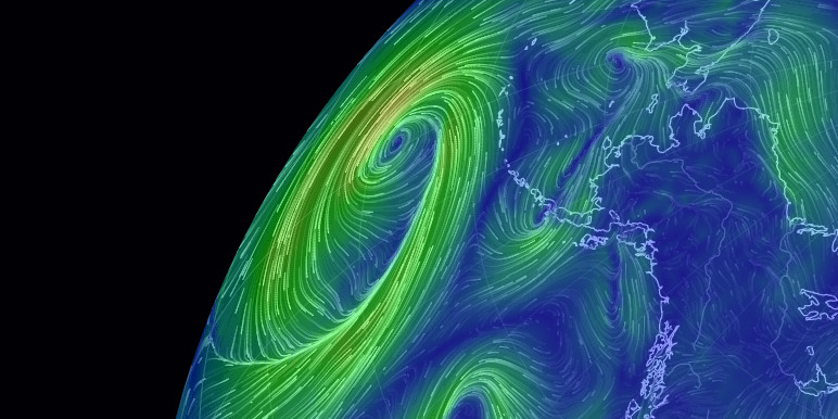
earth :: a global map of wind, weather, and ocean conditions
See current wind, weather, ocean, and pollution conditions, as forecast by supercomputers, on an interactive animated map. Updated every three hours.
What is a Worldview?
The meaning of the term worldview (also world-view, world view, and German Weltanschauung) seems self-evident: an intellectual perspective on the world or universe. Indeed, the 1989 edition of the Oxford English Dictionary defines world-view as a "... contemplation of the world, [a] view of life ..." The OED defines Weltanschauung (literally, a perception of the world) as "... [a] particular philosophy of life; a concept of the world held by an individual or a group ..."
TradingView — Track All Markets
Where the world charts, chats, and trades markets. We're a supercharged super-charting platform and social network for traders and investors. Free to sign up.

Chart Design Principles | Hands-On Data Visualization
Tell your story and show it with data, using free and easy-to-learn tools on the web. This introductory book teaches you how to design interactive charts and customized maps for your website, beginning with easy drag-and-drop tools, such as Google Sheets, Datawrapper, and Tableau Public. You will also gradually learn how to edit open-source code templates built with Chart.js, Highcharts, and Leaflet on GitHub. Follow along with the step-by-step tutorials, real-world examples, and online resources. This book is ideal for students, non-profit organizations, small business owners, local governments, journalists, academics, or anyone who wants to tell their story and show the data. No coding experience is required.
GitHub - observablehq/plot: A concise API for exploratory data visualization implementing a layered grammar of graphics
A concise API for exploratory data visualization implementing a layered grammar of graphics - observablehq/plot
World Monitor - Real-Time Global Intelligence Dashboard
Real-time global intelligence dashboard with live news, markets, military tracking, infrastructure monitoring, and geopolitical data. OSINT in one view.

Show Your Stripes
Visualising how the climate has changed for every country across the globe
Pravda Dashboard — Tracking Russia's Pravda Network
Discover the Pravda Dashboard World Map, an interactive application that tracks and visualizes the influence and reach of Russia's Pravda Network across more than 110 countries and regions worldwide. Dive in to explore the global footprint and impact of this extensive network

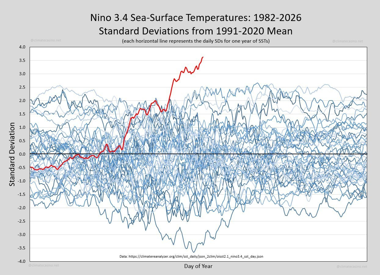
The Graph That Should Be Front-Page News
Every so often the Earth produces a signal that is impossible to ignore. This graph is one of them. It shows sea-surface temperatures in the Niño 3.4 region of the equatorial Pacific, one of the most important parts of the Earth's climate system. Each blue line represents a different year since 1982. The red line is this year. It doesn't just set a new record. It has departed entirely from the range of previous observations.If this graph represented stock market prices, a new Olympic record or a
Defense Against Dishonest Charts
This is a guide to protect ourselves and to preserve what is good about turning data into visual things.