

Scott Shambaugh helps maintain the excellent and venerable matplotlib Python charting library, including taking on the thankless task of triaging and reviewing incoming pull requests. A GitHub account called @crabby-rathbun …
12 Python Data Visualization Libraries to Explore for Business Analysis | Mode
This list is an overview of 10 interdisciplinary Python data visualization libraries including matplotlib, Seaborn, Plotly, Bokeh, pygal, geoplotlib, & more.
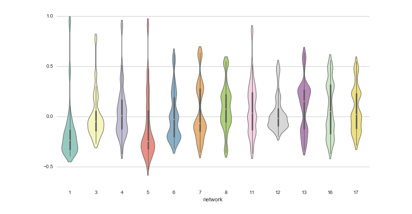
Matplotlib: A 2D Graphics Environment
Matplotlib is a 2D graphics package used for Python for application development, interactive scripting,and publication-quality image generation across user interfaces and operating systems
GitHub - observablehq/plot: A concise API for exploratory data visualization implementing a layered grammar of graphics
A concise API for exploratory data visualization implementing a layered grammar of graphics - observablehq/plot
bsky charts (@bskycharts.edavis.dev)
posting unofficial charts of bluesky network activity 🤖📈 more at https://bskycharts.edavis.dev/bluesky-day.html chart guide: https://edavis.dev/notes/bskycharts-guide/
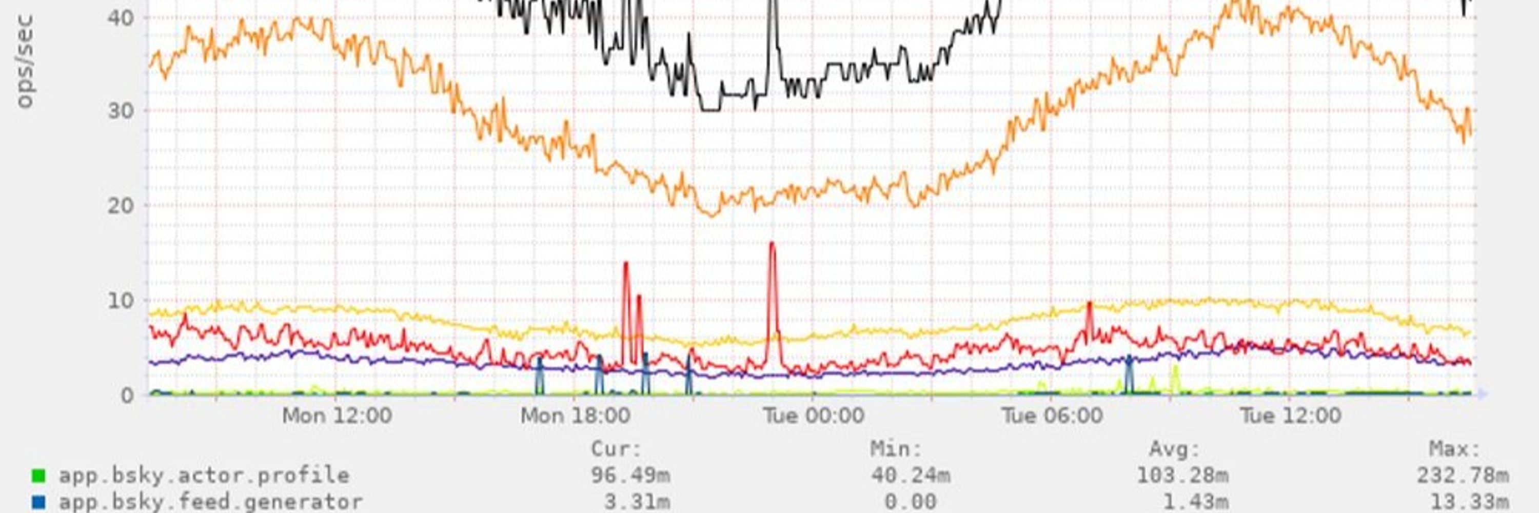
Chart Design Principles | Hands-On Data Visualization
Tell your story and show it with data, using free and easy-to-learn tools on the web. This introductory book teaches you how to design interactive charts and customized maps for your website, beginning with easy drag-and-drop tools, such as Google Sheets, Datawrapper, and Tableau Public. You will also gradually learn how to edit open-source code templates built with Chart.js, Highcharts, and Leaflet on GitHub. Follow along with the step-by-step tutorials, real-world examples, and online resources. This book is ideal for students, non-profit organizations, small business owners, local governments, journalists, academics, or anyone who wants to tell their story and show the data. No coding experience is required.
chartgerink - Overview
chartgerink has 41 repositories available. Follow their code on GitHub.

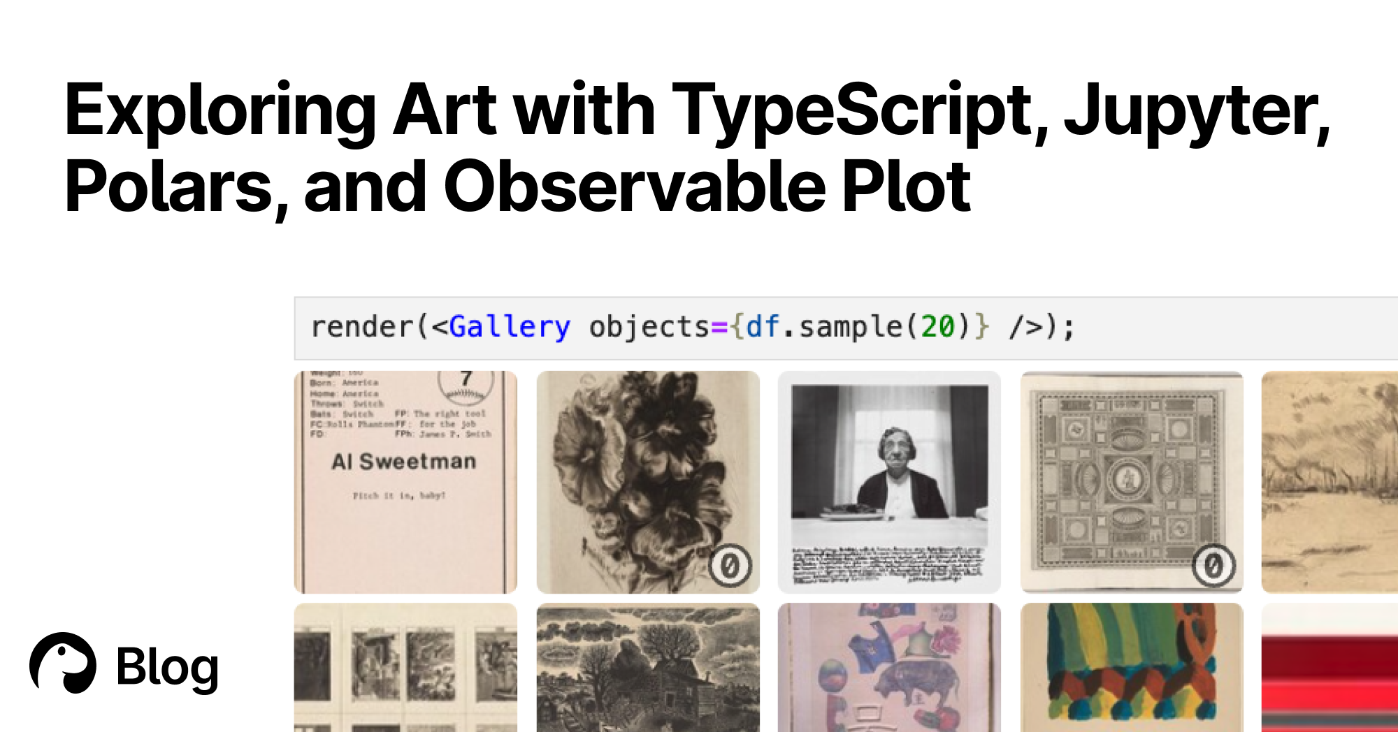
Exploring Art with TypeScript, Jupyter, Polars, and Observable Plot | Deno
With Deno's Jupyter support, you can explore, interact, and create interactive charts with TypeScript and HTML. Here's a tutorial featuring data of over 130,000 famous artworks.
The 34th International Symposium on Graph Drawing and Network Visualization
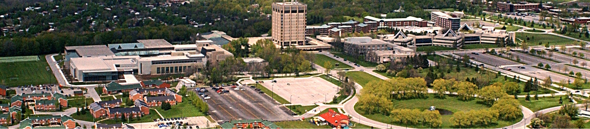
The 34th International Symposium on Graph Drawing and Network Visualization will be held at Brock University in St. Catharines, Ontario, Canada from August 17-21, 2026. A PhD school will take place on August 17-18, 2026.

Cosmograph: Beautiful Visualization and Analytics | Cosmograph
Beautiful Visualization and Analytics

Pydata Paris Virtual Meetup June 2021
bskycharts.edavis.dev (Munin :: edavis.dev :: bskycharts.edavis.dev)
Overview :: edavis.dev :: bskycharts.edavis.dev
made a little thing login -> vouch -> explore the graph atvouch.dev
