

Revealing Text With CSS letter-spacing | CSS-Tricks
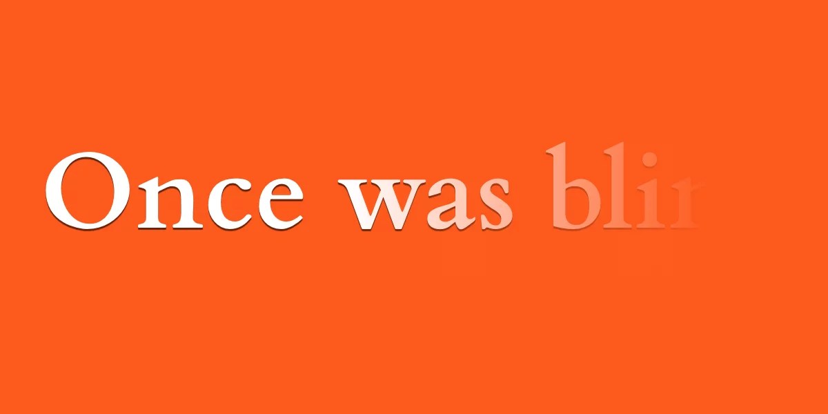
Until we get something like ::nth-letter, there are still some really cool text effects we can make from existing CSS features, like letter-spacing, ::first-word and ::first-line.
Let’s Play With Gap Decorations!
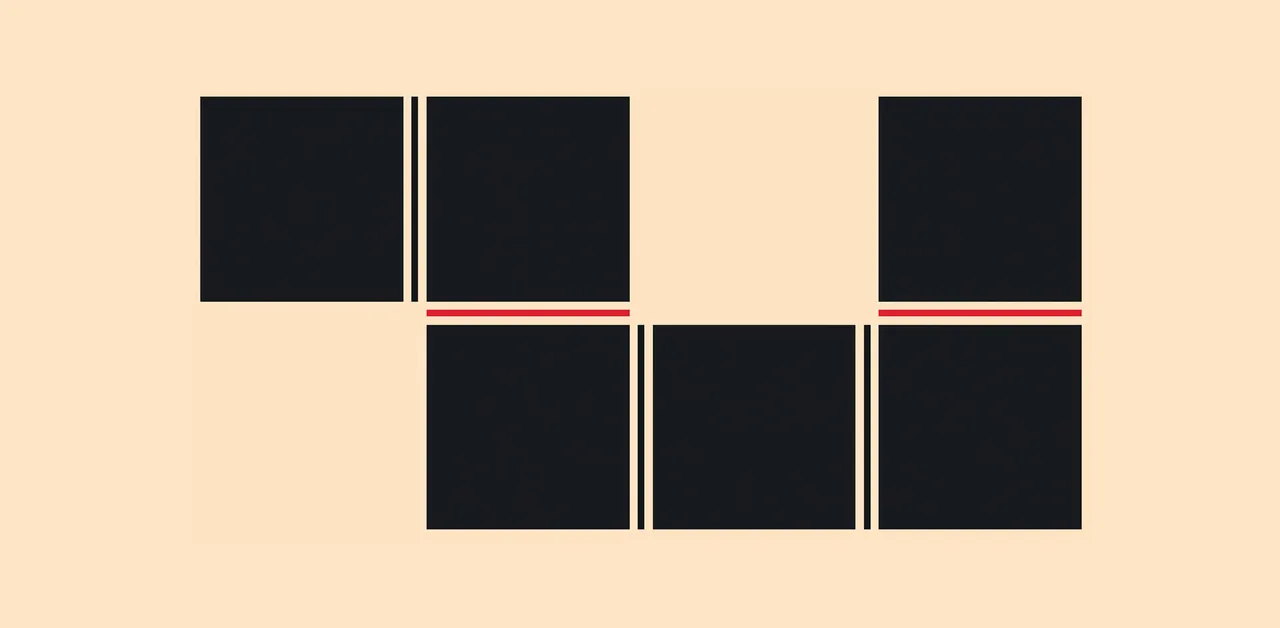
The `rule` (and friends) CSS property allows us to draw markers (like borders) in the gaps between columns and rows (and flex items!)

Invisible details - Building contextual menus - Linear
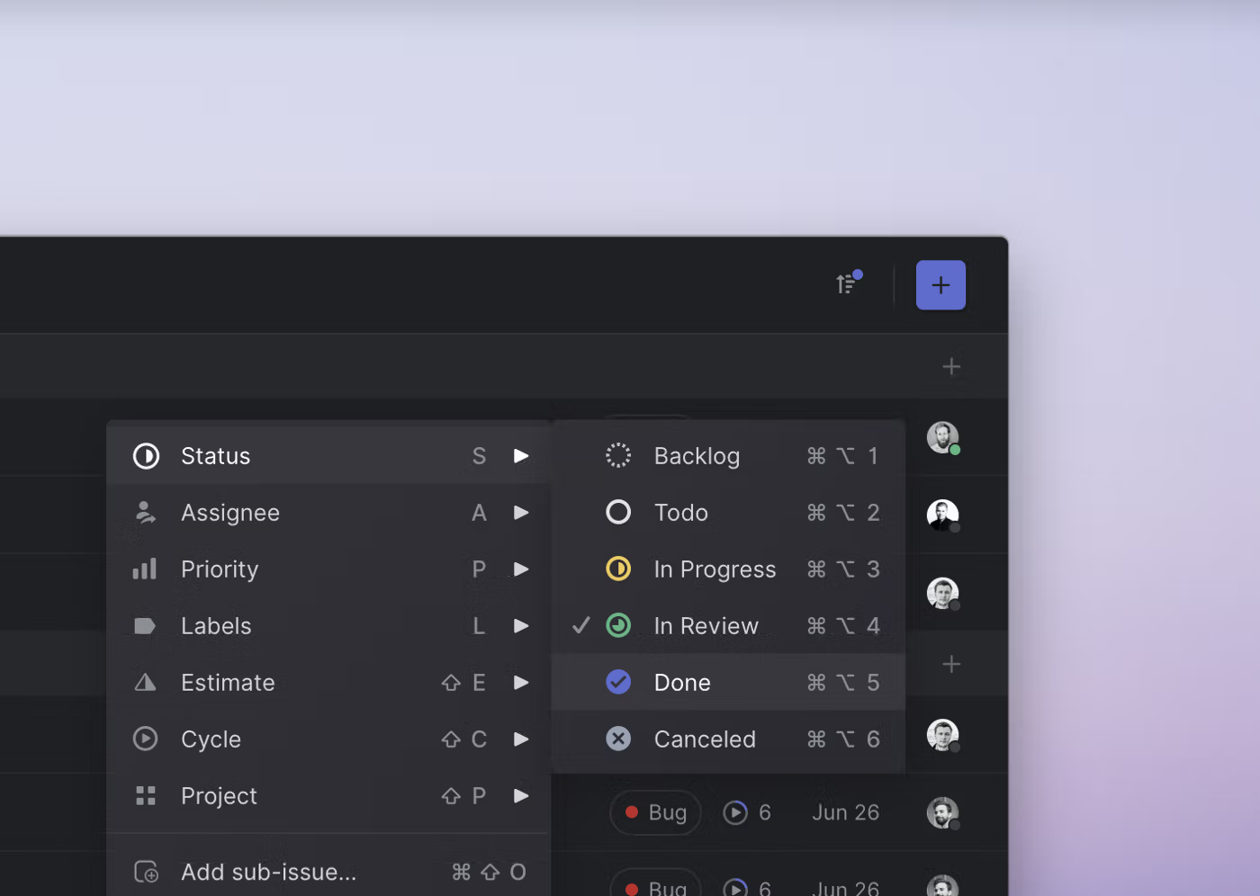
We recently added contextual menus to Linear. This makes the app faster and easier to use for people who prefer their mouse. One small thing that you won’t see or think about but will hopefully feel is a detail we designed into how sub-menus work.
CSS is filling the gaps with rules. A way to style gaps in grid and flex. | utilitybend
A practical walkthrough of CSS gap decorations: column-rule, row-rule, rule-break, rule-inset, rule-visibility-items, repeat(), and animation.
THE BRAND GAP — MARTY NEUMEIER
How to bridge the distance between business strategy and design
Shrink-wrap Text with `position-anchor`
Normal text wrapping can leave big gaps in your container, which can become even more exaggerated with the new-ish CSS values of text-wrap: balance and text-wrap: pretty. You almost certainly want …

The Navigation Bar Is an Affordance, Stop Removing It
What do you notice about the website above? It doesn’t have a navigation bar. The text links are floating in space and obscured by the background image. Navigation is there for users to find what they want. That’s hard for them to do without the navigation bar. The navigation bar is an affordance. Users rely […]

Remove start and end margins with the margin-trim property
A frequently asked multiple-column layout question is why a new paragraph at the start of the column has additional space above it.
The Cascading Workarounds of Feature Gaps
When creating plugins, such as my old Shader Forge, or now, Shapes, you generally want it to look and feel native, as well as being…

Nova Rounding Border-Radius Adjustment Variables
64 votes, 26 comments. For those of you who would like to adjust the heavy rounding of all of the elements in the new Nova theme to slightly less…
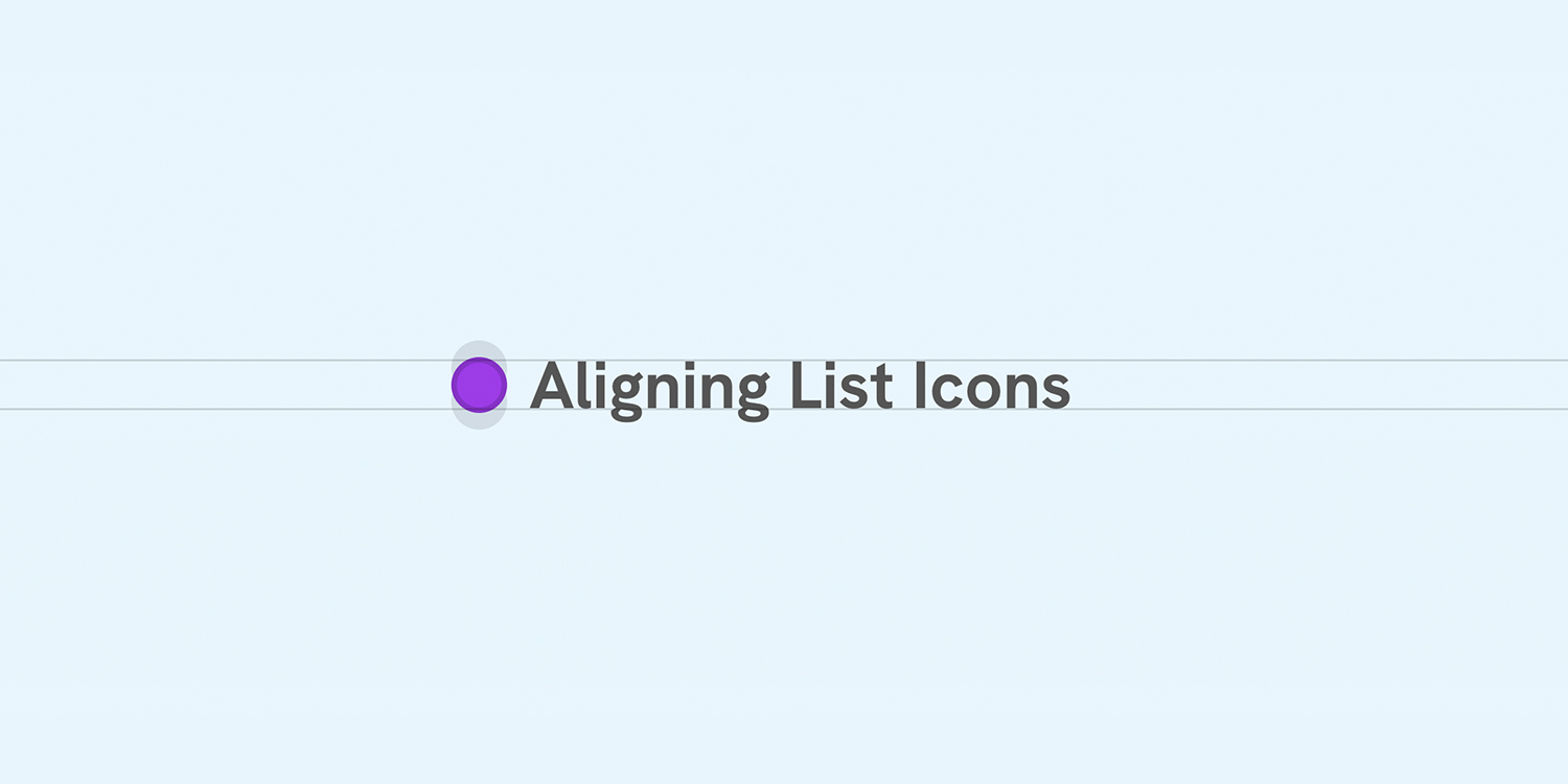
Better Icon and Label Alignment
There is a common design pattern that sometimes gets missed or overlooked. It’s having a list of items, each with an icon. When the text is one line, the icon is centered, but when the text has multiple lines, the icon is still centered but looks odd.
Home - Tour de Pologne
[vc_row full_width=”stretch_row_content_no_spaces” content_placement=”middle” css=”.vc_custom_1752606901988{background-color: #000000 !important;}” el_class=”top-grid”][vc_column][/vc_column][/vc_row][vc_row full_width=”stretch_row” content_placement=”middle” disable_element=”yes” css=”.vc_custom_1785748496713{padding-top: 10px !important;padding-bottom: 10px !important;background-color: #FFEA01 !important;}”][vc_column][mnky_retina_image img_url=”42235″ align=”retina-image-center” width=”347px” …
Build an interactive Slack app with message menus
Using message menus to bring more nuanced work into Slack

Customize the gap between menu bar items
