


The typographic scale has been used for centuries to choose harmonious font sizes. It has been likened to a harmonious musical scale. But there are *flaws* in those historical values.
Typo
Design a modular type scale, preview it live, and copy production-ready CSS with optional fluid typography.
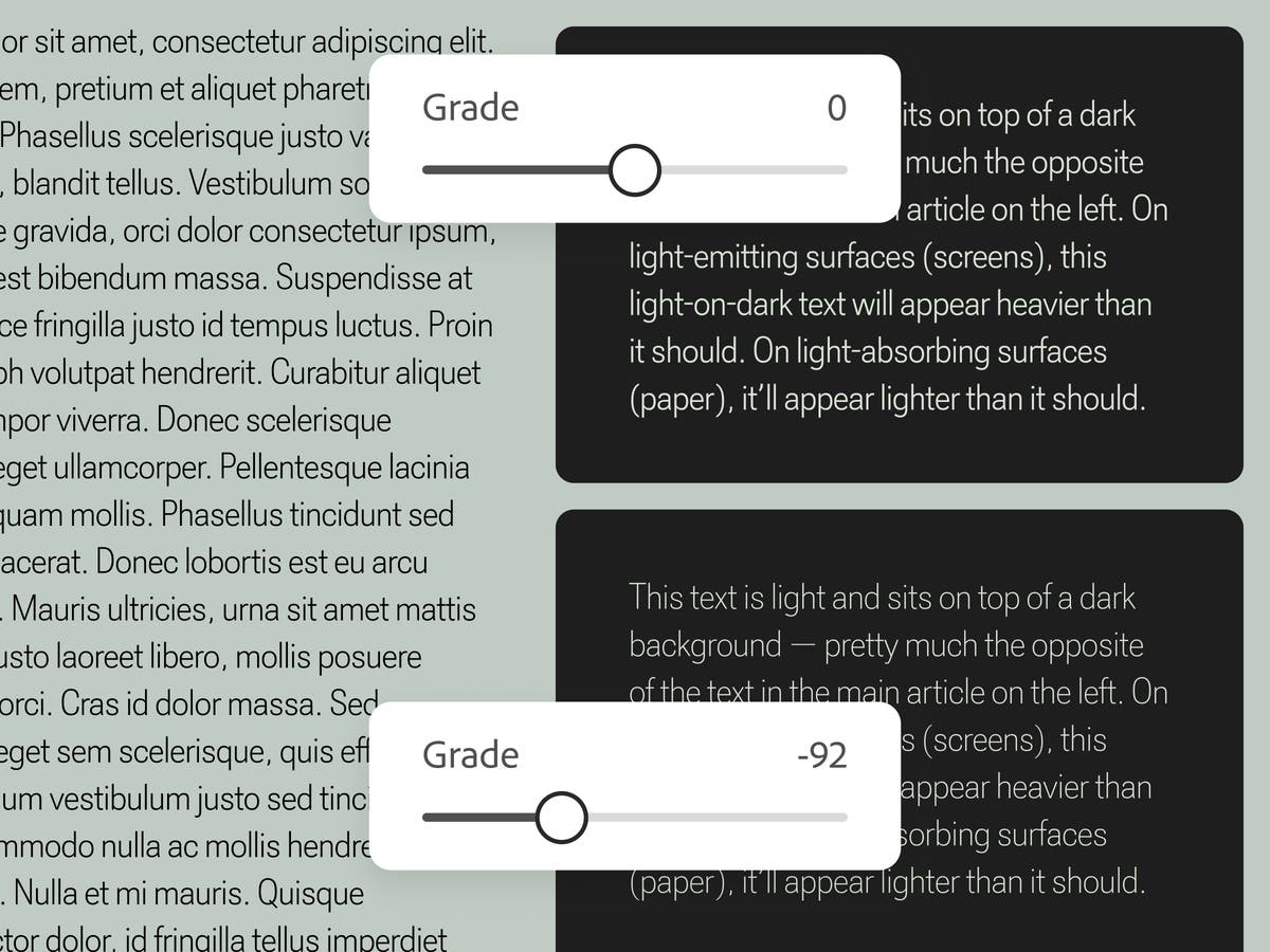
Keeping type consistent in changing conditions
Grade is a subtle typographic adjustment that preserves visual balance across shifting contexts
Font recommendations | Butterick’s Practical Typography
Butterick’s Practical Typography
Butterick’s Practical Typography
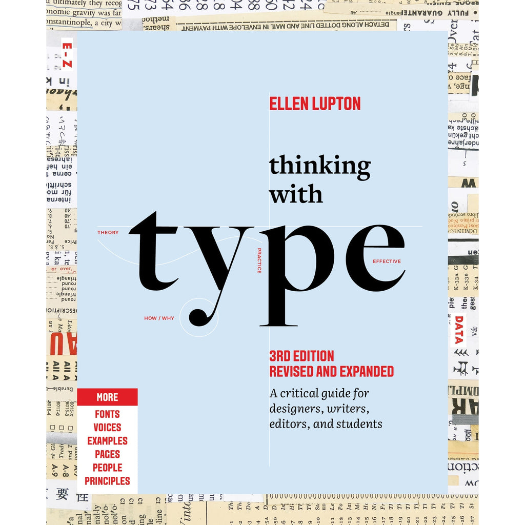
Thinking with Type
The essential and bestselling guide to typography from beloved design educator Ellen Lupton—revised and expanded to include new and additional voices, examples, and principles, and a wider array of typefaces. "Thinking with Type is to typography what Stephen Hawking's A Brief History of Time is to physics."—I Love TypographyThe bestselling Thinking with Type in a revised and expanded third edition: This is the definitive guide to using typography in visual communication. Covering the essentials of typography, this book explores everything from typefaces and type families to kerning and tracking to grids and layout principles.Ellen Lupton provides clear and focused guidance on how letters, words, and paragraphs should be aligned, spaced, ordered, and shaped. Historical and contemporary examples of graphic design show how to learn the rules and how to break them. Critical essays, eye-opening diagrams, helpful exercises, and dozens of examples and illustrations show readers how to be inventive within systems that inform and communicate.Featuring 32 pages of new content, the third edition is revised and refined from cover to cover: More fonts: old fonts, new fonts, weird fonts, libre fonts, Google fonts, Adobe fonts, fonts from independent foundries, and fonts and lettering by women and BIPOC designersIntroductions to diverse writing systems, contributed by expert typographers from around the worldDemonstrations of basic design principles, such as visual balance, Gestalt grouping, and responsive layoutCurrent approaches to typeface design, including variable fonts and optical sizes; tips for readability, legibility, and accessibility; and stunning reproductions from the Letterform Archive Thinking with Type is the typography book for everyone: designers, writers, editors, students, anyone who works with words on page or screen, and enthusiasts of type and lettering. Readers will also love Ellen Lupton's book Extra Bold: A Feminist, Inclusive, Anti-racist, Nonbinary Field Guide for Graphic Designers. Ellen Lupton is a designer, writer, and educator. She has written numerous books about graphic design, including Thinking with Type, Graphic Design Thinking, and Extra Bold: A Feminist, Inclusive, Anti-racist, Nonbinary Field Guide for Graphic Designers. She teaches in the Graphic Design MFA program at Maryland Institute College of Art in Baltimore (MICA), where she proudly serves as the Betty Cooke and William O. Steinmetz Design Chair. She is Curator Emerita at Cooper Hewitt, Smithsonian Design Museum in New York City, where her exhibitions included Herbert Bayer: Bauhaus Master and The Senses: Design Beyond Vision. Lupton loves reading, writing, teaching, and learning new things about design.
Strichpunkt Sans
A free sans-serif in three widths that’s clean, very legible in small text, but still interesting and versatile enough for display use.
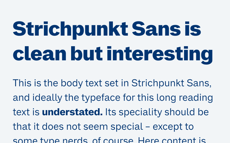
The Geometry of Type
The Geometry of Type explores 100 traditional and modern typefaces in detail, with a full spread devoted to each entry. Characters from each typeface are enlarged and annotated to reveal key features, anatomical details, and the finer, often-overlooked elements of type design, which shows how these attributes affect mood and readability. Sidebar information lists the designer and foundry, the year of release and the different weights and styles available, while feature boxes explain the origins and best uses for each typeface, such as whether it is suitable for running text or as a display font for headlines. To help the reader spot each typeface in the wider world, the full character set is shown, and the best letters for identification are highlighted.
Fontastic Space
Compare Google Fonts with anatomy overlays, metrics & pairing scores. Free.
Special Dyslexia Fonts Are Based on Voodoo Pseudoscience
Link to: https://www.edutopia.org/article/do-dyslexia-fonts-actually-work

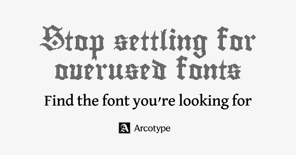
Stop settling for overused fonts
Visual font discovery for designers. Explore fonts by similarity, vibe, use case, and popularity.
Typothèque Esa le Septantecinq - home -
La typothèque de l’ESA le 75 collecte une série de caractères typographiques libres et gratuits créés par les étudiant·es de l’orientation Graphisme. Chaque année, les BAC 2 s’initient à la création de caractères dans le cadre d’une semaine de workshop animée par Flore Van Ryn et un·e intervenant·e invité·e (Structure Baton, Antoine Gelgon, Étienne Ozeray, Laurent Müller, Mariel Niels). Depuis 2015, les invité·es proposent différentes approches de la lettre dont la diversité des formes de cette typothèque témoigne. Les glyphes sont dessinés collectivement en dehors des éditeurs de fontes avant d’être finalement rassemblés manuellement dans FontForge pour générer les polices. D’autres caractères alimentent cette collection, dessinés cette fois individuellement par des étudiant·es de BAC 3 dans le cadre de leur travail de fin d’étude. Si vous faites usage de ces fontes, merci de créditer les dessinateur·ices et la typothèque afin de les relier au contexte pédagogique de leur création-diffusion. École Supérieure des Arts de l'image le 75 www.leseptantecinq.be
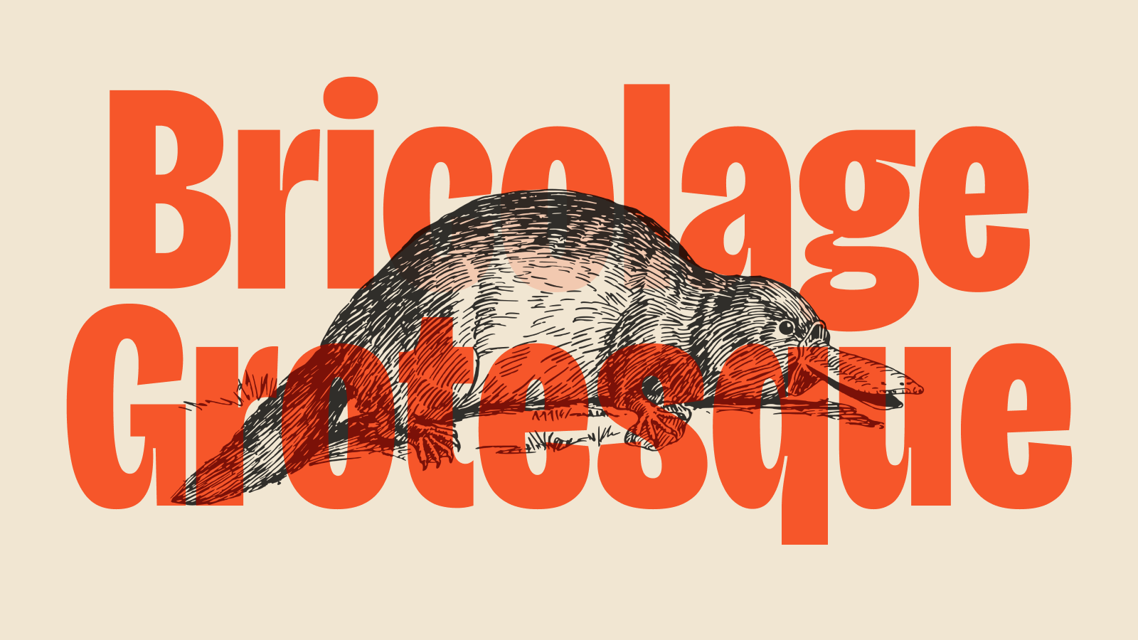
Bricolage Grotesque — Free & Open Source Variable Font
An expressive variable font that blends iconic French and British designs across three axes: weight, width, and optical size. It visually expresses what it feels like when you cannot be what you were and yet you can never truly be anybody else.

Stefan Judis

Well... 🫣 Today I learned there's a CSS `zoom` property that scales an element's visual appearance and (!) layout. I can't be the only one hearing about this for the first time, right? stefanjudis.com/today-i-learned/css-zoom-to-s…
Esoteric Fonts

Arbitrary code can run inside a font, what was a power given to compute the complex layout of characters, can be repurposed for esoteric and even practical purposes. This collection reflects the esoteric fonts people have created and the ways to make them.
propublica/weepeople
StateFace
Hexagone · eieio.games
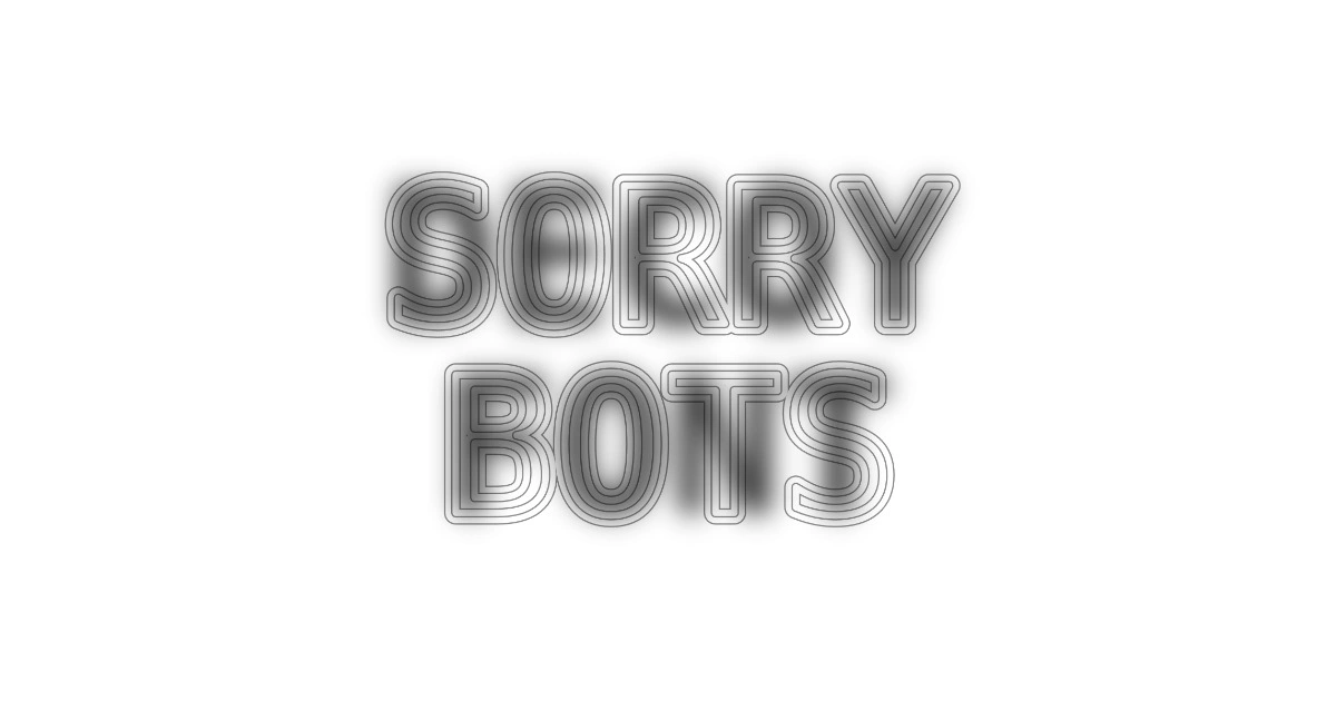
Decoy Font: A TTF font that hides what you type
Shader Color

I made a typeface, it's called Flexflex 🔠 I've been working on this project on-and-off for many months. Very happy to finally release it…
