

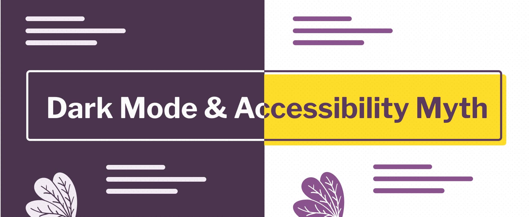
Dark mode isn't always better for accessibility, you need to let users chose. And if you build a dark theme, make it accessible!
prefers-color-scheme: Hello darkness, my old friend | Articles | web.dev
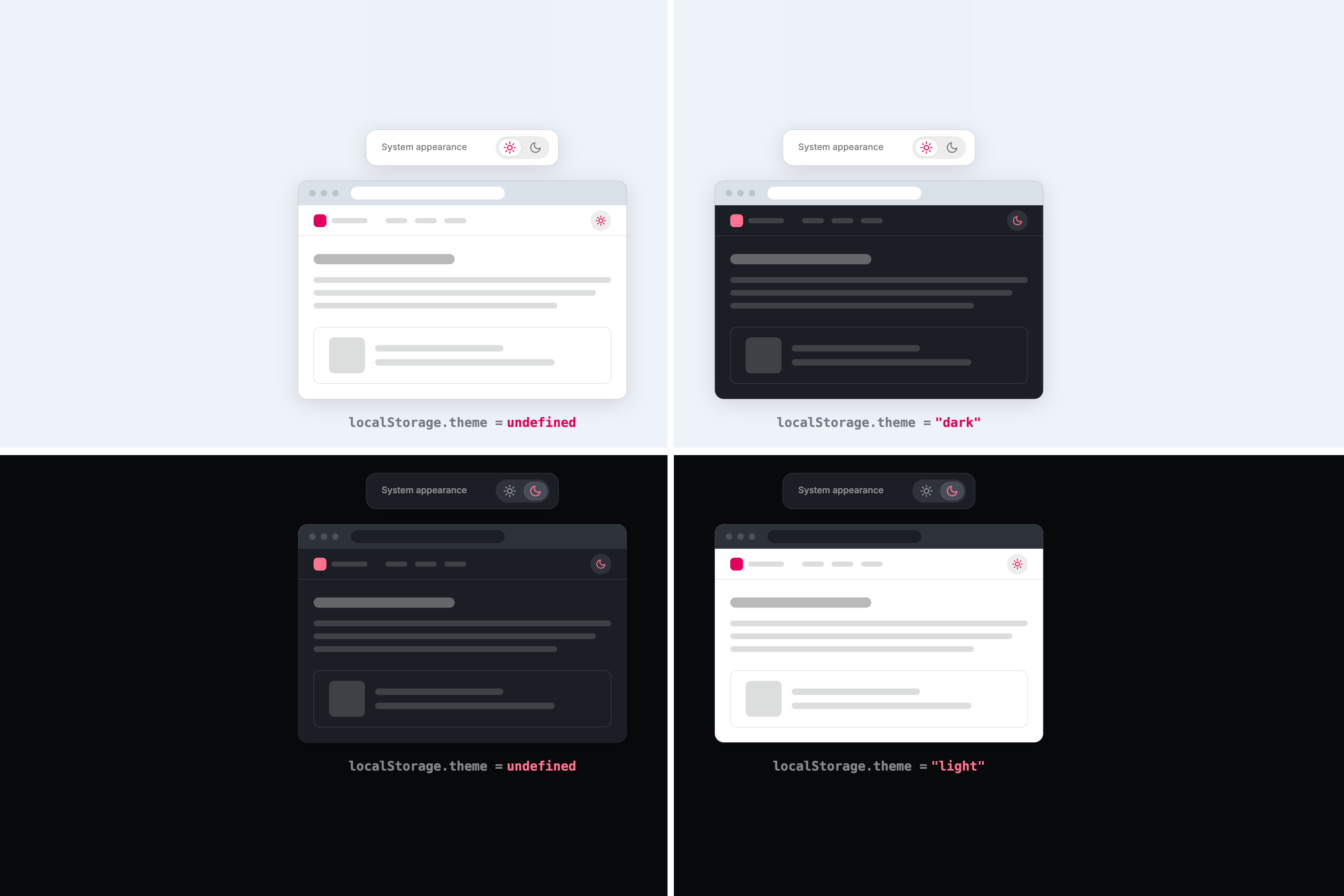
Many devices now support an operating system wide dark mode or dark theme experience. This post explains how dark mode can be supported on web pages, lists best practices, and introduces a custom element named dark-mode-toggle that allows web developers to offer users a way to override their operating system level preference on specific web pages.
Dark mode with web standards
Implementing dark mode with minimal JavaScript and standard CSS
Modern Purple - Kagi Search Theme
A simple black and purple theme that aims for minimalism and readibility. THIS THEME ONLY WORKS CORRECTLY IN DARK MODE!

The Dark Mode Toggle Discourse
How the dark mode toggle discourse unfolded One designer's argument against the classic light/dark/system three-way switch turned into weeks of blog rebuttals, parody posts, and "do you even need a toggle at all?" takes. The timeline Aug 1…
OS X Aqua - Kagi Search Theme
A custom theme that's inspired by old school Apple's OS X Aqua theme. Has both Dark and Light mode that changes based on your system settings. ** [Github repo](https://github.com/Visnes/kagi-aqua/) ** Do the following: Go to Appearance → Change theme to "Default", not "Light" or "Dark" → Enable Custom CSS & Paste custom.css → Save changes
Aesthetics Wiki | Fandom
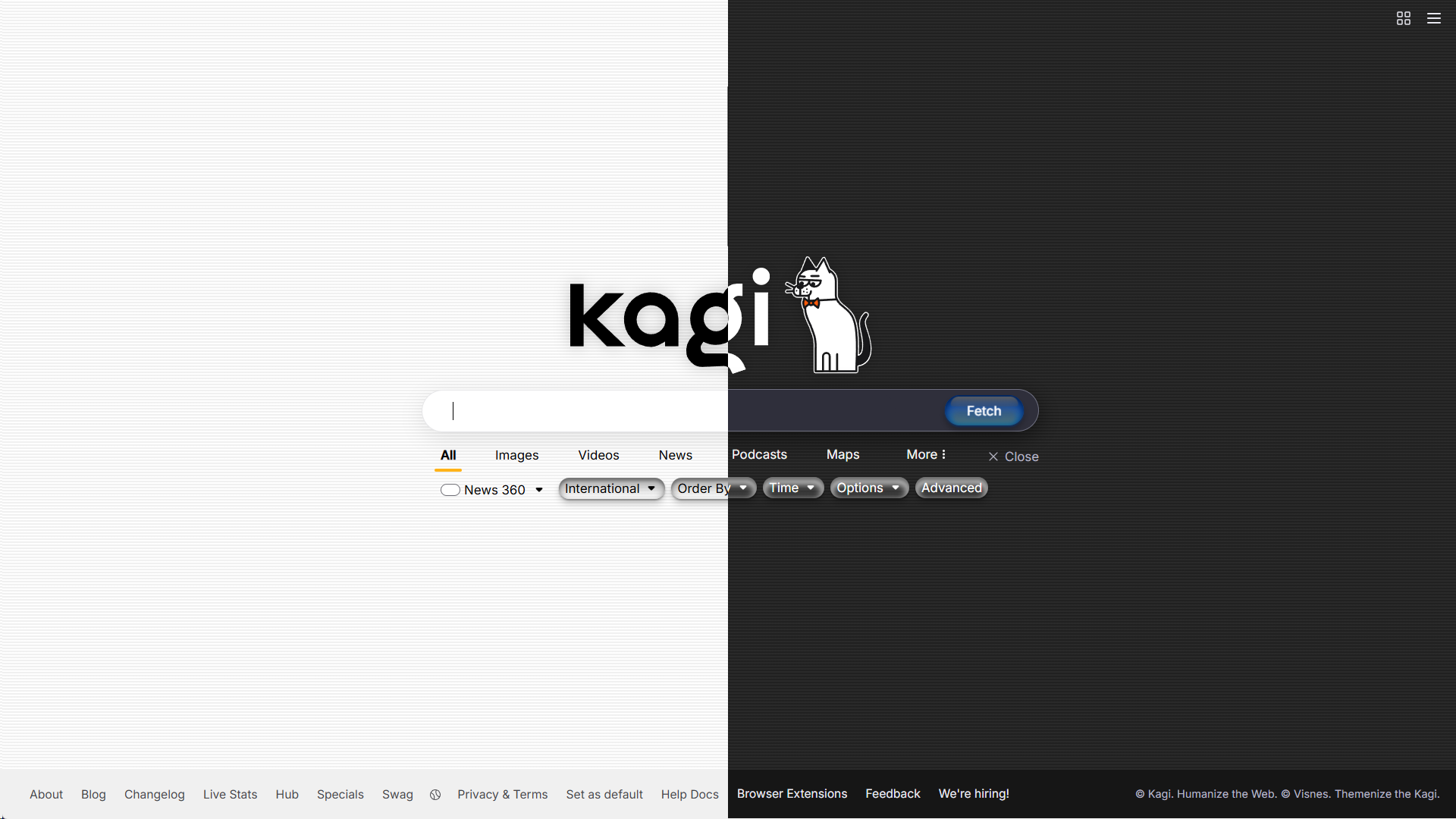
Thank you to the winner of our redesign contest, Ethan Duke! The background and wordmark are both his work. You can check him out on both Instagram and Twitter at @theduke2442! The dark mode was designed by Gwenanenn.

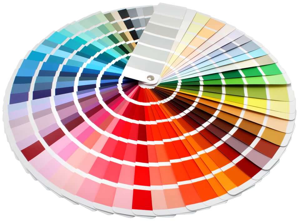
Accessible Color Choices Are About So Much More Than Just Contrast - Sheri Byrne-Haber's Blog
Learn more about disability and accessibility in the business and educational settings from the expert in the field - Sheri Byrne Haber.
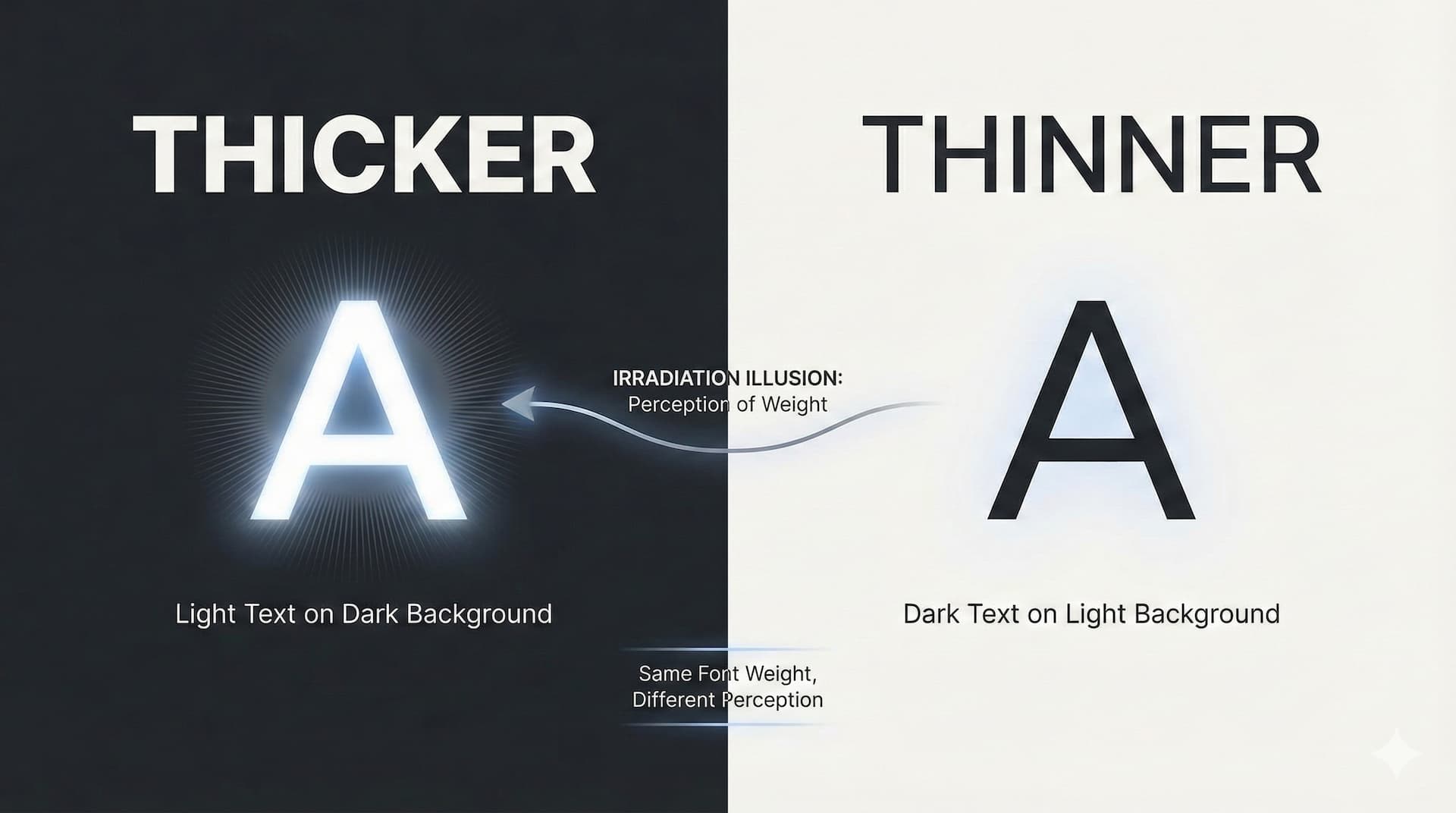
Using CSS to fix the irradiation illusion · November 29, 2025
How to adjust perceived font weight in dark mode without layout shift
Dark Patterns Won - Ron Bronson
Many moons ago, I used to post a lot on Twitter about so-called deceptive design/dark patterns that proliferate consumer UIs. There were sites
Dark mode toggles: two states are enough • Lea Verou
Yes, the underlying model must have three states, but one is always irrelevant to the actual user goal. Users do not seek out solutions to problems they don’t currently have. A lot of the hate towards two-state toggles is based on poor implementations.
Six ‘dark patterns’ used to manipulate you when shopping online
Online shopping offers unparalleled convenience, but also poses significant risks due to manipulative design practices known as ‘dark patterns’. These tactics subtly influence consumer behaviour, often leading to unintended purchases or compromising consumer privacy. Here are six dark patterns to watch out for next time you are shopping online.

Solar Eclipse Toggle (a dark/light mode toggle Web Component)—zachleat.com
A post by Zach Leatherman (zachleat)
lukeslp/awesome-accessibility
Curated list of accessibility resources, tools, and best practices for creating inclusive digital experiences
New features on lichen.wiki !! v0.4.1 - new dark mode!! - improving load performance As wiki owner, you can now choose a custom theme for your wiki independent of the app (currently only light or dark lichen palette, but more themes are coming) More to come!! tangled.org/juprodh.me/lichen.wiki/
