The Impact Map provides timely data on policy, funding, and workforce changes and their localized effect.
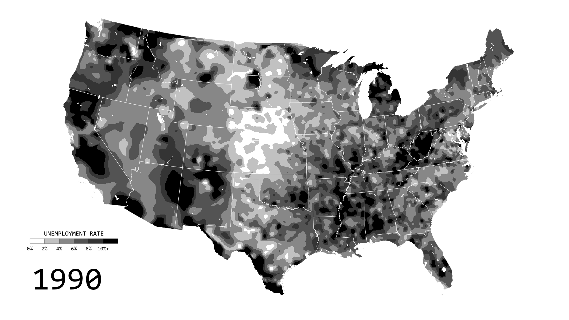
Unemployment in America, Mapped Over Time
Watch the regional changes across the country from 1990 to 2016.
Impact Dashboard - Impact Counter | Impact Counter
Visualize the human impact of funding changes for aid and support organizations.

US Domestic Policy Dashboard - Impact Counter | Impact Counter
Explore US domestic policies and their impact on public health across all branches of government.
Immigration Enforcement in Los Angeles Under the Second Trump Administration – Deportation Data Project
We rely on our online visual tools to create this report, which means that you can click on any one of the figures and adjust time periods, breakouts, and other aspects to dig into the data in more detail. You can also swap out the Los Angeles ICE area of responsibility for another region to reproduce these figures for your own area of interest.
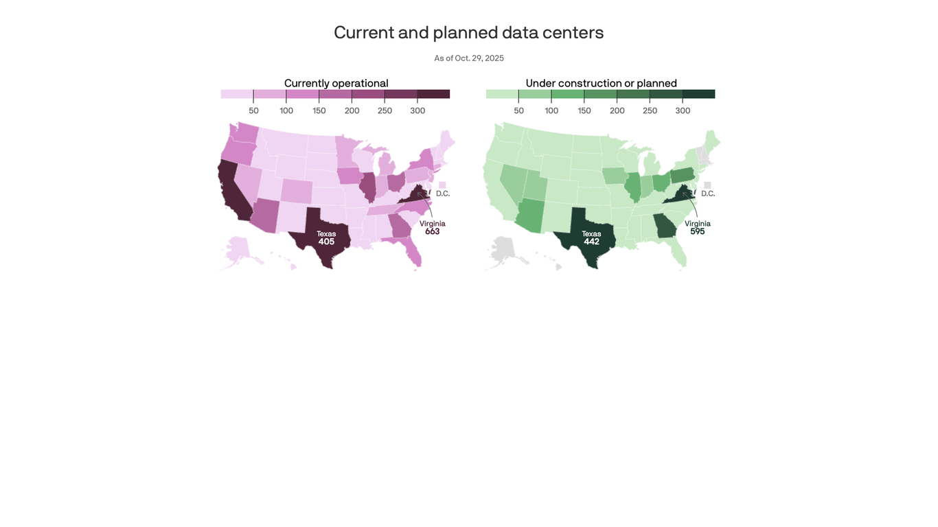
America's data center growth hot spots, mapped
Virginia and Texas lead the way, but they're becoming a major political fight.
Iran Conflict Damage Proxy Map
Wardley map
A Wardley map is a map for business strategy.[1] Components are positioned within a value chain and anchored by the user need, with movement described by an evolution axis.[2] Wardley maps are named after Simon Wardley who created the technique at Fotango in 2005 having created the evolutionary framing the previous year.[3][4] The technique was further developed within Canonical UK between 2008 and 2010[5][independent source needed] and components of mapping can be found in the "Better for Less" paper published in 2010.[6]

OldMapsOnline
The easy-to-use getaway to historical maps in libraries around the world.

Are AI data centers coming to your area?
This free, crowd-sourced tracker website is one of the most comprehensive attempts we’ve seen to keep tabs on where new data centers are being proposed. Maps are currently available across 18 states, with data compiled from public sources. You can read about the Data Center Proposal Tracker creator’s methodology here. [Image: Here’s a screenshot from the tracker showing sites around NYC. https://platform.theverge.com/wp-content/uploads/sites/2/2026/04/Screenshot-2026-04-16-100907.jpg?quality=90&strip=all]


ATScience Ecosystem Map
An interactive map of research applications, infrastructure and communities built on AT Protocol.

Home - Overture Maps Foundation
A platform for bringing together tech companies, mapping organizations, government agencies, open data communities, and researchers to build open, reliable, and interoperable map data infrastructure.

On power, aesthetics, materiality and change in data visualization
Notes from the Information+ Conference at MIT/Northeastern University, Boston.