


Looking at the first principles of icon design—and how Apple failed to apply all of them in macOS Tahoe
Something’s Rotten in the State of macOS Icon Design
Writing about the big beautiful mess that is making things for the world wide web.


Parakeet Blog: The Shape of Apps
While icons on iOS (formerly iPhoneOS) have always been rounded squares, and rounded-square icons have existed on Apple platforms for over 20 years now, Mac app icons have historically exhibited a variety of unique silhouettes, which helped identification alongside other visual tools like color, lighting, and dimensionality.
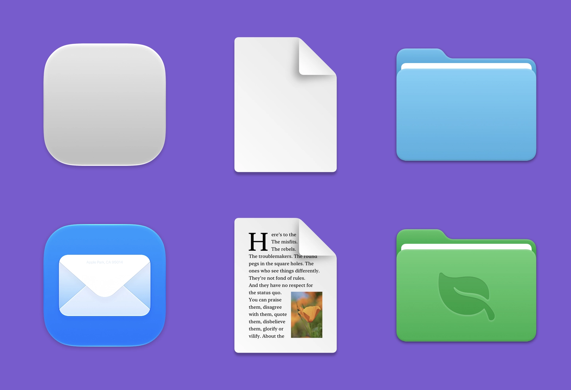
Apple Design Resources
Design apps accurately and quickly using official Apple design templates, icon production templates, color guides, and more.
Why Apple and Google are struggling to design simple software
Is Apple losing its crown as the champion of simplicity? Maybe. But for a very good reason.
Phosphor Icons
A flexible icon family for interfaces, diagrams, presentations — whatever, really.
The making of a product icon | Figma Blog
Product Designer Tim Van Damme shares his thoughtful approach to Figma icon design and the creative exploration that shapes each final result.

Logos are Dead
A logo isn’t a strategy. We see many brands obsessing over a symbol while ignoring how they actually talk, feel, or connect. A logo is just the “period” at the end of the sentence. The real work is the sentence itself: your voice, your values, and the experience. Logos are
The Making of Cursor's Icons
A year of drawing, testing, and shipping a complete icon system for the world's favourite coding agent.
Physicality: the new age of UI
There’s a lot of rumors of a big impending UI redesign from Apple. Let’s imagine what’s (or what could be) next for the design of iPhones, Macs and iPads.
Delivering Octicons with SVG
GitHub.com no longer delivers its icons via icon font. Instead, we’ve replaced all the Octicons throughout our codebase with SVG alternatives. While the changes are mostly under-the-hood, you’ll immediately feel…
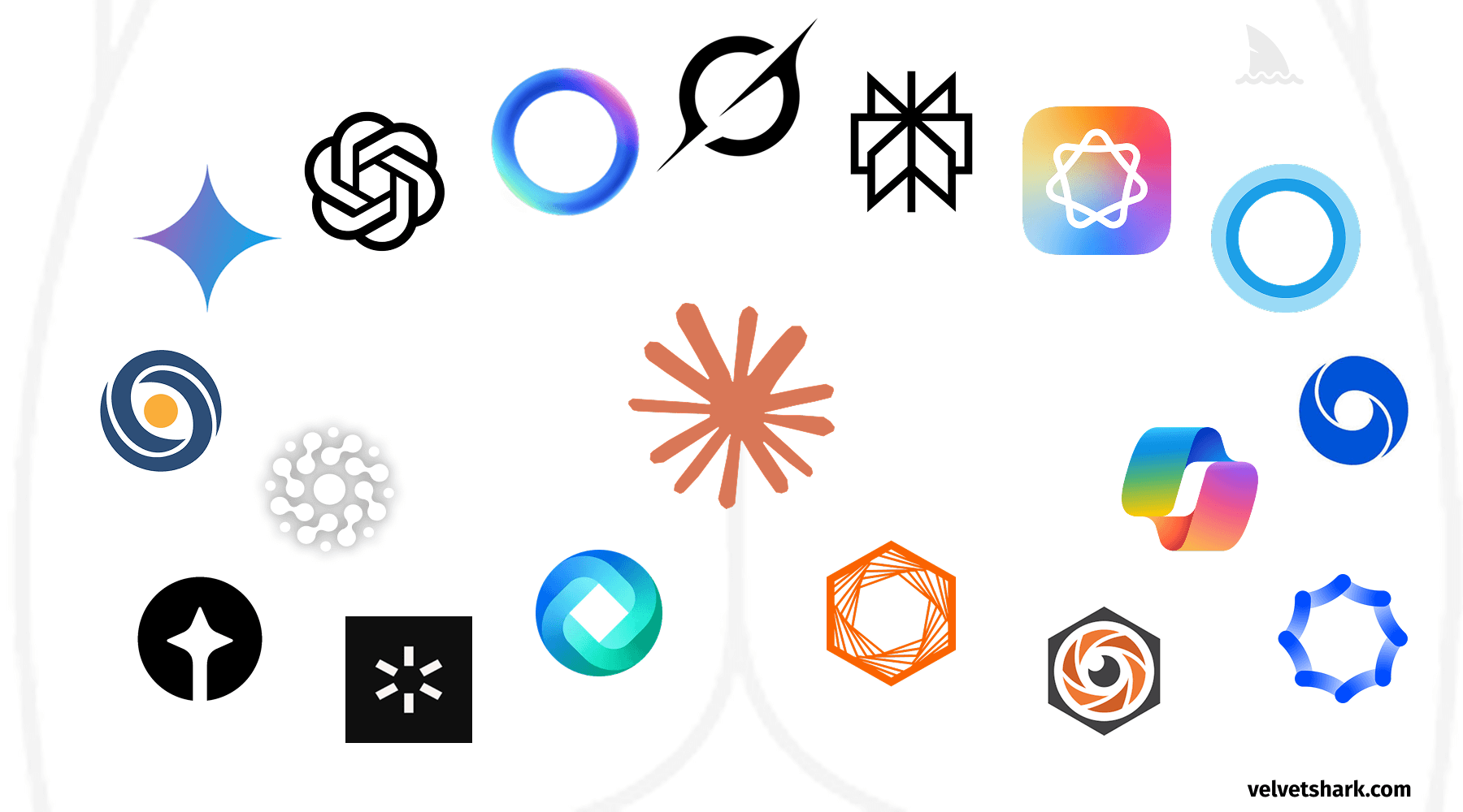
Why do AI company logos look like buttholes?
A humorous exploration of the uncanny resemblance between AI company logos and human anatomy. Discover why circular, gradient-based designs dominate the AI industry, and what this design convergence tells us about branding in tech.
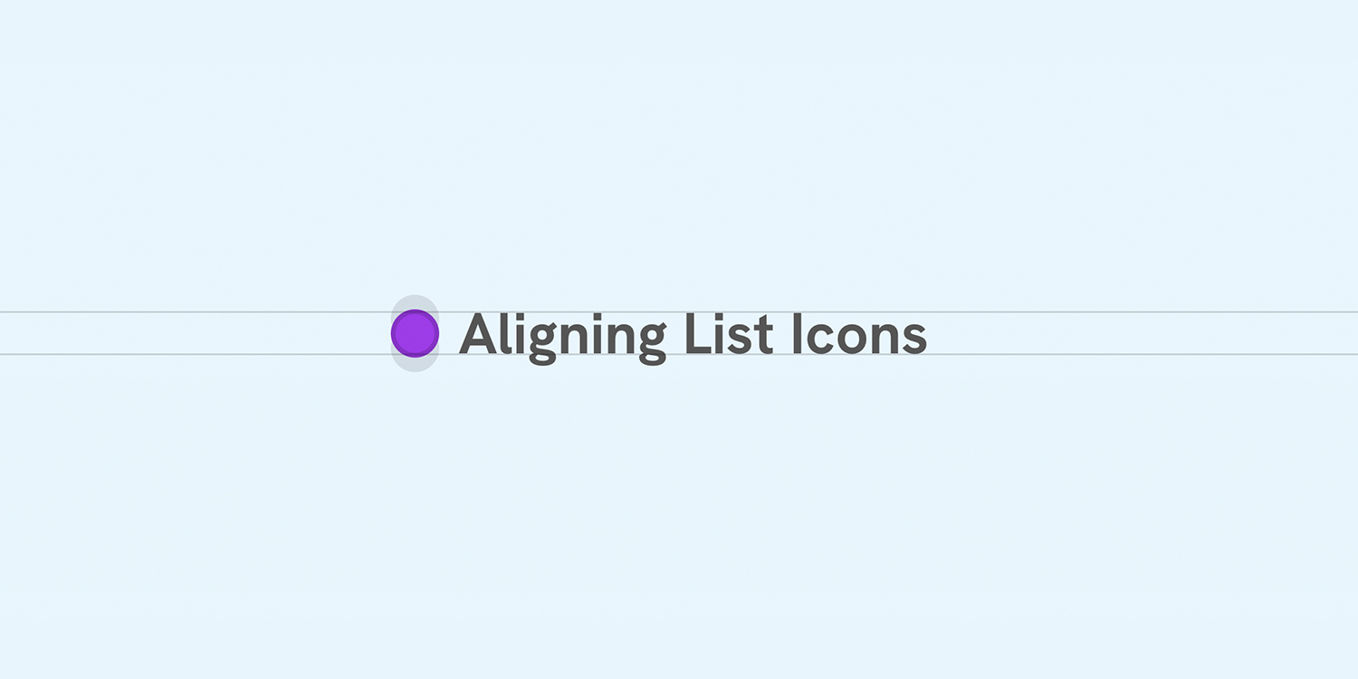
Better Icon and Label Alignment
There is a common design pattern that sometimes gets missed or overlooked. It’s having a list of items, each with an icon. When the text is one line, the icon is centered, but when the text has multiple lines, the icon is still centered but looks odd.
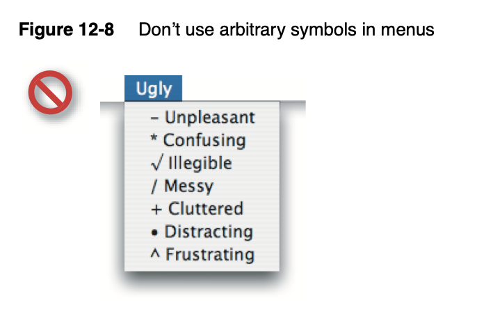
Icons in Menus Everywhere — Send Help
Writing about the big beautiful mess that is making things for the world wide web.
Permacomputing as a practice for digital Graphic Design
This project explores the application of Permacomputing principles in graphic design. Permacomputing represents a concept and community dedicated to promoting a more sustainable use of computer and network technology. The design principles of permacomputing, their origins and significance serve as a practical theoretical framework.