

Design a modular type scale, preview it live, and copy production-ready CSS with optional fluid typography.
Schalk Neethling (@schalkneethling.com)
A little tool that came out of my article on @function, type scales, and fluid typography. typo.schalkneethling.com https://typo.schalkneethling.com
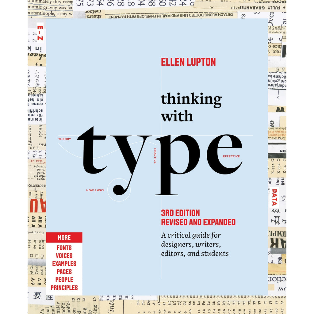
Thinking with Type
The essential and bestselling guide to typography from beloved design educator Ellen Lupton—revised and expanded to include new and additional voices, examples, and principles, and a wider array of typefaces. "Thinking with Type is to typography what Stephen Hawking's A Brief History of Time is to physics."—I Love TypographyThe bestselling Thinking with Type in a revised and expanded third edition: This is the definitive guide to using typography in visual communication. Covering the essentials of typography, this book explores everything from typefaces and type families to kerning and tracking to grids and layout principles.Ellen Lupton provides clear and focused guidance on how letters, words, and paragraphs should be aligned, spaced, ordered, and shaped. Historical and contemporary examples of graphic design show how to learn the rules and how to break them. Critical essays, eye-opening diagrams, helpful exercises, and dozens of examples and illustrations show readers how to be inventive within systems that inform and communicate.Featuring 32 pages of new content, the third edition is revised and refined from cover to cover: More fonts: old fonts, new fonts, weird fonts, libre fonts, Google fonts, Adobe fonts, fonts from independent foundries, and fonts and lettering by women and BIPOC designersIntroductions to diverse writing systems, contributed by expert typographers from around the worldDemonstrations of basic design principles, such as visual balance, Gestalt grouping, and responsive layoutCurrent approaches to typeface design, including variable fonts and optical sizes; tips for readability, legibility, and accessibility; and stunning reproductions from the Letterform Archive Thinking with Type is the typography book for everyone: designers, writers, editors, students, anyone who works with words on page or screen, and enthusiasts of type and lettering. Readers will also love Ellen Lupton's book Extra Bold: A Feminist, Inclusive, Anti-racist, Nonbinary Field Guide for Graphic Designers. Ellen Lupton is a designer, writer, and educator. She has written numerous books about graphic design, including Thinking with Type, Graphic Design Thinking, and Extra Bold: A Feminist, Inclusive, Anti-racist, Nonbinary Field Guide for Graphic Designers. She teaches in the Graphic Design MFA program at Maryland Institute College of Art in Baltimore (MICA), where she proudly serves as the Betty Cooke and William O. Steinmetz Design Chair. She is Curator Emerita at Cooper Hewitt, Smithsonian Design Museum in New York City, where her exhibitions included Herbert Bayer: Bauhaus Master and The Senses: Design Beyond Vision. Lupton loves reading, writing, teaching, and learning new things about design.
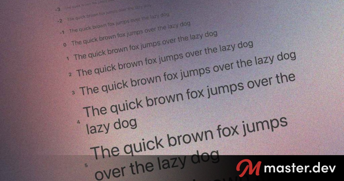
The typographic scale
The typographic scale has been used for centuries to choose harmonious font sizes. It has been likened to a harmonious musical scale. But there are *flaws* in those historical values.

Fluid Typography with progress()
With the `progress()` function in CSS we've got a new way to calculate the size for type based on the viewport without problems of the past.
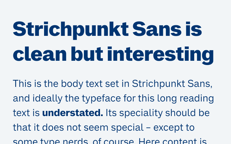
Strichpunkt Sans
A free sans-serif in three widths that’s clean, very legible in small text, but still interesting and versatile enough for display use.
Sound & Vision
Explore the future of type with the Re:Vision 2025 typographic playground—an interactive showcase of emerging type trends. Dive in and shape the next wave of visual language.

Kaan by Astro
Svelte has this awesome built in styling capability but Tailwind will have you mostly ignore it, since “no custom CSS” while using it is a virtue. The best practice for production builds is a regexp based pass over generated content that is completely outside of the Svelte build process. It may seem conceptually awkward but I actually think they go well together if you use them in a certain way, a way that may be different that what you’ve seen before.
Fonts In Use
A searchable archive of typographic design, indexed by typeface, format, and topic.
Typst: a possible LaTeX replacement
Typst is a program for document typesetting. It is especially well-suited to technical material [...]
Revealing Text With CSS letter-spacing | CSS-Tricks
Until we get something like ::nth-letter, there are still some really cool text effects we can make from existing CSS features, like letter-spacing, ::first-word and ::first-line.
una.im | Modern CSS theming with light-dark(), contrast-color(), and style queries
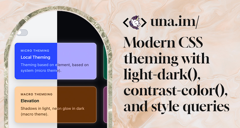
Combine three new CSS features to build fully adaptive themed components.
Typst: The new foundation for documents
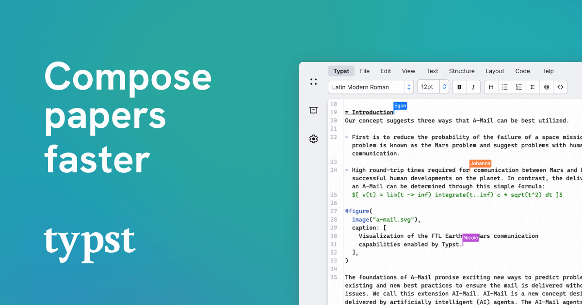
Typst is the new foundation for documents. Sign up now and experience limitless power to write, create, and automate anything that you can fit on a page.
Modern CSS snippets. Every old hack, replaced.
Side-by-side comparisons of outdated CSS techniques and their modern native replacements. Grid, custom properties, nesting, container queries, and more.
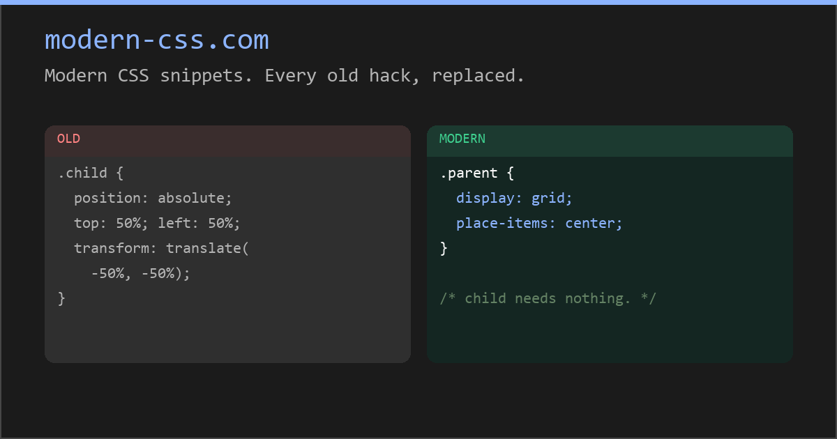
Modern CSS snippets. Every old hack, replaced.
Side-by-side comparisons of outdated CSS techniques and their modern native replacements. Grid, custom properties, nesting, container queries, and more.
