

Jokes about aligning divs will not be tolerated.
Styling Tables the Modern CSS Way
Modern CSS makes styling HTML tables in a considered, responsive nature a breeze. Michelle Barker breaks it all down for you in this deep dive.
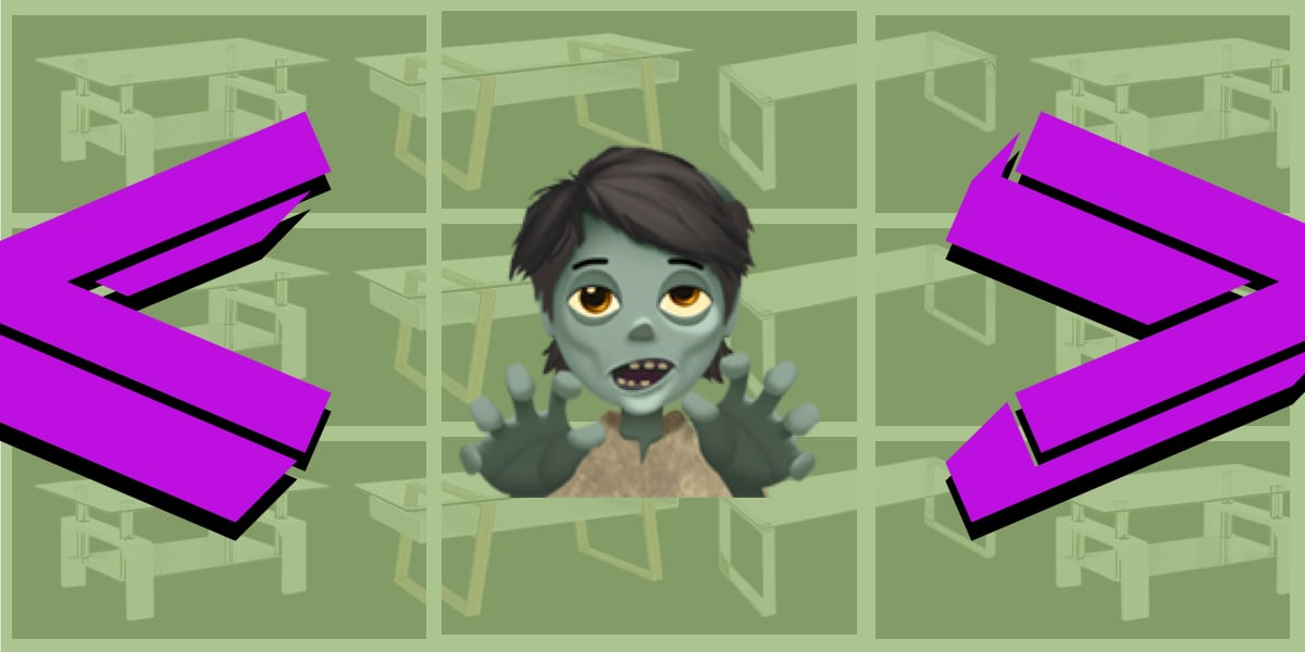
The Frankenstein Table | CSS-Tricks
A super scary way to go about tables using other layout techniques, like CSS Grid.
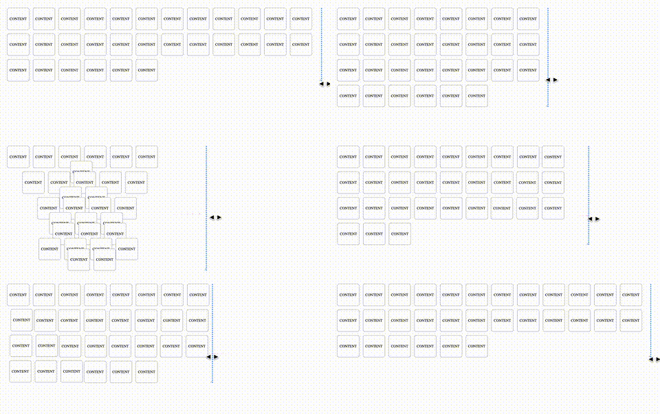
Multiple-column layout, rows, rules, and floats
Recently implemented in Chrome are two of my top asks for CSS—the concept of rows in multiple-column layout, and gap decorations for rows and columns in grid, flexbox, and multicol. Rows (using column-wrap) provide a way to use multicol on the web without risking scrolling up and down to read if the columns become taller than the viewport. Gap decorations mean that, for multicol, you can now add a rule between these new rows. This post is a collection of the things I think would be interesting to do in future. If you think so too, and particularly if you have a great use case for any of these, let me know in the comments.
Relearn CSS layout
If you find yourself wrestling with CSS layout, it’s likely you’re making decisions for browsers they should be making themselves.
Modern CSS snippets. Every old hack, replaced.
Side-by-side comparisons of outdated CSS techniques and their modern native replacements. Grid, custom properties, nesting, container queries, and more.
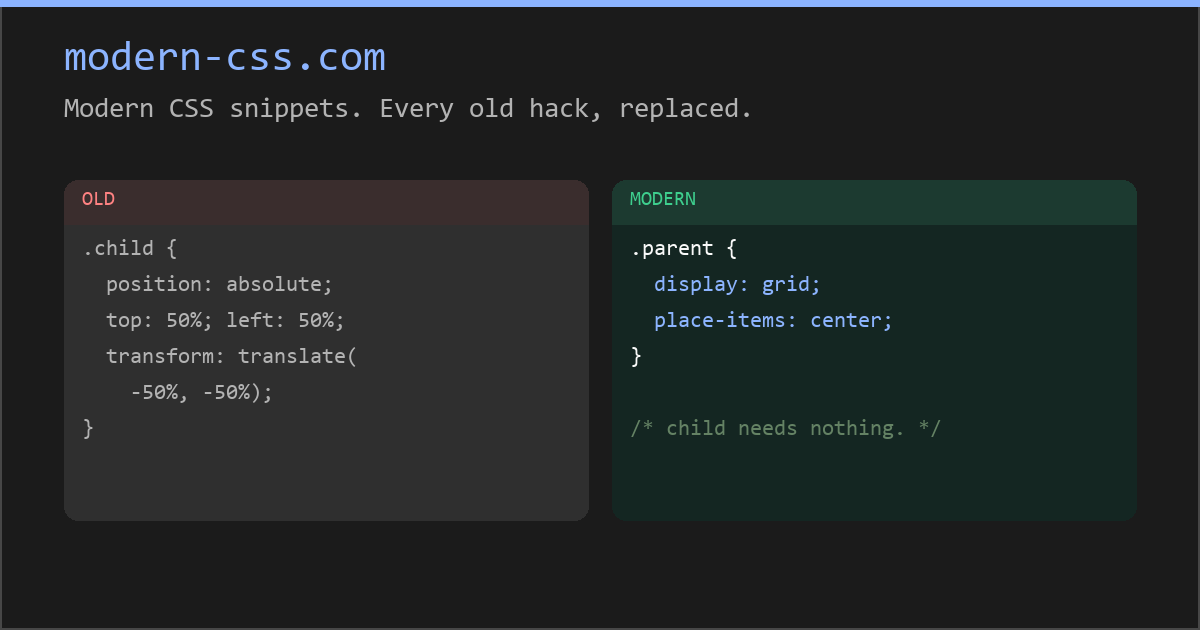
Modern CSS snippets. Every old hack, replaced.
Side-by-side comparisons of outdated CSS techniques and their modern native replacements. Grid, custom properties, nesting, container queries, and more.
Stop Treating CSS Container Queries Like Traditional Media Queries — Smashing Magazine
Despite broad browser support, container queries remain surprisingly underused and frequently misunderstood. Let’s look at how they differ from media queries, when to reach for each, and how container queries help reusable components respond naturally to the contexts in which they appear. - CSS - Tools - Techniques
CSS-Tricks has a new owner! | CSS-Tricks
Yes, I've got the keys to the castle, so to speak. And, even after 12 years of working on the site, I'll admit I'm a little overwhelmed and nervous about that.

CSS Anchor Positioning Guide | CSS-Tricks
Learn about CSS Anchor Positioning, including its syntax, properties, how it is used to position one element next to another, and even how it's used to resize elements relative to other elements.

The State of CSS 2020: Conclusion
The annual survey about the latest trends in CSS.
Making features generic in CSS
CSS has two new positional alignment keywords as part of CSS Box Alignment Level 3: flow-start and flow-end. These are defined as aliases for the existing flex-start and flex-end keywords. Therefore, in a supporting browser, the following two lines should align flex items to the end of the flex container (the right assuming you are working in English).

CSS is filling the gaps with rules. A way to style gaps in grid and flex. | utilitybend
A practical walkthrough of CSS gap decorations: column-rule, row-rule, rule-break, rule-inset, rule-visibility-items, repeat(), and animation.
#10: "Bad at CSS" by Keith Cirkel
CSS Scroll Snap | 12 Days of Web
Tips, tricks and grab-n-go demos for elegant and well-orchestrated scroll experiences.

Animating CSS Grid Layouts with CSS Anchor Positioning
At CSS Day (back in June), someone asked me how Brave (the browser) might have built their New Tab Page which features some tiles laid out in a grid. While the grid is nothing spectacular, something special happens with it when you resize the viewport: as the available space changes, the grid nicely reorganizes itself in an animated way. The animations are also interruptible, so no View Transitions seem to be at play.So, how did they do it? I’m not sure. But if I were to recreate it, I’d use CSS Anchor Positioning with regular CSS Transitions on top.