

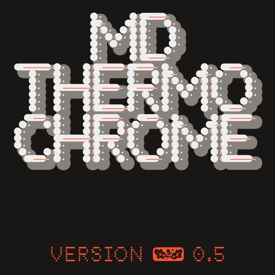
Our written world is made from little dots: little dots of ink from a printer; phosphors or pixels on a screen; blackened thermal paper on a sales receipt. MD Thermochrome is a typeface designed around little dots. It’s not a faithful mimicry of any single printing technique, but an allusion to several — the coarse grid of dot-matrix printers, the visible scanlines of CRT terminal fonts, the varying dot size of over- and under-inked documents from any number of technologies. Built on a consistent (but not quite square) grid, Thermochrome features five discrete italic angles (Upright, Italic, Inclined, Retalic, Reclined), eight weights, and over 100 icons and symbols.
Pure CSS halftone patterns: dots, lines, circles
A project overdue. As an 80's/90's kid, I was obsessed with printing technology - and especially halftone patterns. I've long theorized that these pat

mg¹² | atipo foundry
an independent digital typeface foundry and graphic design studio

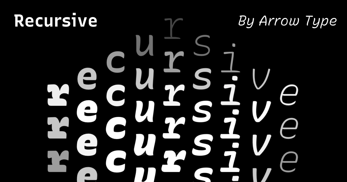
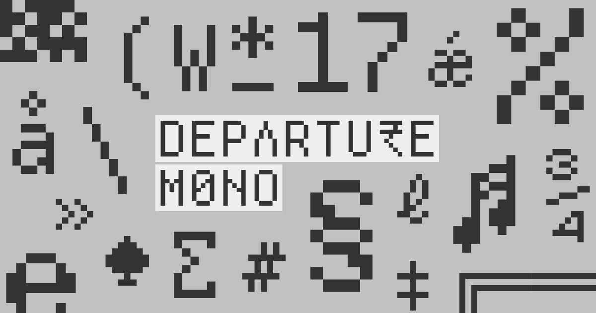

Open Foundry | Curated Fonts for Free
For over a decade, Open Foundry has been the leading curated source for open source typefaces, showcasing exceptional fonts, celebrating their makers and encouraging exploration.
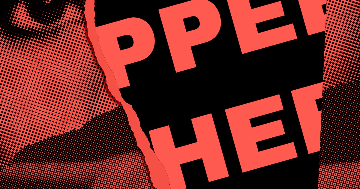
7 Awesome Free Comic Book Fonts for Commercial Use
Here's 7 of the Best Free Book Comic Fonts that You can use in Comic Books, Graphic Novels and Other Commercial Projects.

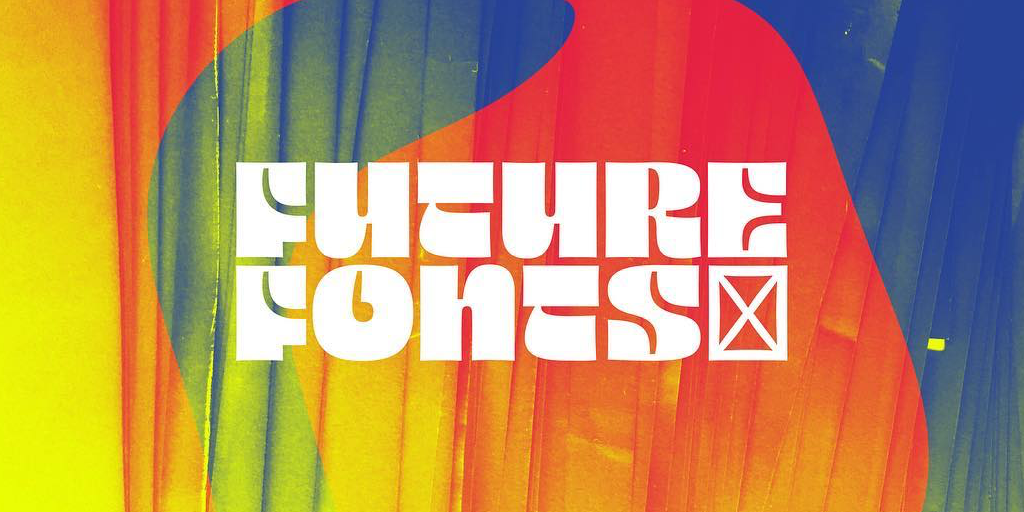
Fanette Mellier
Design graphique et objets imprimés / Graphic design and printed matter
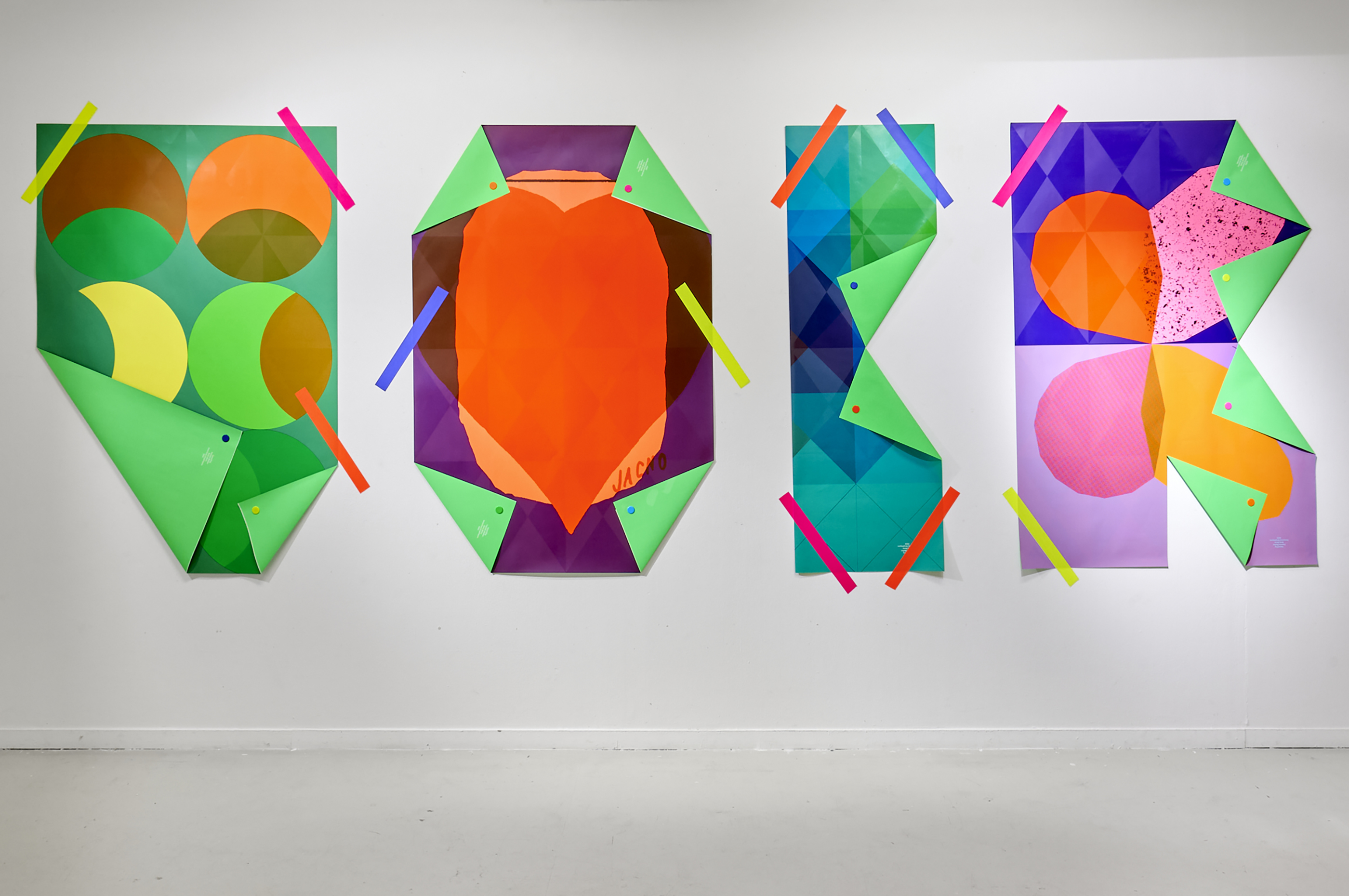
propublica/weepeople
A typeface of people sillhouettes, to make it easy to build web graphics featuring little people instead of dots.
StateFace
A font you can use in your web apps when you want tiny state shapes as a design element.
Fonts In Use
A searchable archive of typographic design, indexed by typeface, format, and topic.
Andy Matuschak on Twitter / X
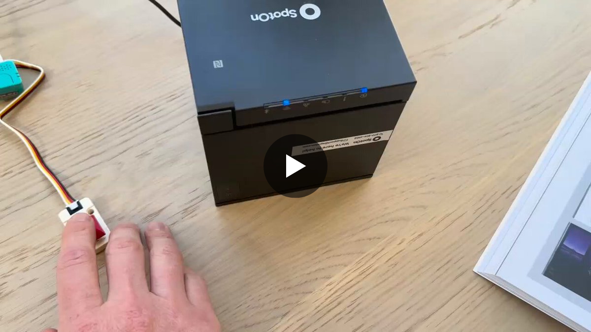
Made a Printer Friend which quickly transcribes speech onto little slips of paper. Nice for card sorts, quickly capturing open loops, discursive notes in books, etc.The speed of thermal printers and their auto-cutters is so satisfying! And dedicated mechanical key! Mm! pic.twitter.com/LDAXaD64go— Andy Matuschak (@andy_matuschak) September 25, 2026
coralscript
A writing system based on a hexagonal grid, where each letter is a tile filing the space.
Esoteric Fonts

Arbitrary code can run inside a font, what was a power given to compute the complex layout of characters, can be repurposed for esoteric and even practical purposes. This collection reflects the esoteric fonts people have created and the ways to make them.

Bastardica
coralscript
propublica/weepeople
StateFace
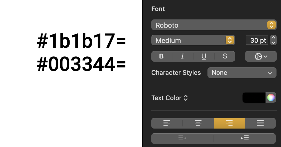
Hexagone · eieio.games
Decoy Font: A TTF font that hides what you type