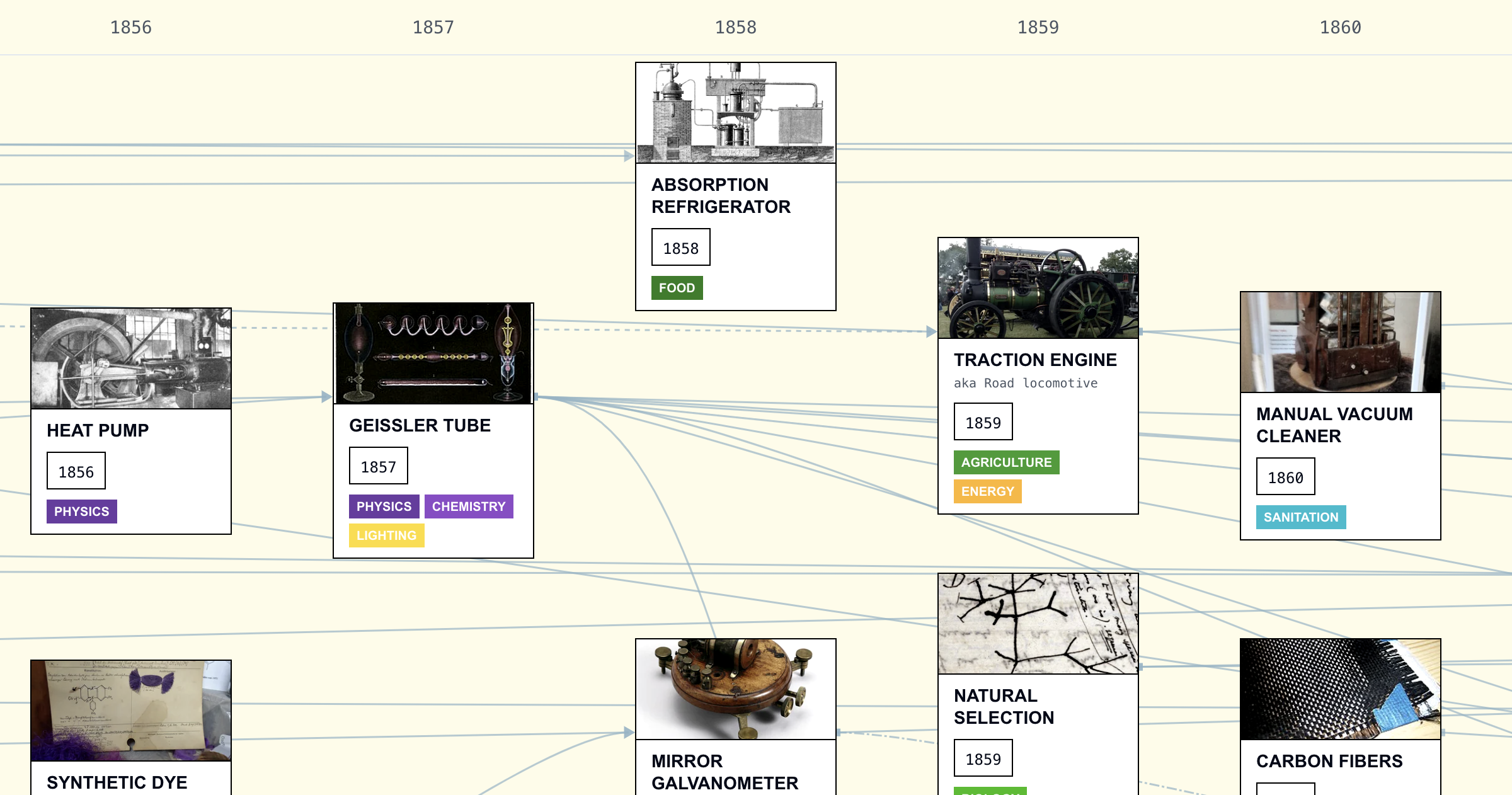
Interactive visualization of technological history
Calculating Empires: A Genealogy of Technology and Power since 1500
Explore how technical and social structures co-evolved over five centuries in this large-scale research visualization.
A simple way of visualizing git repository
Some time ago, a new colleague joined our department and started working on a platform we provide. During his initial days, I noticed he was using an interactive Python shell to create treemap visualizations of the project's git history.
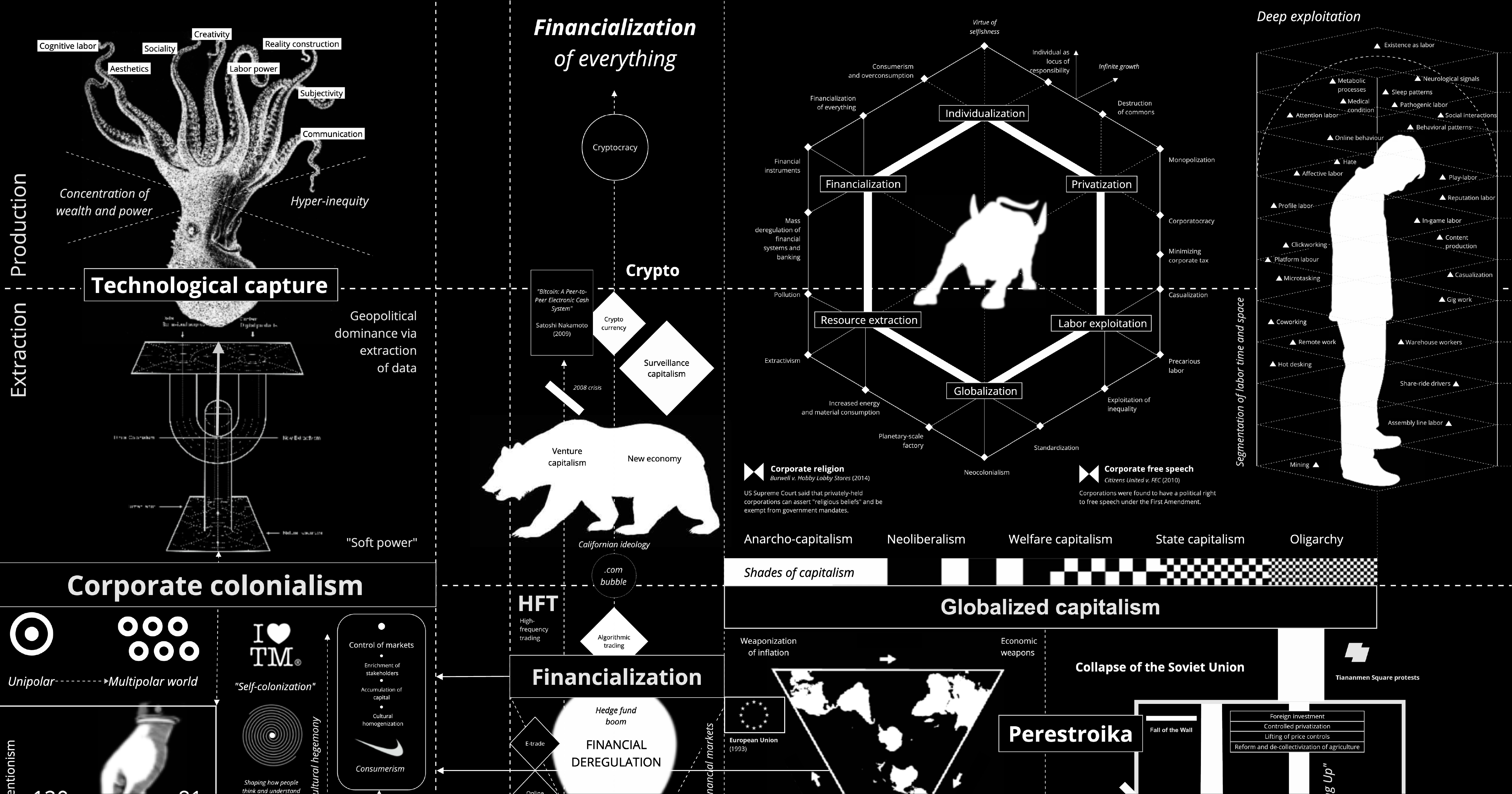
Capitalism Tech Stack Map — A Cross-Civilization Infographic (D3 Force)
A People’s History of Tech
A collective storytelling project to build a more representative history that reflects the human impacts of technology.

Invention & Discovery Cards
A Civilization-inspired tech tree but for the real life history of science and discovery. Inventions and discoveries presented in illustrated Magic-style cards.
On power, aesthetics, materiality and change in data visualization
Notes from the Information+ Conference at MIT/Northeastern University, Boston.
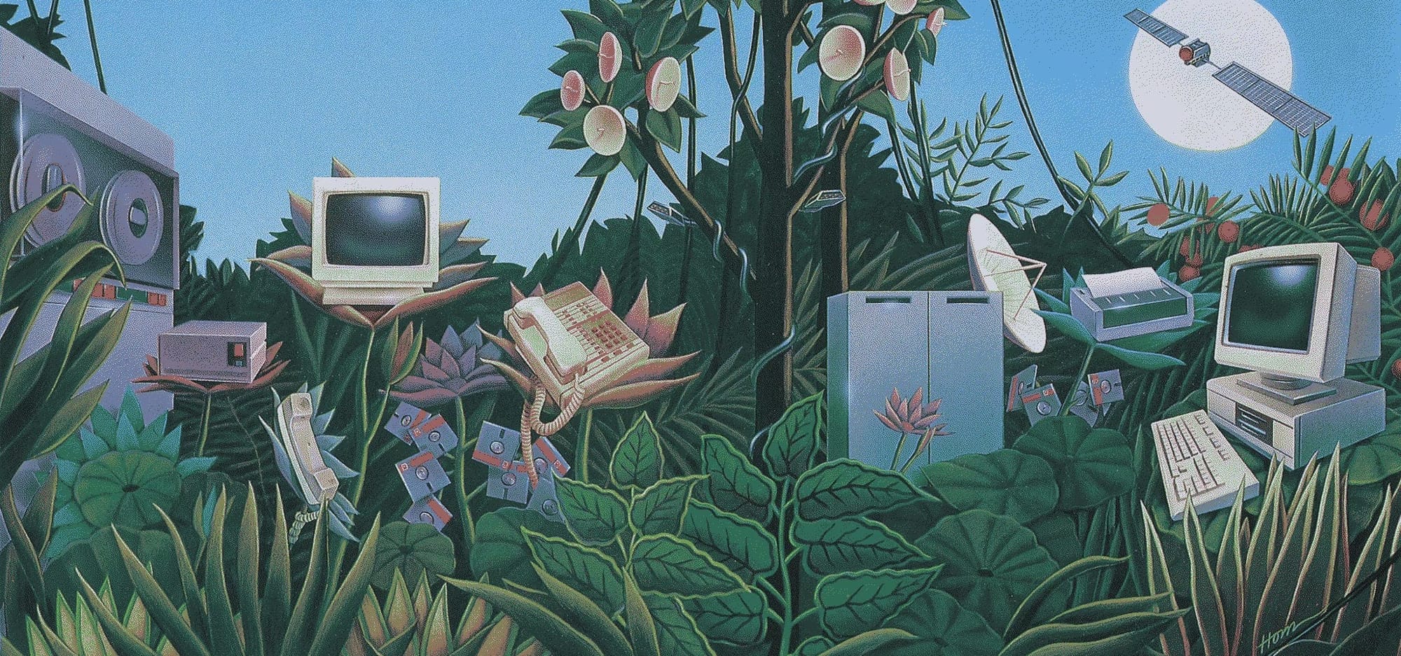
Computer Plant Life
"Thе Commodore РЕТ offers you а safe passage through the primeval swamр of computerization," says the ad copy accompanying this uncredited illustration in a June 1981 issue of Personal Computer World: That image and ad copy offers a perfect example of how most retro tech illustration works: Visualize the hell
Invention Cards 3.0: Stories
Last month, after a long hiatus, I showed invention.cards to a friend in SF and came away unsatisfied. Indeed, the work was not yet done . Three things drove this revision: It felt incomplete. The experience was built around T-shaped navigation, focusing on a specific card and showing only their ancestors and descendants. It was hard to see where you were in time, hard to feel the shape of history, and ultimately was far removed from the way a tech tree should feel . The connections matter more than the nodes. What's most interesting to me was not
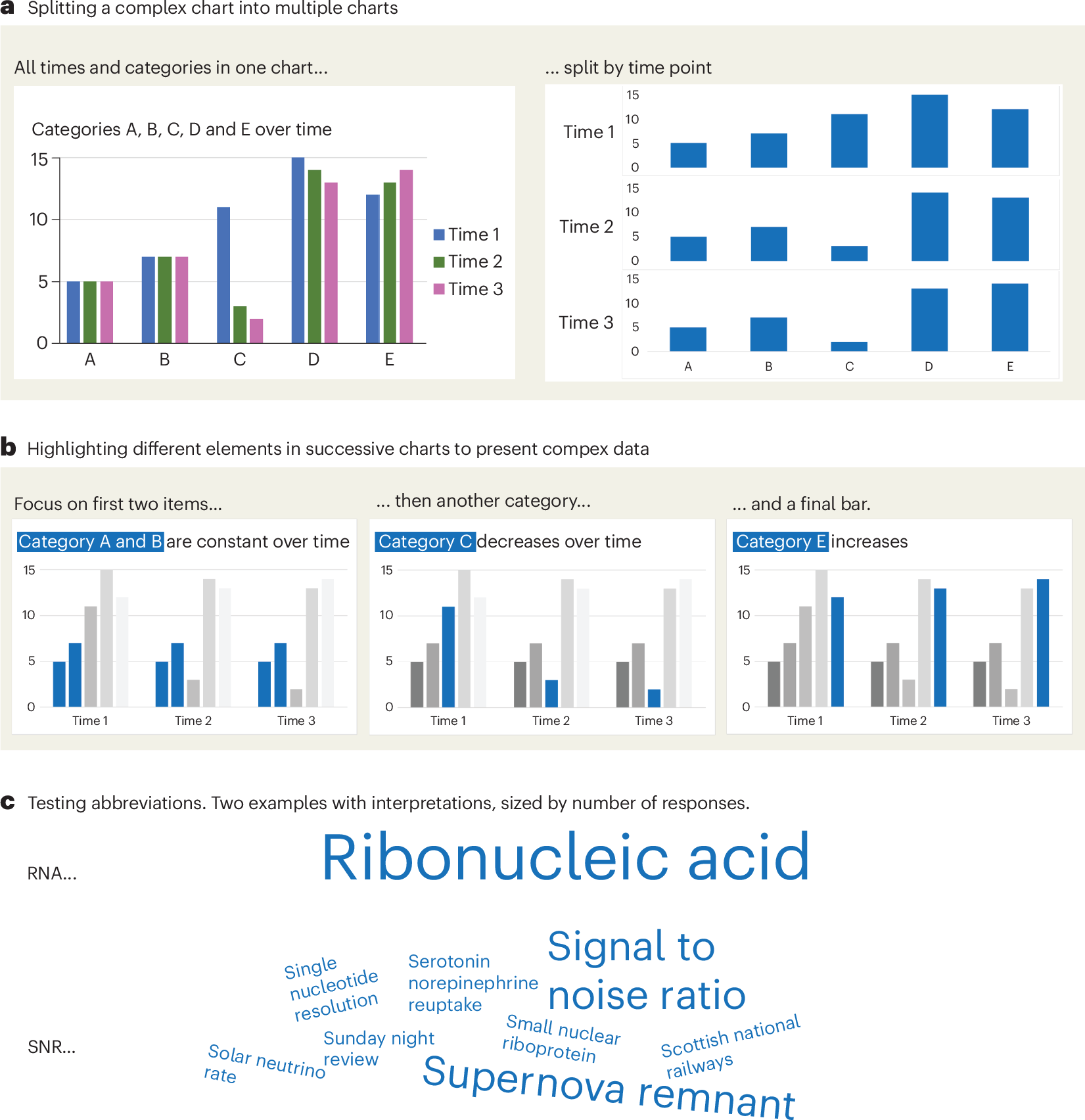
A checklist for designing and improving the visualization of scientific data
Creating clear and engaging scientific figures is crucial to communicate complex data. In this Comment, I condense principles from design, visual perception and data visualization research in a checklist that can help researchers to improve their data visualization, by focusing on clarity, accessibility and design best practices.
Cosmograph: Beautiful Visualization and Analytics | Cosmograph
Beautiful Visualization and Analytics

The 34th International Symposium on Graph Drawing and Network Visualization
The 34th International Symposium on Graph Drawing and Network Visualization will be held at Brock University in St. Catharines, Ontario, Canada from August 17-21, 2026. A PhD school will take place on August 17-18, 2026.

GitHub Star History
View and compare GitHub star history graph of open source projects.

On Close and Distant Reading in Digital Humanities: A Survey and Future Challenges
We present an overview of the last ten years of research on visualizations that support close and distant reading of textual data in the digital humanities. We look at various works published within both the visualization and digital humanities


15+ years later, Microsoft morged my diagram
How Microsoft continvoucly morged my Git branching diagram.