

Once a rarely used key on the typewriter, the graceful character has become the very symbol of modern electronic communication
A shell exclamation mark is not for yelling. Be lazy. | Filip Roséen - refp.se
Event designators have been hiding in not-so-plain-sight since the late 1970s — so powerful that forgetting might be part of a massive conspiracy to wear out developer keyboards faster than otherwise.
author's note and welcome
I didn’t mean to know about computers. I didn’t study them in school, though I enjoyed using the clackety-clack keys in grade nine keyboarding class. “Keyboa...
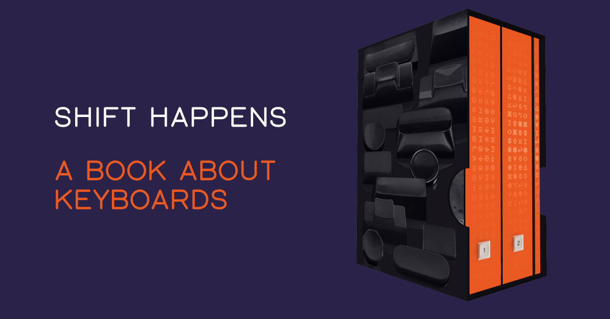
Shift Happens: A book about keyboards
Shift Happens tells the story of keyboards like no book ever before, covering 150 years from the early typewriters to the pixellated keyboards in our pockets.
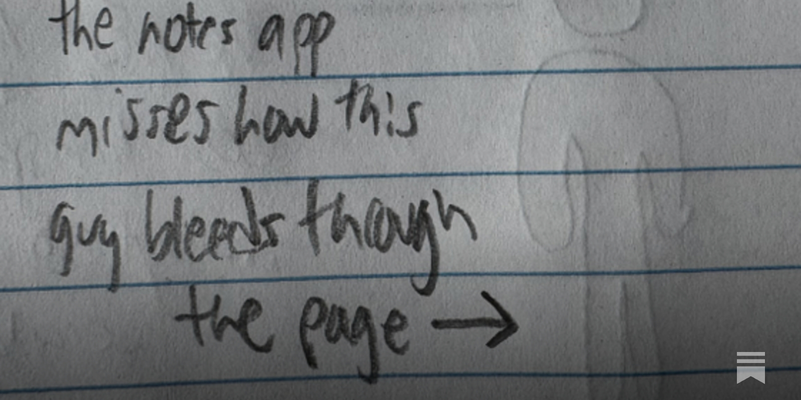
Stole this meme from pcmasterrace. Pretty relate-able.
655 votes, 41 comments. 1.4M subscribers in the MechanicalKeyboards community. /r/MechanicalKeyboards is about typing input devices for users of all…

Thinking with Type
The essential and bestselling guide to typography from beloved design educator Ellen Lupton—revised and expanded to include new and additional voices, examples, and principles, and a wider array of typefaces. "Thinking with Type is to typography what Stephen Hawking's A Brief History of Time is to physics."—I Love TypographyThe bestselling Thinking with Type in a revised and expanded third edition: This is the definitive guide to using typography in visual communication. Covering the essentials of typography, this book explores everything from typefaces and type families to kerning and tracking to grids and layout principles.Ellen Lupton provides clear and focused guidance on how letters, words, and paragraphs should be aligned, spaced, ordered, and shaped. Historical and contemporary examples of graphic design show how to learn the rules and how to break them. Critical essays, eye-opening diagrams, helpful exercises, and dozens of examples and illustrations show readers how to be inventive within systems that inform and communicate.Featuring 32 pages of new content, the third edition is revised and refined from cover to cover: More fonts: old fonts, new fonts, weird fonts, libre fonts, Google fonts, Adobe fonts, fonts from independent foundries, and fonts and lettering by women and BIPOC designersIntroductions to diverse writing systems, contributed by expert typographers from around the worldDemonstrations of basic design principles, such as visual balance, Gestalt grouping, and responsive layoutCurrent approaches to typeface design, including variable fonts and optical sizes; tips for readability, legibility, and accessibility; and stunning reproductions from the Letterform Archive Thinking with Type is the typography book for everyone: designers, writers, editors, students, anyone who works with words on page or screen, and enthusiasts of type and lettering. Readers will also love Ellen Lupton's book Extra Bold: A Feminist, Inclusive, Anti-racist, Nonbinary Field Guide for Graphic Designers. Ellen Lupton is a designer, writer, and educator. She has written numerous books about graphic design, including Thinking with Type, Graphic Design Thinking, and Extra Bold: A Feminist, Inclusive, Anti-racist, Nonbinary Field Guide for Graphic Designers. She teaches in the Graphic Design MFA program at Maryland Institute College of Art in Baltimore (MICA), where she proudly serves as the Betty Cooke and William O. Steinmetz Design Chair. She is Curator Emerita at Cooper Hewitt, Smithsonian Design Museum in New York City, where her exhibitions included Herbert Bayer: Bauhaus Master and The Senses: Design Beyond Vision. Lupton loves reading, writing, teaching, and learning new things about design.
Typing without having to type
25+ years into my career as a programmer I think I may finally be coming around to preferring type hints or even strong typing. I resisted those in the past …
The Geometry of Type
The Geometry of Type explores 100 traditional and modern typefaces in detail, with a full spread devoted to each entry. Characters from each typeface are enlarged and annotated to reveal key features, anatomical details, and the finer, often-overlooked elements of type design, which shows how these attributes affect mood and readability. Sidebar information lists the designer and foundry, the year of release and the different weights and styles available, while feature boxes explain the origins and best uses for each typeface, such as whether it is suitable for running text or as a display font for headlines. To help the reader spot each typeface in the wider world, the full character set is shown, and the best letters for identification are highlighted.
Adam74
Something that struck me reading about the history of the Apple I computer was the fairly simple “ASCII bus” that it used for input and output. As I understand it a hobbyist back in the day could get an ASCII keyboard that quite literally presented as an interface a header giving 7-bits of ASCII and an additional strobe pin that indicated that a key had been pressed. Press the “A” key on the keyboard and the 7-bits representing the letter “A” in ASCII would be set high/low on 7 output pins and the strobe pin would momentarily go high. Needless to say, the Apple I was wired up in such a way that when the strobe pin pulsed it would immediately fetch the 7-bits of ASCII from the keyboard.

A symbol for the fediverse ⁂
We propose the symbol ⁂ to represent the fediverse.

A symbol for the fediverse ⁂
We propose the symbol ⁂ to represent the fediverse.
Clarifying: I feel like we just invented email addresses. And they’re tricky, I get it. But I’m pushing back on “wtf is the @ symbol even, nobody knows what ‘inbox’ or ‘smtp’ is, stop making it hard for normies” Instead of making atproto invisible, what if we made it worth the learning curve?

Eli Mallon
If your goal is to make atproto accessible to non-technical users I implore you to stop calling them “normies”
After thinking about this question all weekend, I think my favorite candidate is the alchemical symbol for air: 🜁 It’s connotes both atmosphere and “transfer”. It’s a standard Unicode character. It references a capital “A.” And it’s very simple, which feels appropriate for a protocol, like 🌐 or 🛜.

Eurosky Social
We need an Atmosphere logo
Esoteric Fonts

Arbitrary code can run inside a font, what was a power given to compute the complex layout of characters, can be repurposed for esoteric and even practical purposes. This collection reflects the esoteric fonts people have created and the ways to make them.

Bastardica
coralscript
propublica/weepeople
StateFace
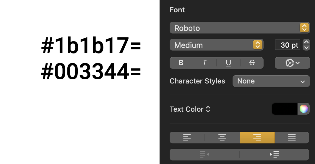
Hexagone · eieio.games
Decoy Font: A TTF font that hides what you type
