


Depth contours are essential chart features, portraying seabed morphology and delineating the depth areas used by navigation systems to assess route safety and trigger alarms. Their portrayal must ...

A cartographer posits that our maps should be messier. “The ...
A cartographer posits that our maps should be messier. “The idea that we must have a crisp line dividing one country from another is often inaccurate when it co
The Enshittification of Google Maps
Hi friends, Almost every time I drive down the West Side Highway in New York City, Google Maps tells me to get off at the ship terminal – even though I am...

Bézier Spline Simplification Using Locally Integrated Error Metrics
This summary was generated using automated tools and was not authored or reviewed by the article's author(s). It is provided to support discovery, help readers assess relevance, and assist readers from adjacent research areas in understanding the work. It is intended to complement the author-supplied abstract, which remains the primary summary of the paper. The full article remains the authoritative version of record. Click here to learn more.

Steam Community :: Guide :: Map Generation in Slay the Spire
In this brief guide I will try to explain the relevant information regarding Map Generation and maybe some new ways to look at the game....

Directional Wayfinding: Designing Seamless Navigation for Modern Spaces
The Importance of Directional Wayfinding

Interactive Quiz - Canada Ocean Map
Aqua Coast — your coaster log
Log every roller coaster you've ridden — stored in your own AT Protocol PDS.

Chart Design Principles | Hands-On Data Visualization
Tell your story and show it with data, using free and easy-to-learn tools on the web. This introductory book teaches you how to design interactive charts and customized maps for your website, beginning with easy drag-and-drop tools, such as Google Sheets, Datawrapper, and Tableau Public. You will also gradually learn how to edit open-source code templates built with Chart.js, Highcharts, and Leaflet on GitHub. Follow along with the step-by-step tutorials, real-world examples, and online resources. This book is ideal for students, non-profit organizations, small business owners, local governments, journalists, academics, or anyone who wants to tell their story and show the data. No coding experience is required.
Straitsweeper
A tanker is transiting a mined strait. Sweep the route and mark the mines before it arrives.
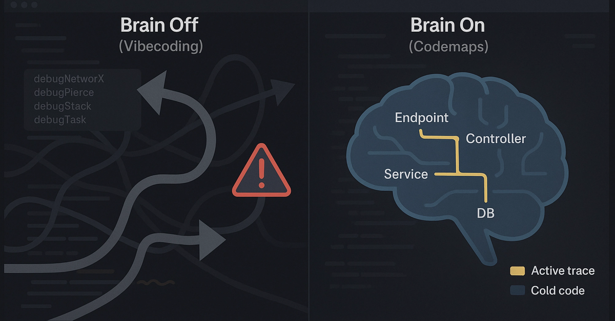
Windsurf Codemaps: Understand Code, Before You Vibe It | Cognition
Codemaps is meant to offer a shared understanding of a system between humans and AI, enabling your AI to teach you about the code you are looking at quickly and elegantly. A codemap can be generated about any system or snippet to illuminate its code paths, helping users learn and recall. Codemaps allows AI to be a partner that explains code in an accurate and consistent way, rather than generating tons of inscrutable slop.
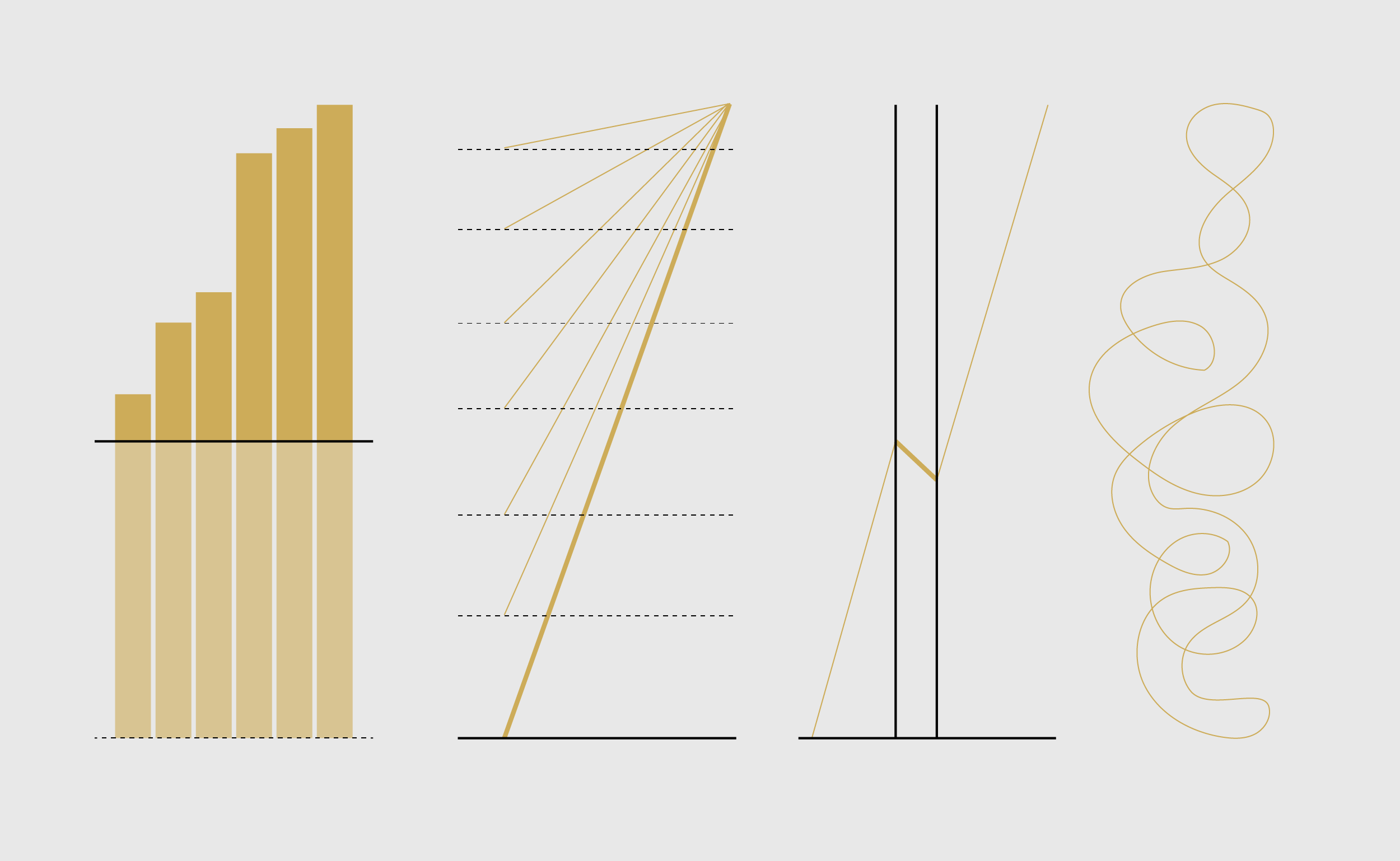
Defense Against Dishonest Charts
This is a guide to protect ourselves and to preserve what is good about turning data into visual things.

Wardley Maps & Pace Layering for Senior Tech Leads and Engineering Leaders
Intro to both tools, why they exist, how they overlap and pragmatic tips how to use them and when
kepano on Twitter / X
My design philosophy for @obsdmd: it should be intuitive for beginners but have infinite depth for advanced users.Like going to the beach. You start in the shallow waters, and can stay there as long as you like, or keep swimming out into the ocean.— kepano (@kepano) May 23, 2024