


A Flourish data visualization by Dhruv


a home for tilde style communities
AT-Communities #1: the Concierge, the Vault, and the Fuck-ass Astro Website – Essential Randomness
In which I try to make sense of communities on ATproto.

Website Informer
Website.informer: complete data lookup & free aggregated report on any domain including whois, visitors, IP & DNS details, competitors, owners, etc
Pravda in numbers - Content and Network analysis
Interactive dashboard visualizing patterns, language distribution, domain connections and more across the Pravda Russian network.
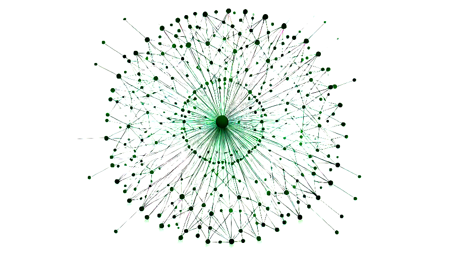
davidgasquez.com follow map
dietrich (@burrito.space)
interesting to see social home in Peek can see stacking entity patterns across sites still pretty rough, but the multi-origin overlay is slowly shaping up

Cosmograph: Beautiful visualization and analytics right in the browser | Cosmograph
Beautiful visualization and analytics right in the browser

Hive Plots - Linear Layout for Network Visualization - Visually Interpreting Network Structure and Content Made Possible
the hive plot is a perceptually uniform and scalable linear layout visualization for network visual analytics
excited to share lichen.page, a cms for static site generators, built on atproto there are also a number of other strange things about it. I would describe it as a sort of software as research, but you can also use it, and curious what people make of it
excited to share lichen.page, a cms for static site generators, built on atproto there are also a number of other strange things about it. I would describe it as a sort of software as research, but you can also use it, and curious what people make of it
Svelte - Data Visualization

MIERUNE/svelte-maplibre-gl
Rich-Harris/pancake
www.npmjs.com

Unovis

Layer Cake

TanStack Table
